Havin’ it large.

Life size print of a cartoon by Jon Tremlett at soulcraftcandy.

The above phrase, regularly used and a feature of the colloquial landscape that is modern english, often refers to a bout of over indulgent and often excessive behaviour, invariably fueled by alcohol.


Despite there being little alcohol consumed at the time this idea was born, the phrase seems most apposite in describing the birth of the above creation. For quite a while now, the suggestion that the drawings should perhaps take on a larger scale has been hovering about in the back of my mind but, achieving this jump up in size presented lots of challenges that would need to be overcome. Aside from wondering where in the house one could create a big enough space to do it, the mechanics of transferring a basic layout onto large boards or sheets is something I’ve not yet figured out. I know that simply drawing straight onto large format sheets is tricky, ones perceptions of perspective and proportion are distorted, and being so close to the image as you make it means you can’t “see” all of it, so you have to keep standing back to check on your progress. There are lots of tools out there to help with these issues like projectors and setting up a copying grid, but the fact remains that it’s a daunting undertaking if you’re not practiced at it. I really wanted to see what one would look like blown up, before embarking on a creative exercise of this size.

Life size print of a cartoon by Jon Tremlett at soulcraftcandy.

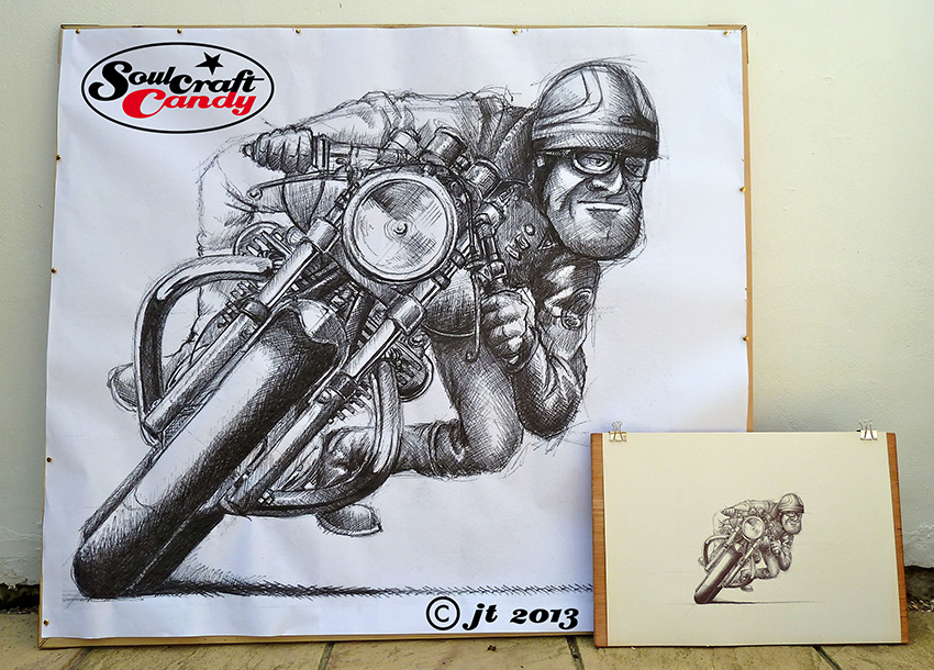
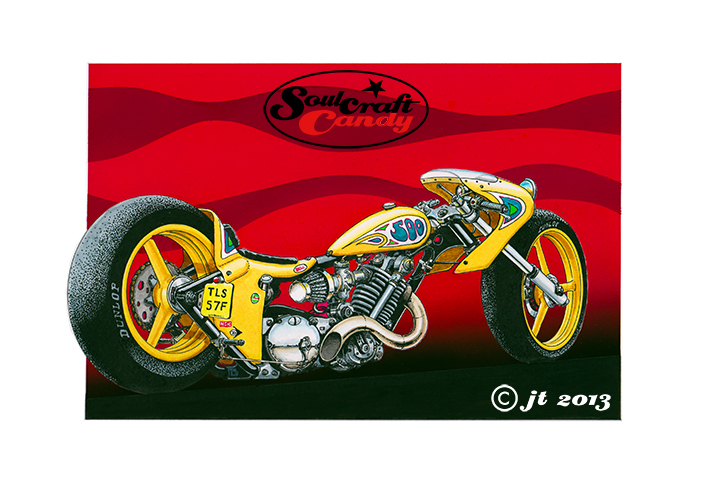
Fortunately for me, a good friend who runs a small architectural office offered the use of his A0 plotter to run something out as an experiment. I knew that printing out a massive version of one of the finished biro drawings would rapidly consume his stock of black printing cartridges, not a good idea seeing as this was a generous offer already, so elected to use one of the early sketches which is much lighter in tone. The scale for the print was based on the size of the front wheel which would be approximately life size. There was no way it was going to fit on a single piece of paper either, so I split the picture in two with a bit of an overlap so it could be trimmed and glued together afterwards. The sketch was re-scanned at 1200 dpi to avoid any pixelation when blowing it up, resized across two sheets of A0 light weight plotter paper and converted into a pdf file to keep the file size down a bit, we didn’t want to be sat there for hours while the plotter got on with the job.


Back at base the sheets were trimmed on the kitchen table and the two edges stitched together with spray glue, before being pinned to a rough frame made from some scrap lengths of baton found in the shed. Choosing to do this on a really hot day at the start of a very rare heatwave meant the exercise was a little fraught and the subsequent union a little wrinkly, but it looks fine for what I wanted it to achieve. I took a couple of photos for the blog post with one of my crash helmets in the shot and the original sketch to give you an idea of the size of this thing.

Detail of cartoon by Jon Tremlett at soulcraftcandy.

There are some interesting things that spring to mind when I look at it. The jump in scale really shows up the distortion that occurs in the cartoon process, for example, although the riders body is about right, his head is really quite huge. The original sketch was done in biro onto non acid free lining paper which has a really gritty surface, and the way the line breaks up is very prominent in the blown up version and gives the whole thing a lovely looseness. Take a look at the detail shot to see what I mean.


So the question now is, what am I going to do next? I think it splits into two routes. The first one is to find a printing method, onto paper, canvas or vinyl, which will enable me to get one of the finished drawings done at this size. I can see them making great banners, or even applied to the sides of a vehicle in vinyl, though persuading anyone to take them may be harder than I imagine, but it’s worth thinking about. The second is to start to think seriously about how I would create a drawing at this scale, a journey probably riddled with experimentation with different media and tools which could be a lot of fun. Part of that journey has already started with the idea, hatched at the local coffee shop with my good friend Ben as usual, to investigate making a drawing instrument which creates the quality of line shown in the big print. And that is as exciting as actually doing the drawing itself, so I’ll keep you all posted on my travels in the world of large format printing and whether I can figure out how to construct the worlds biggest biro pen.


A small commission.

Sidecar commission by Jon Tremlett at Soulcraftcandy

The sharing of pictures which are completed as gift commissions is always a little tricky. Firstly you need to wait until the gift has actually been given, and secondly as in this case, I was waiting for it to be published on a club website before picking up my small trumpet and giving it a blow.


This depiction of slightly exuberant sidecar piloting was done for the brother in law of a very good and old friend of mine Ben, whose approaching 50th birthday required a special kind of gift. Adrian, the brother in law, is an ardent sidecar enthusiast and is setting out this summer on a european tour on his outfit with his wife Polly. Over a coffee with Ben, we agreed that a speeding outfit with fresh french produce bulging out of all available spaces would be particularly apt.


When undertaking an exercise such as this I like to work from some decent reference material and Ben duly supplied me with some photographs of Adrian, Polly and the big Honda outfit. Whilst one doesn’t want to slavishly depict every detail exactly, a cartoon is an interpretive exercise after all, it’s good to have all the information available for feeding the distortional process which occurs when the pencil hits the paper. I’ll openly admit that my skill in creating facial likeness is not very good, a frequent obstacle in undertaking any commissions, but thankfully in this case I was rather saved by needing to show him riding and so with a helmet on his head. Background information really helps here too as you can pick up little things which you can include in the image which help to flesh out the character you’re trying to show, like the soccer team scarf and riding gear.

Sidecar commission by Jon Tremlett at Soulcraftcandy

The pencil layout before applying the colour washes and ink.

This one was drawn onto Bristol Board before being coloured with watercolour washes and then inked up using technical pens of various widths. I thought it came out really well and was thrilled to hear that Adrian was chuffed to receive such a unique gift.


Seeing red.

The Traffic Light Special by Jon Tremlett for Soulcraftcandy 2013

Applying the thousands of ink dots that make up the shadow areas in the “Slugger” picture featured in the previous post, got me thinking about what the image would look like if it was in colour. This short period of playful thought led to the creation of this second image based on the same drawing. It seemed like a fun idea to start by turning the bike into a street machine, but something built for short sprints like dashing between sets of traffic lights. So it needed lights, some different handlebars and a license plate, all fairly easy to include. It also felt right that it should be brightly coloured, a reflection of the exuberance of the activity it was created for.


So the main body of the picture employs the watercolour and pen technique used a good deal lately. I love the way it gives the pictures such a punchy look, almost jumping off the page and into your eyeballs. I so liked the dotted tyre shading from the last version I kept it in, contrasts nicely with the grey.


The bit I’m most pleased with though is the background, the bike really needed something big and bold behind it. I had a good fiddle in Photoshop before doing it, playing around with some ideas based around red, amber and green, the traffic light palette, but these merely made the whole thing look like some odd homage to Rastafarian culture. Needless to say they got dumped, too weird, too complicated, but the red element remained as it worked really well with the bright orange of the bike. This final version is simply primary red overlaid by a darker tint made by adding black. The background is air brushed using gouache paint. I covered the whole picture area with lo-tac film and cut around the bike very carefully with a craft knife, it always surprises me how little pressure is needed to cut the film so it pays to exercise the upmost patience. A solid red was then sprayed on and left to dry before removing the film. Another piece of film was then laid over and the lines for the wave forms were put on in very soft pencil. These were then cut out, again with a fresh bladed craft knife, and sprayed with tint made from the same red with some black added. Even though the picture already had a black ground line, the above process was repeated once more so that pure black could be sprayed on to give the gradient shading of the black area dissolving into the red. Challenging, messy and rather time consuming but the outcome is everything I wanted.


It’s called “The Traffic Light Special”.