New drawings and a wake up call.

Wakey wakey Jon!

Writing the first post at the end of an absence is the hardest thing. It’s not about working out where to start per se but, it’s more about avoiding the endless list of excuses as to why this has happened. This is not so much to make my readers feel some kind of sympathy for me, more to do with appeasing my own guilt at having been so neglectful. Ok, that’s the bit about feeling bad done with. There is one big excuse though.

CR_group©Jon Tremlett2016

You may have noticed in a couple of the pictures from the last post that I’m standing in front of a rather untidy brick wall. Well, that was the remains of my kitchen and was taken at a time when we had just embarked upon a major overhaul of the house. Various building works to remove some walls, make holes in others and finally fit a new kitchen were already turning our lives upside down. It went on for quite a few weeks. To finish everything off it was down to me, a form of self selected masochistic punishment, to build some big floor to ceiling cupboards, box out the under stair area and fit bookcases, all after redecorating the whole of the ground floor. It took a while and consumed my life until well after Christmas. All done now, until I need to get cracking on the first floor. A smaller project that one.

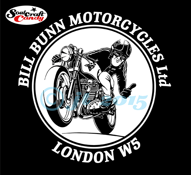
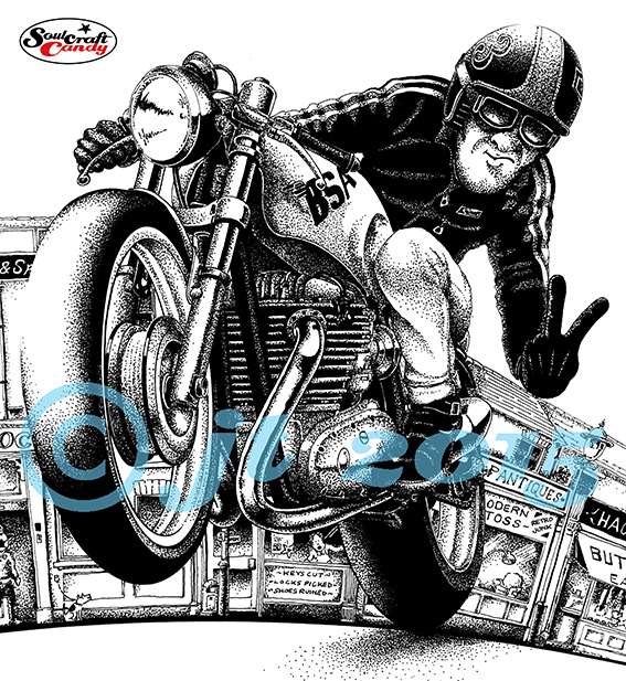
I was still doing some drawing but not making the effort to blog about it, so I’ll shed some light on what I’ve been up to on that front over the following posts. The photo above is of three black and white reductive ink drawings that were done after doing the t-shirt for my local bike shop (they sell like hot cakes by all accounts, which is good to hear). I have a contact in the US who fancied some designs for shirts of his own, having seen the blog post, so I set out to see what I could rustle up for him. Two of them made it through to printing and can be found in the apparel section of his web shop here, http://carpyscaferacers.com. They look pretty good combined with his type work so I’m hoping they’ll sell well and more work comes of it.

Thrux_comp1©JonTremlett2016

These next two pictures are really to shed some light on my process and show the preliminary sketches I do for these pictures so that you can see where things come from and how they change and develop as I move them through to inking them up. I invariably reach for my favourite blue biro for preliminary sketches, for no other reason than they’re lovely to use and one can achieve such a variety of line weights. This helps hugely when I want to move a line or change details. These are then traced off on the light box, making changes along the way, to give me a base drawing that I can then ink over. It may seem rather a long process, repeating a drawing two or three times but, it’s the best way to get it how you want it. The downside is that this is one of the main reasons why these drawings take so much time.

Thrux_comp2©JonTremlett2016

As before the inking is done with Rotring and Steadler technical pens so that I can maintain as crisp a line quality as possible and there is no ink bleeding on the thin Bristol Board I use. Because the ink is similar to Shelac based Chinese ink, it is very black which is a great help. You don’t have to go over everything twice to get great opacity and it’s just about sturdy enough to cope with tidying up the drawing with a small eraser after you’ve finished. The creation of printable artwork for shirt printing requires these drawings to be scanned and converted to vector paths in a graphics package, so the cleaner and crisper the initial scan the better. I’ll talk more about the whole vectorising thing in a later post.

I hope you like todays pictures and thanks for visiting the blog.

Advertisement

A good pen is an expensive tool, look after it.

The finished workshop polo shirt.

The finished workshop polo shirt.

So here is the shirt design for Bill Bunn Motorcycles, my local bike shop, in its finished form. The guys very kindly gave me a polo shirt in way of payment, which makes one feel very good about the idea of bartering. The quality of the screen printing is really good and the level of line and detail they have managed to keep is very high. A great result.

This black and white block reductive drawing is becoming strangely addictive. Partly I think it has to do with the process being quite quick, you see results quite fast but, it also has much to do with the simple pleasure of pen use and the decision making process. Areas of the drawing are either black or white and that’s it, this way or that, simple. As more drawings take shape it becomes easier to decide which way to go, ones ability to “see” what gets left out becomes clearer. It is amazing how the eye and brain are able to build a complete image from only a rather basic framework of information.

Big_Ink_CB750©JonTremlett2015

This activity is also helping me to complete some drawings which have been lying dormant in the drawing chest because I couldn’t decide on how to finish them. This indecision invariably comes from a lack of confidence and a worry about messing something up having invested a great deal of time and effort into it. For some reason this temerity seems to disappear once I start thinking of completing them in this style. One example is the drawing above. It must have sat in the drawer for about a year while I dithered over the final execution. However, armed with a couple of freshly filled Rotring pens it all came together rather quickly. there is still some background to complete to bring it on a bit further but essentially a neglected work has taken on new life.

Techy pens1

One aspect of working in this way is that I’ve realised that I actually have a rather unhealthy pen fetish! I’m actually a bit of a technical pen nerd in reality. It is a necessary part of using these things that one has to be rather fastidious about their cleanliness in order to get the best out of them, and I find myself enjoying this often messy job. There’s something terribly satisfying about making the first lines after a thorough clean and refill of my most oft used pen. What strikes me as a bit excessive is why I have to have so many of the things? At least a dozen at the last count, though not all are in working order. Long neglected at the bottom of a drawer, one or two are utterly dried up and solid with ink residue, a rock hard shellac like substance that seems to be impervious to most solvents. Prolonged soaking in cleaning fluid, often weeks, helps to release things but often the smaller sized nibs are beyond help. I have no idea why I have so many, like many bits of drawing equipment we just seem to accumulate them unwittingly over time. I remember purchasing my original Rotring box set over 30 years ago, second hand from a market stall but where the others have come from is anyones guess. Likely bought because I’d forgotten I had that size already or they were so bunged up I just went and got a new one rather than bother cleaning them out. Profligate and lazy days to be sure. One thing being a freelancer teaches you though, is looking after your stuff so hopefully m nibs can look forward to a more pampered and productive life from here on.

Support your local bike shop.

The finished design at it will look on the shirt back.

The finished design at it will look on the shirt back.

It is an old english adage that the centre of any small community is the local pub, a hub around which much of the activities of the local people revolves. This is invariably true and in larger communities it is also true that local shops and tradespeople make a huge contribution to the life and vibrancy of a place. Now more than ever it falls upon us, particularly here in the Uk, to support these small local businesses as more and more areas fall victim to the scourge of the megastore. I’m trying to do my bit, buying bread from the baker, meat from the butcher and sundries from the local hardware store. Being an avid motorcyclist I’m also making myself a regular customer down at my local bike shop.

Bill Bunn Motorcycles, a small family business, has been in existence for about 50 years and is the epitome of what your local bike shop should be; compact, friendly and happy to handle everything from an engine rebuild to changing your oil. The guys there are always helpful, good humoured and armed with years of hard won wisdom and experience to help you keep your machine(s) on the road. They are a top team and deserve to stay in business for many years to come. Fortuitously, for me at least, it turns out that they are fans of my work, having found it via the blog last year sometime. A resulting chat, enjoyed whilst dropping the little Suzuki off for a new tyre fitting, revealed that they’re refreshing the store this year, sprucing it up a bit with fresh paint and a general sort out. So, along with some lovely old photographs they have, the guys wanted to hang some prints of my cartoons on the walls too. One should never pass up this kind of opportunity and I’ve supplied some framed prints to them with some prices if anyone might want to purchase one. They also asked about perhaps doing a design for a t-shirt based on one of the drawings so that they could get some shop shirts printed up. I said yes.

How to turn this into a vector artwork?

How to turn this into a vector artwork?

The title image to this post is the final design for the first shirt, we’re thinking of doing more if these prove popular, and will be printed on white on the back of the shirts with a shop logo on the front. I’ve never really spent much energy before working up stuff for a t-shirt print, though I have been thinking about it a lot recently, so this was a great chance to work out how to do it.

Although there are now lots of options open to anyone wanting to have some shirts printed, from simple transfers to laser cut vinyls, the one technique that still stands above the others in terms of crispness and quality is screen printing, and for that most of the printers require vector file artwork. So I needed to get from highly detailed dot shaded hand drawing to vector line art and I had no clear idea how. I knew that all the relevant software needed was sitting in front of me, I just hadn’t used it in this way before. Time to learn some new tricks and jump into the web for tips, advice and a whole host of helpful tutorials on Youtube.

Starting with a high resolution scan of the source image in Photoshop and converting it to a bitmap image, it was relatively simple to cut it out from the background and start tidying it up. What caught me by surprise was how long it would take to remove all of the dot shaded areas and then touch up the picture with erasers and brushes so that line thicknesses and detail areas were not so fine as to get lost in the subsequent tracing process in Illustrator. I admit that I had to go back and forth between the programs several times before things started to look right. Eventually I got it how I wanted it and dropped it into a layout for the final design.

Vectorised and ready.

Vectorised and ready.

The second thing that took me by surprise was the reversal process to create the artwork. Screen printing requires that the artwork, what’s to be printed, is presented in black on a white background. With this shirt the print will be white ink on a black shirt, so the artwork for the drawing needs to be reversed so that it’s the white bits that get printed and not the black bits. I hope this makes sense. The tricky bit here was making sure that when reversed the highlight areas in the normal image weren’t so small as to disappear during printing. This reversal had to be done in Photoshop before the tracing process took place but, it worked out pretty well.

The shirts are now ordered and I’m looking forward to getting my hands on one, it will be he first properly printed t-shirt I’ve ever designed, and that it in itself a really big step for me. As a result I’ve been pushing on with a couple of my own designs and I’m hoping to get those to print before too long. If they’re any good I’ll put some up in the blog shop. Watch this space.

Before I go, a quick apology for the blue copyright stuff across the images today. Like many I suffer from image appropriation and this is a small gesture to try and eliminate a bit of it.