Don’t rush it, you’ll finish it soon enough.

Biro drawing by Jon Tremlett for Soulcraftcandy.

So here’s a progress update on the biro ink drawing I’m working on at the moment. It’s coming along really well though it is taking quite a long time to complete. The thing is, you reach a point in a drawing where you really start to see how it will turn out, and inspired by this you open yourself to  an internal pressure to get it finished. This can be a good thing, you are energised to put in the effort but, it can also be a bad thing because if you’re not careful you rush things, and when that happens you make mistakes. Although it can often be a little frustrating at times it is always better for me in these situations to take a deep breath, take frequent breaks to take stock of the marks I’m making on the paper and accept the fact that slow is good, and that I’ll get to the end, one small step at a time. I’m having to be extra mindful with this one too. It is not a commission but a work based around a request, and the last thing I want to do is muck it up. I want it to be the best one I’ve done so far and as a result my internal pressure gauge is already off the scale!

Catch_me_detailJonTremlett2014

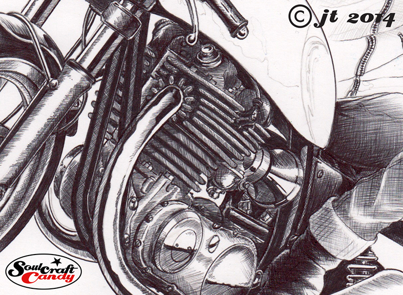
From this detail shot you can see I hope, how much pen work goes into these things, so you get an understanding of how important it is for me not to make mistakes. I spend a lot of time scribbling on a separate sheet to get the pen running right and my hand steady (I have a natural shakiness at close range). There’s a discipline to cross hatching, getting the tone and line direction consistent which requires huge concentration. Sometimes it just doesn’t work, the angle of the pen gives too much black or the pressure you’re using is too firm and at times like this you just have to step back, scribble on a loose sheet until you’re happy and then come back to it. No one ever said this was easy, so I try not to think that. In essence the greater the effort the greater the reward. Let’s see how I cope with the rest of it.

Today I painted a car! Part 1.

A painting in progress by Jon Tremlett ©2014

It would be fantastic to say that after only a day of painting that the picture was complete, but I know I don’t work that fast and besides, any faster would be a rush and that’s when mistakes happen. Anyway, as you can see from the shot above it has come a long way from the blue sketch shown in the last post. I suppose at this point the car is about half done.

Barring a couple of small detail changes it was very straightforward to trace off on to the watercolour paper using the lightbox. I use a good old HB pencil for tracing off, and I’ve found that once you’ve captured the image you can then stretch the paper as you would normally and not loose any of the pencil work. This is a really handy discovery and means I can avoid endless hours mucking about with grids and such transferring the drawing on to paper stuck to a big wooden board.

All of us who have been lucky enough to have been on the receiving end of any artistic tuition will have been told at some point or other that there is no such thing as black when making a drawing or a painting. So the first challenge when rendering a black car is working out what colour it is. An old tutor I had at design school always recommended starting with Payne’s Grey and working from there. He’s been proved right so many times. So the picture is built up using various dilutions of Winsor and Newton Payne’s Grey, wash upon wash. This means you can work slowly toward the shade you’re after without putting down a whole load, and subsequently realising it should have been lighter. It’s time consuming, but a lovely technique. To get the slight blueness in the highlights I put a very thin wash of Indigo Blue down first. The bits that look black, but are in fact an intense dark blue, were put down quite thick as those areas had very defined lines to follow. For the area of shadow under the car I’m going to use a half and half mix of W&N Payne’s Grey and Schmincke Payne’s Grey which will give me a slightly warmer shade. I’ll mention here that although I have three tubes of paint here all called Payne’s Grey, from different manufacturers, they are all quite different. It helps to buy a few and find the one that suits your technique the best.

The background contains the concrete telegraph pole shown, and a whole swathe of a large green leafed hedge that sits behind the car in my reference shot. There’s a big tree in there as well so they will go in towards the end of the painting process so that I can build them up gradually and frame the car just enough without swamping it. It’ll be done soon.

Shotgun drag bike – the finished picture.

107_Shotgun©JonTremlett2014

Now that the finished picture is finally with its new owner, it’s the right time to post it here on the blog. It would have been unfair on Nik to put the finished picture up before he’d had a chance to see it in the flesh. Needless to say he had a very big smile on his face when he unwrapped the parcel, a moment that gave me great satisfaction and a fitting end to a project that has been utterly enjoyable to do, and has left me feeling that this could very well be the best picture I’ve done to date. So brilliant to get something just right. I think he’s going to hang it in his living room which makes me very proud and is rather flattering to be honest.

The front fairing was, in time honoured tradition, pretty much the trickiest part to complete in colour. As I hinted in the previous post, these intense liquid colours come with their own set of particular limitations, namely their ability to “blend” across larger areas and around complex details. Getting the red to “flow” around all of the lettering involved lots of quick brush work, letting things dry and using very diluted tints laid over each other. It took quite some time, but the result looks great in the context of the overall picture. We’d agreed that the bike would sit alone on the background and so the finishing touch was just to put the thick black line under the wheels and sign it. Job done.

108_Shotgun_B&W©JonTremlett2014

Nik had also asked me to do him a smaller black and white drawing that he could use for t-shirts and cards. I chose a simple elevational view for this one, and the dot shading technique I’ve used on a couple of previous pictures seemed the best way to go. As I’ve said before, this is a rather time consuming way to apply shade to a drawing but it does give the finished thing a look which is very distinct and crisp.

With these two done it’s time to delve into the unfinished projects drawer and pull out a couple of sketches that have been on the back burner for some time now. There’s also the possibility that I’ll do another picture of the Shotgun, perhaps a partial drawing from another angle. I’m undecided at present but will post up how I get on with both of these options soon.