Can you draw women?

Bike_girl_comp©JT2016

Ok, so here’s a thing, time for a confession, I’m pretty rubbish at drawing women. There, I’ve said it. This sounds like one of those introductory confessions one might be asked to make upon a first attendance at a therapy group. Like, “Hi, my name’s Jon and I can’t draw women”. This is neither something to be proud of or be ashamed to admit. Don’t ask me why this is so, it’s just the way it is. Some people probably find drawing people, whatever their gender or form much easier than others. Other folk probably find drawing men less hard because it is easier to express generic masculine traits and you can get away with portraying less good looking men (!?). And then there are those who find the innate curvature and character of the female form easy to capture because they just do. One thing’s for sure though, and that is that when asked to view a drawing of a woman most of us automatically make some kind of judgement based on the perceived beauty of the rendered subject, i.e. if your drawing doesn’t portray a pretty/elegant/feminine woman, it’s the first thing people will comment on.

The above is only intended to be a cursory observation, the whole discussion around how we render and view human subjects is much, much more wide ranging that this, but what it does do, I hope, is shed some light onto how difficult it is to get to grips with a subject area such as this. Not being someone who has ever really received the benefit of extensive life drawing classes or any formal training in figure drawing, I have arrived at a point in my creative life lacking the confidence to draw half the people who surround me. I’m sure I’m not alone.

This new challenge came about through a request from a contact about possibly designing some t-shirts for women. Throwing my usual caution to the wind I agreed to have a go and then quickly realised that I would have to do something about the fact that I have never really successfully drawn women who look like women. To be honest with you, when I’ve had to do it in the past I’ve either traced off a magazine picture or concocted something akin to a rather effeminate man. So, time to put all of that to one side and see if I could actually learn how to do it more convincingly. I don’t know which is harder, learning a new skill like this in a straight drawing sense or in the cartoonish vein in which I normally work? Time to find out.
BGsketch_comp©JT2016

Thankfully, and this is again where the internet comes into its own; one is not short of resources to study as a way of starting. One can not only gain access to myriad video based tutorials on YouTube etc., but you can also find every single kind of cartoon style referenced so you can easily see how different characteristics are emphasised depending on the style you want to follow. To give you just a couple of examples; if mastering eyes is problematic for you, there are hundreds of variations and iterations to be found within the Manga drawing style and if the classic hour glass figure is something that you want to focus on, you will find plenty of guidance if referencing mid 20th century lifestyle and fashion illustration.

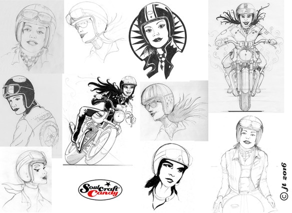
My brief, such as it was, was “Marilyn Monroe in a Bell helmet”. Quite a broad brief to say the least, so plenty to think about. My first scribbles, shown above in the first selection from my sketch books was as much about the brief as it was about learning the distinct attributes of a woman’s face. Eye shape, size and position, the jaw line, the line of the brow, the position and proportion of the nose and the mouth. These all sound incredibly obvious but until you have to think about them and draw them, your brain just rumbles on telling you that this should all be easy as it knows all this stuff already. No it doesn’t, you have to teach it and at the same time convince your drawing hand to follow. This goes right back to previous posts I’ve written about the idea of embedded knowledge. You’ve got to look and look and look, and then draw, draw, draw until hopefully things start to feel natural. It takes work and there’s no easy way around it unless you want to spend your life tracing photographs.

I was also trying to think about shirt designs at the same time, so this had quite an impact on my sketching, both in terms of speed and overall feel. Some of my attempts are way off, some are starting to point towards something more workable. The second of the images is another compilation of sketches where I am starting to get the hang of it, though you can see I’m yet to get my eye shape and spacing anywhere near right. I must confess also, that by this point I’d had gone back to referencing some old lifestyle photos in a book to try and speed things along. It seems to work best for me if I am combining an iterative drawing approach with regular reference to other materials. Placing a crash helmet onto a woman’s head brought its own challenges and I ended up taking lots of photos of my own crash hat at various angles to give me an idea of how its many curves look when not viewed simply in elevation. The bikes I didn’t seem to have a problem with. Funny that.

More on this in the next post I hope.

Advertisement

New drawings and a wake up call.

Wakey wakey Jon!

Writing the first post at the end of an absence is the hardest thing. It’s not about working out where to start per se but, it’s more about avoiding the endless list of excuses as to why this has happened. This is not so much to make my readers feel some kind of sympathy for me, more to do with appeasing my own guilt at having been so neglectful. Ok, that’s the bit about feeling bad done with. There is one big excuse though.

CR_group©Jon Tremlett2016

You may have noticed in a couple of the pictures from the last post that I’m standing in front of a rather untidy brick wall. Well, that was the remains of my kitchen and was taken at a time when we had just embarked upon a major overhaul of the house. Various building works to remove some walls, make holes in others and finally fit a new kitchen were already turning our lives upside down. It went on for quite a few weeks. To finish everything off it was down to me, a form of self selected masochistic punishment, to build some big floor to ceiling cupboards, box out the under stair area and fit bookcases, all after redecorating the whole of the ground floor. It took a while and consumed my life until well after Christmas. All done now, until I need to get cracking on the first floor. A smaller project that one.

I was still doing some drawing but not making the effort to blog about it, so I’ll shed some light on what I’ve been up to on that front over the following posts. The photo above is of three black and white reductive ink drawings that were done after doing the t-shirt for my local bike shop (they sell like hot cakes by all accounts, which is good to hear). I have a contact in the US who fancied some designs for shirts of his own, having seen the blog post, so I set out to see what I could rustle up for him. Two of them made it through to printing and can be found in the apparel section of his web shop here, http://carpyscaferacers.com. They look pretty good combined with his type work so I’m hoping they’ll sell well and more work comes of it.

Thrux_comp1©JonTremlett2016

These next two pictures are really to shed some light on my process and show the preliminary sketches I do for these pictures so that you can see where things come from and how they change and develop as I move them through to inking them up. I invariably reach for my favourite blue biro for preliminary sketches, for no other reason than they’re lovely to use and one can achieve such a variety of line weights. This helps hugely when I want to move a line or change details. These are then traced off on the light box, making changes along the way, to give me a base drawing that I can then ink over. It may seem rather a long process, repeating a drawing two or three times but, it’s the best way to get it how you want it. The downside is that this is one of the main reasons why these drawings take so much time.

Thrux_comp2©JonTremlett2016

As before the inking is done with Rotring and Steadler technical pens so that I can maintain as crisp a line quality as possible and there is no ink bleeding on the thin Bristol Board I use. Because the ink is similar to Shelac based Chinese ink, it is very black which is a great help. You don’t have to go over everything twice to get great opacity and it’s just about sturdy enough to cope with tidying up the drawing with a small eraser after you’ve finished. The creation of printable artwork for shirt printing requires these drawings to be scanned and converted to vector paths in a graphics package, so the cleaner and crisper the initial scan the better. I’ll talk more about the whole vectorising thing in a later post.

I hope you like todays pictures and thanks for visiting the blog.

It’s been a long time coming.

"Catch me if you can", a biro drawing by Jon Tremlett for Soulcraftcandy.

Finally, finally, finally, today it’s time to reveal the latest finished drawing. For now it’s called “Catch me if you can”, and I think it will probably stay that way. This one has taken rather a long time to complete, though I’m hoping you’ll see why and understand my excitement at seeing it done. As I’ve mentioned before it is inspired by an idea thrown at me by Steve Carpenter over in California, a nod to the underlying disregard for authority and convention that underpins our shared love of motorcycles and what we do with them. Having said that I would add that this is by no means meant to celebrate bad behaviour or law breaking (much).

As with some of my previous drawings this one is drawn using a yellow barrelled fine tipped Bic biro (c’mon guys where’s that sponsorship ;D) on 250gsm Bristol Board at A3 size. For some reason, and I think it might have something to do with not having done a biro drawing for a while, I approached this with a level of conscientiousness that I found quite surprising. Hence the time it’s taken to finish. I even got to the point of wrapping tape around the barrel of the pen to remind me where I needed to hold it to get a particular line weight and thickness. They say that God lives in the details, and perhaps that’s where He is in this one, not in the picture but in the bit of blue tape wrapped around my pen?

For much of its gestation the picture was just the bike and the pursuing police car but, following what I did on the V-Bob picture recently, see the post here, I decided to put in some street scene to provide some context and stuff. I think it works quite well. Aside from the cartoon nature of the depiction, like the hand gesture and the light flying off the car roof, the street scene offers the perfect opportunity to inject a little bit of extra humour into the composition. It’s something I’ll be working on more in future, it appeals to my sense of the ridiculous. I’ve been wandering around my neighbourhood here in Ealing taking lots of pictures of local shops, pubs and buildings so that I can build a little reference archive to use for future inspiration.

As usual I’ve put this up as a low resolution image, so apologies if you’re struggling to see the detail. Please feel free to share it but, I would ask that you don’t use it for any other purpose for the time being. Much obliged and thanks for dropping by today, I hope you enjoyed it.

Here are some details from the drawing for you.

Details of "Catch me if you can" by Jon Tremlett ©2014.