Can you draw women?

Bike_girl_comp©JT2016

Ok, so here’s a thing, time for a confession, I’m pretty rubbish at drawing women. There, I’ve said it. This sounds like one of those introductory confessions one might be asked to make upon a first attendance at a therapy group. Like, “Hi, my name’s Jon and I can’t draw women”. This is neither something to be proud of or be ashamed to admit. Don’t ask me why this is so, it’s just the way it is. Some people probably find drawing people, whatever their gender or form much easier than others. Other folk probably find drawing men less hard because it is easier to express generic masculine traits and you can get away with portraying less good looking men (!?). And then there are those who find the innate curvature and character of the female form easy to capture because they just do. One thing’s for sure though, and that is that when asked to view a drawing of a woman most of us automatically make some kind of judgement based on the perceived beauty of the rendered subject, i.e. if your drawing doesn’t portray a pretty/elegant/feminine woman, it’s the first thing people will comment on.

The above is only intended to be a cursory observation, the whole discussion around how we render and view human subjects is much, much more wide ranging that this, but what it does do, I hope, is shed some light onto how difficult it is to get to grips with a subject area such as this. Not being someone who has ever really received the benefit of extensive life drawing classes or any formal training in figure drawing, I have arrived at a point in my creative life lacking the confidence to draw half the people who surround me. I’m sure I’m not alone.

This new challenge came about through a request from a contact about possibly designing some t-shirts for women. Throwing my usual caution to the wind I agreed to have a go and then quickly realised that I would have to do something about the fact that I have never really successfully drawn women who look like women. To be honest with you, when I’ve had to do it in the past I’ve either traced off a magazine picture or concocted something akin to a rather effeminate man. So, time to put all of that to one side and see if I could actually learn how to do it more convincingly. I don’t know which is harder, learning a new skill like this in a straight drawing sense or in the cartoonish vein in which I normally work? Time to find out.

BGsketch_comp©JT2016

Thankfully, and this is again where the internet comes into its own; one is not short of resources to study as a way of starting. One can not only gain access to myriad video based tutorials on YouTube etc., but you can also find every single kind of cartoon style referenced so you can easily see how different characteristics are emphasised depending on the style you want to follow. To give you just a couple of examples; if mastering eyes is problematic for you, there are hundreds of variations and iterations to be found within the Manga drawing style and if the classic hour glass figure is something that you want to focus on, you will find plenty of guidance if referencing mid 20th century lifestyle and fashion illustration.

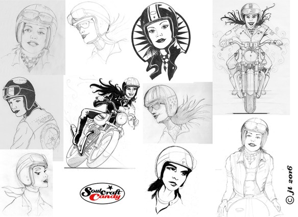
My brief, such as it was, was “Marilyn Monroe in a Bell helmet”. Quite a broad brief to say the least, so plenty to think about. My first scribbles, shown above in the first selection from my sketch books was as much about the brief as it was about learning the distinct attributes of a woman’s face. Eye shape, size and position, the jaw line, the line of the brow, the position and proportion of the nose and the mouth. These all sound incredibly obvious but until you have to think about them and draw them, your brain just rumbles on telling you that this should all be easy as it knows all this stuff already. No it doesn’t, you have to teach it and at the same time convince your drawing hand to follow. This goes right back to previous posts I’ve written about the idea of embedded knowledge. You’ve got to look and look and look, and then draw, draw, draw until hopefully things start to feel natural. It takes work and there’s no easy way around it unless you want to spend your life tracing photographs.

I was also trying to think about shirt designs at the same time, so this had quite an impact on my sketching, both in terms of speed and overall feel. Some of my attempts are way off, some are starting to point towards something more workable. The second of the images is another compilation of sketches where I am starting to get the hang of it, though you can see I’m yet to get my eye shape and spacing anywhere near right. I must confess also, that by this point I’d had gone back to referencing some old lifestyle photos in a book to try and speed things along. It seems to work best for me if I am combining an iterative drawing approach with regular reference to other materials. Placing a crash helmet onto a woman’s head brought its own challenges and I ended up taking lots of photos of my own crash hat at various angles to give me an idea of how its many curves look when not viewed simply in elevation. The bikes I didn’t seem to have a problem with. Funny that.

More on this in the next post I hope.

Advertisement

It feels good getting back in the saddle.

SC_Sketch_1©JonTremlett2014

Wow, it’s been two months since the last post!  I don’t for a moment think that that is a good thing but, the time has now passed so there’s little point worrying about it. Summer is always a busy time and this year is no exception, though I would have preferred it if one of the things that’s been happening in the meantime wasn’t the premature termination of my working contract. Hey ho. At least I wasn’t fired, I just became the resultant collateral damage of a major falling out between other parties who couldn’t resolve their differences. Such is the unpredictability of freelance working I suppose, and something that we all have to get used to by necessity rather than choice. As you can imagine, finding the next thing to do is a challenge which drags me away from keeping my blog up to date.

But enough about that. Today the creative itch has finally got the better of me and sketches have been scanned, paper has been stretched and the need to draw is whispering in my ear. So, what am I going to work on next?

SC_Sketch_2©JonTremlett2014

Some time ago, far too long to be considered as recently, I was contacted by a guy in California, a certain Mr Steve Carpenter, who has made a very successful business out of building cafe racers for select customers. He wanted to know if we could do something together. I said yes, of course, the guy’s a very respected builder and a very creative chap. I feel rather honoured to be asked, frankly. So my next project is to create some specific artworks for Steve in my black biro style, based around some ideas we’ve talked about.

So here are a couple of initial sketches, done in blue pen on newsheet, which are my first attempts at capturing what Steve and I have chatted about. I think you can get the gist of what we’re thinking from the images. These two are first thoughts and are not yet exactly what I’m after. There are a stack of post-it notes here covered in notes about what I want to change about them, I find this the best way to document my thoughts and satisfy my inner editor, so the final image will be different. But these are a solid start in trying to capture the feeling I’m after and get a feel for the overall “shape” of the picture I want to create. Mr. C knows I do this as a hobby, so he’s not applying any pressure, I’m very capable at doing that myself (!), but looking at these sketches today and reading through the notes makes me want to get on with it and rev up the creative engine again.

It’s good to be back.

Celebrate unexpected outcomes.

The finished thing, blobs and all.

The finished thing, blobs and all.

Those of you who’ve followed the blog for some time will know that I have a thing for a ball point pen. I have my favourites obviously, just like painters tend to have a favourite brush or colour, but generally speaking it doesn’t really matter what brand it is or how cheap. In fact some of the best for drawing are amongst the cheapest you can buy. Although I tend to use black mainly, there’s nothing wrong with other colours, they bring a certain something to an image. But I digress.

This drawing you see here must be one of the messiest I have done for quite some time. I have no problem with this, in fact it was a joy to make, really, and it was made using a ball point pen. Well, I’ll call it a pen for now, but in fact it’s more of a marker and actually I used two different types to make the picture. You may remember some time ago I posted that I’d had a sketch of one of the original Cafe Racer drawings printed out at life size. The resultant print, taken from a scan of a loose biro sketch, revealed all of the feathering and broken line work that were not really visible on the original. It looked great, one could really see where the pen had travelled and what marks it had left behind. On the back of this experiment I wanted to investigate whether I could create a giant ball point pen to try and replicate this character and do some massive drawings at life size. Scaling things up I needed to find a pen with a ball of roughly 3.0mm in diameter. My searches unfortunately proved that no such thing existed but something very similar did. What I found were ball point paint markers which are used in the construction and engineering fields for marking parts and assemblies. Finding a convenient supplier in Royston, Hertfordshire I duly bought a couple to try. In black.

Detail showing paint build up.

Detail showing paint build up.

Both of the markers are shown in the bottom picture. The first, a thing called a Texpen made by Dykem, is a fairly conventional looking marker and quite easy to hold and manipulate. The other is a more heavy duty one from a company called Suremark. As you can see it’s essentially a bottle of paint with a ball point cap screwed onto the top. Lasts longer but not so easy to handle, and is refillable.

Before venturing into huge scale and wrecking large pieces of paper I thought I’d try something smaller to start with, to see if my suspicions were correct or not. The picture you see here is on a piece of A2 cartridge paper. I roughed out a sketch in blue biro first and then hit it with the paint markers. After half an hour of struggling I had to get up and have a cup of tea whilst I coped with my disappointment. After sweet tea and swearing I sat down and tried again, and this time really enjoyed myself.

These things are not like ball point pens at all, no sir. Firstly the paint is thick, gooey and doesn’t really flow. Secondly, the balls in the nibs are spring loaded so you have to press down to release the paint, so describing a line in a sweep is virtually impossible. Once I’d got my head around mark making though, I found I could squidge and blob my way to creating an image without too much trouble, the key bit was realising that detail and line consistency were never going to come to this party. It was a great lesson in learning how to approach getting the best out of an unfamiliar tool. The paint takes a short while to dry so avoiding putting your drawing hand in it is quite difficult, hence various blobs scattered about. The bottle option proved best for filling in solid areas while the pen option was easier to “draw” with. You can see from the detail shot, I hope, that paint tends to build up quite a bit on the blackest areas.

Paint_sketch3©JonTremlett2013

I stopped at a point beyond which I thought I might spoil it, and let it dry. When I returned I wanted to give it something extra so grabbed some cheap coloured biros I have here and put some colour on the riders helmets to lift the whole thing a little.


I hope you like it. This isn’t the end of my experiments with these markers, there are different papers to try in the search for different results and different types of drawings to try too. All very exciting, I’ll let you know how I get on.