When you’re unsure, redraw.

Sketch by Jon Tremlett for soulcraftcandy 2014

Ok, so there’s been a bit of a gap between this and the last post, I’ve been working, putting in some serious time on a freelance job, one which involved constructing a couple of full sized mock ups of some new airline seat concepts, in polyboard. For those of you who don’t know, polyboard is that stuff that folk normally use for presentations, a couple of sheets of very thin card with a foam core. It’s great for what it was designed for but, it also makes a great modelling material provided you know what you’re doing. I’ve been making models out of this stuff for longer than I care to remember so it presents few challenges as such, the main obstacle these days is that the forms that are created in CAD by the designers are so complex that we are now operating well beyond what a basic sheet material can achieve.

Polyboard_model1

Fortunately there are ways around this, including software that essentially creates complex nets for making paper models, which can be utilised to assist in turning curved surfaces into flat plates that one can cut, bend and glue together. It’s hard work, but becoming a skill fewer and fewer people possess, so there may be hope for me yet! Here’s a pic of the kind of thing I’ve been building. This is a very old model so no one will mind me showing it, the more recent stuff is, as usual, highly confidential so no pics of that for a few months at least.

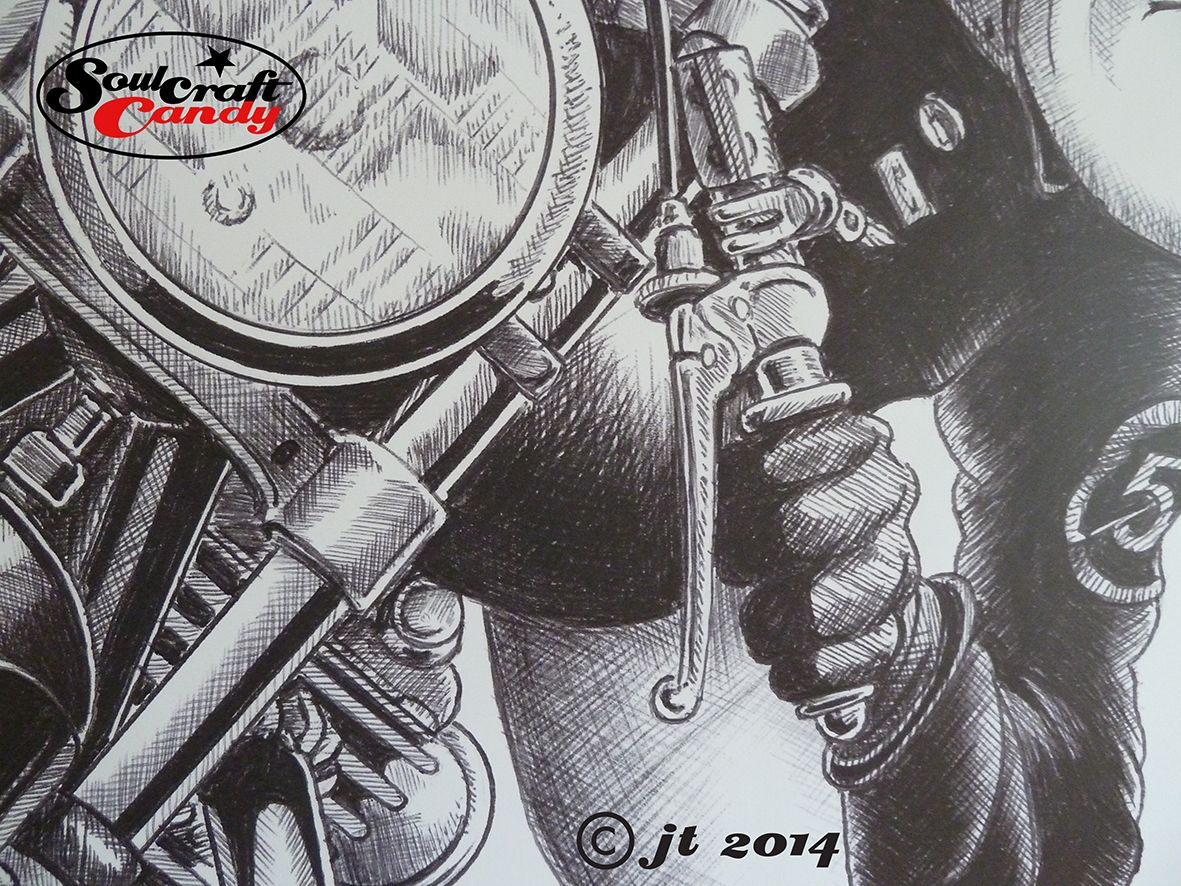
Anyway, enough about work. Todays post is actually about this sketch above, the next stage in creating the drawings for Mr. C. After my initial efforts, see the relevant post here, it became obvious that what I wanted wasn’t anywhere near what I’d initially drawn so was beyond a quick set of modifications. Only one thing for it, redraw the whole thing. Not a problem, the learning and critique of the first sketches really informs your hand second time around so the process is more focused and as a result much better. What I do find though is that I can’t force this part of the process, it has to happen when the mood takes rather than when sitting down and telling oneself to get on with it. Needless to say the use of the magic blue biro helps as well, laying gentle lines first and slowly building up. This is now much more what I’m after in terms of view angle, the position of the bike on the page, the curve of the road and where the police car is. This will now get transferred onto Bristol board for the final bit and I’m already thinking I should do another version in tandem which shows a motorcycle which is closer to the kind of bike Mr.C constructs using four cylinder engines. More very soon, and thanks for taking the time to read the post today.

Advertisement

Going large, how blowing up images changes their character and impact.

Vinyl banner print by Jon Tremlett for Soulcraftcandy.

Another project that has spent many a month in the pipeline is the continuation of an experiment I started last year, where I wanted to see what impact it would have if I blew up one of the drawings to something like life size. While I’m still very much trying to figure out a way of being able to draw at this scale, it seemed like a good idea to get something printed in order to be in the position to make some judgements about how to approach such a challenge in the future. Initially I’d enlisted the help of a good friend, an architect with a big format plotter, to run out a couple of A0 sized sheets with the sketch image of the above drawing on. Taped together, these looked pretty impressive though the paper wasn’t too keen on staying very flat for long. Follow this link to that particular post.

After some further investigation, and with one eye on the possibility that I could use such prints for other purposes, it became clear that the best thing to do was get something printed on vinyl as a kind of banner. So this is what you see above, hanging in my dining room. It’s a metre and a half square, roughly 60 inches across and high, and is a thing of beauty, even though I say so myself. Well, I would, wouldn’t I ?

Vinyl banner print detail by Jon Tremlett for Soulcraftcandy

The jump up to such a scale causes you to regard the image in a very different way. The first is that it challenges your perceptions in that one hardly ever sees a cartoon at this size, so one is confronted by a strangely proportioned interpretation of a man and his machine. Some things fit and others don’t. The other change is that the print doesn’t hold any of the information in it back. Every single mark, line and cross hatch is revealed in all its glory, and so what appears a very neat drawing at normal size takes on a looser and more sketchy feel. As the creator, this change is not unlike revealing ones inner secrets of technique and skill to the viewer. Letting them see every stroke of then pen, every guiding thought and inevitably, every mistake. All unexpectedly liberating to see everything laid bare in this fashion. The good thing is, though I may stand to be corrected by others, that the drawing doesn’t suffer for this jump up in size in my mind, it still looks like a drawing, just a very big one done with a very big pen.

I’ve resolved to have some more of these prints done, and it would be really interesting to see what happens to one or two of the colour drawings. To see how every small daub of paint is shown in minute detail. The main challenge will be choosing which one to reproduce. Some would suggest that a painting should never be enlarged beyond its original size but, we do this to photographs so why not something made by hand?

Before I go I’d just like to mention that although vinyl banner printing is a widely available service, it pays dividends to find a printer one can talk things through with before placing the order. So many companies offer a web based service and instant file upload facility, but it’s the ability to see what your final print will look like where many fall short. Luckily I found one who did, so I’ll be visiting them again. If you need to know who they are please contact me.

Today I painted a car! Part 2.

Ford Mustang water-colour by Jon Tremlett ©2014

Well, here it is, the finished Mustang picture I’ve been working on over the last week. A slightly more intense painting session took hold yesterday and before I knew it I was sat staring at a completed picture. It would be fair to say I’m more than happy with it given that it’s not a subject I visit very often. I’ve never been a car fan, so they don’t appear on the radar as great subjects unless they are extraordinary, and even then I pretty much have to force myself to draw them. Just one of those things I suppose. Anyway, the main stimulus for doing this one was that it’s going to be a gift for a friend so that helps to keep the focus and the enthusiasm up at a level where you need it to make a decent job of it.

There is very much a kind of groove that one gets into when doing something like this. At the beginning of the session things are all rather laboured, small decisions about colour tone, wash density, which bit to do next and even which brush to use seem to take forever. but slowly things speed up and it’s all relatively easy to jump from one thing to the other. It must be a confidence thing too. After painting for an hour or so it all starts to feel more natural and intuitive, and this is really evident in ones ability to push concerns about mucking something up to one side and just get on with it. One gets into a flow which certainly doesn’t happen when trying to complete a picture by picking up the brushes for a few minutes here and there. Best to reserve some quality time and get stuck in.

There were some bits that I found quite difficult. For example the bush or hedge that sits behind the car and the way it’s reflected in the bodywork and windshield. In my reference photo the hedge is much larger but I wanted to reduce it’s presence and use it to help frame the car and give more prominence to the big bulbous hood. I’ve never been good at vegetation so this was a bit of a challenge but great practice for future projects. The other bits that presented a challenge were the headlamps. the lenses are a mass of prismatic forms and they are filled with so many reflections I found it quite hard to see what I was doing and replicate them in a believable way. Thankfully they aren’t too prominent in the overall scheme of things so my rather bitty interpretation of them isn’t to jarring. Again, all good practice for the future. I hope you like the final result as much as I do, and thanks for stopping by and reading todays post.