The big Green Meanie – it’s finished.

A personal commission by Jon Tremlett for Soulcraftcandy.

For once, having said in the previous post that I was close to finishing a picture, I have done exactly that, and faster than I thought I would too. So here is the finished article. The pictures are the wrong way around today, finished one first, purely because it’s great to open a post with a completed picture. I’m pretty happy with how it has come out.

You will notice that I have left the top of the picture plain white rather than include the very dark area at the top of the reference photo. What drove my decision in the end was the thought that I wanted the main subject to really stand out, surrounding it in big dark bits would have dulled it off too much. So there’s just a hint of ochre wash back there to lift it further.

A personal commission by Jon Tremlett.

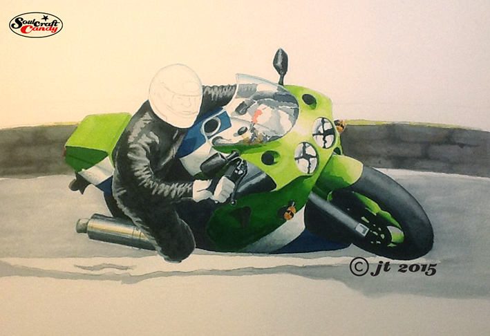
This view, and apologies for my iPad’s inability to take a decent photo in my studio, shows things at about the half way stage. With such dark areas in the image it was a bit of a juggler getting the various tones down in an order where they didn’t conflict too greatly. What helped was mixing two different kinds of grey, one for the riders leathers and the other for the bike area shadows, so I could maintain a distinction between them. The shadow areas go down in a couple of passes with the brush, but the leathers took rather longer, slowly building the tone with much thinner washes. The really tricky bit, doing the helmet and face, came last and again was a slow build. I’m not afraid to admit I find faces and flesh tones quite difficult so going slowly with a small brush gives me the best chance of getting it right. Finally, once all the above is dry, my attention switches to the ground area and their associated shadows, making sure I don’t include too much detail so as to keep your eye focused on the big green thing in the middle.

There is always a process of final fiddling and fettling at the end of the main paint stage. Each time your eye returns to the image after a short break you pick up on little things which just need a small tweak so out comes the tiny brush for some edge honing, some white gouache to bump some highlights up and a colour pencil or two. Some things you can’t adjust so there’s only so much you can do, your biggest challenge is knowing when to stop. This one turned out to be more of a painting than a drawing, something I don’t do that often, but I don’t think it loses anything because of that. Yes, it was a challenge but, it was a fun one to undertake which is just as important.

Thanks for dropping by today and hopefully you’ve enjoyed the post.

Advertisement

Julian and the big Green Meanie.

JW_photo

Firstly, a very happy New Year to all of my readers and followers, may 2015 be a great year for all of you. Here at Soulcraftcandy I’m hoping for a year full of interesting drawing projects to grapple with, some new adventures featuring some new materials and obviously, a whole host of new fans and followers. Not too much to ask for then! So let’s kick off the new year with a story featuring a very old friend, a big green machine and a triumph of physics over human ambition.

The friend in question is Julian, a lovely former wild boy I have had the pleasure of knowing for over forty years. Once a hard core bike rider, his various exploits deserve a blog all of their own, now a responsible dad. Having said that, he has never really lost the bug and as we speak is preparing himself for an off road rally trip over on the Baja peninsula. Watch out Mexico. Back in the day, Julian was the first person I knew who fully embraced the modern sports bike and the newly (at the time) burgeoning cult of the public track day, a barely veiled excuse for Joe Public to go ballistic on his road bike within the controlled confines of a proper race track. Needless to say at one such event our man came a cropper.

Julian has always been interested in my pictures and finally got around to asking me to do a commission for him. It goes without saying that his choice of subject is poignant, being a depiction of him aboard that sports bike on the fateful day he badly broke his ankle and hung up his leathers for a while.

Here’s the photograph, above, he supplied as reference and as you can see it’s not in the best condition or particularly in focus, but that’s not too much of a problem, there is more than enough information here to get going. I wanted to base the picture on this view rather than create a new one, but just tweak it here and there as it’s a great image to start with.

JW_First_trace©JonTremlett2015

The first step is to get the photo into my painter program where I can trace over it in digital pencil to establish some outlines to work with. This initial process also helps to embed some knowledge of the subject into my head so I can start to think about which bits I want to change moving forward. I’m still too much in love with hand techniques to go fully digital with a painting yet but, I’m sure one day soon it will happen. Though when you do that all you get is a print of your artwork, not the actual artwork itself, which is a very different outcome.

JW_Blue©JonTremlett2015

Using the printed trace as an underlay, it’s then onto the light box for another tracing exercise where I can start to move parts of the drawing around, like changing the position of the rider, and playing with the proportions of some details very slightly to gain extra emphasis here and there. Working with the blue biro helps me to see one drawing clearly over the top of the other. You’ll see I’ve shifted him off the seat a bit and given him a more heroic “knee down” stance to get some added dynamism into the picture.

JW_Pencil©JonTremlett2015

This third stage is the final pencil outline drawing on to the water colour paper I’ll use for the painting itself. Again, working on the light box, I trace off the blue biro drawing, tightening details as I go but only putting in the lines that I really will need to rely on. An H or 2H pencil is best for this bit, and light pressure so that it doesn’t leave grooves in the paper surface. All this redrawing might seem rather time consuming but it means I don’t have to worry too much about moving a line or erasing things, both of which will only damage the surface of the water colour paper. Once this is complete I soak the paper and stretch it onto a wooden board in readiness for taking the paint washes. Through experimenting I’ve found that it doesn’t distort the drawing in any way if you stretch the paper after putting the image on it, the secret is just to be patient and resist scrubbing and dabbing the paper too much during the process.

JW_Paint1©JonTremlett2015

When the paper is fully dry it’s time for the first layers of wash. Here I’m using a combination of cake based watercolours, some from tubes and intense liquid watercolours. For colours such as the characteristic Kawasaki green the liquid colours are brilliant. They both lift the image off the page and give it real punchiness. In combination with something like Payne’s Grey one can achieve some lovely transitions from light to dark and some really intense shadow areas. I love them though it pays to exercise caution as a little colour goes a long way and it stains the paper unlike the more “floating” colours.

The next post should see it completed and I’ll take that opportunity to cover more details of the process. So watch this space, it will be here very soon.

Shotgun drag bike – the finished picture.

107_Shotgun©JonTremlett2014

Now that the finished picture is finally with its new owner, it’s the right time to post it here on the blog. It would have been unfair on Nik to put the finished picture up before he’d had a chance to see it in the flesh. Needless to say he had a very big smile on his face when he unwrapped the parcel, a moment that gave me great satisfaction and a fitting end to a project that has been utterly enjoyable to do, and has left me feeling that this could very well be the best picture I’ve done to date. So brilliant to get something just right. I think he’s going to hang it in his living room which makes me very proud and is rather flattering to be honest.

The front fairing was, in time honoured tradition, pretty much the trickiest part to complete in colour. As I hinted in the previous post, these intense liquid colours come with their own set of particular limitations, namely their ability to “blend” across larger areas and around complex details. Getting the red to “flow” around all of the lettering involved lots of quick brush work, letting things dry and using very diluted tints laid over each other. It took quite some time, but the result looks great in the context of the overall picture. We’d agreed that the bike would sit alone on the background and so the finishing touch was just to put the thick black line under the wheels and sign it. Job done.

108_Shotgun_B&W©JonTremlett2014

Nik had also asked me to do him a smaller black and white drawing that he could use for t-shirts and cards. I chose a simple elevational view for this one, and the dot shading technique I’ve used on a couple of previous pictures seemed the best way to go. As I’ve said before, this is a rather time consuming way to apply shade to a drawing but it does give the finished thing a look which is very distinct and crisp.

With these two done it’s time to delve into the unfinished projects drawer and pull out a couple of sketches that have been on the back burner for some time now. There’s also the possibility that I’ll do another picture of the Shotgun, perhaps a partial drawing from another angle. I’m undecided at present but will post up how I get on with both of these options soon.