T-shirts, prints and shop fronts, it’s all go.

Bonnie_girl_design©JonTremlett2016

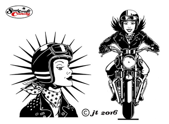
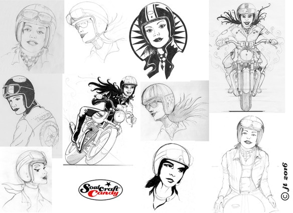
At the time of the last post I’d just sent the second batch of t-shirt ideas over to my contact to see if he would go for any of them. I didn’t have to wait too long this time for a reply, he picked the one shown here. It would be tempting to be a little disappointed with this result after all the work that’s been done, but this is outweighed by the knowledge that I learned a great deal during the process, and have actually ended up with some images that I really like and can do something with in the future.
So, one of the things that I’m going to do is create some hand made prints. This is something that I have wanted to do for a long time. With all these fresh images to now play with it seemed like as good a time as any to have a go. The way the designs have worked out, in very obvious black and white format, they will hopefully lend themselves very easily to a basic printing process.

Lino_cut_1©JT2016

To be honest with you I haven’t done anything like this for a very long time. Wondering which printing process to try led to lots of questions, the answers to which became self evident quite quickly. There are lots of different approaches to take ranging from the utterly basic to highly involved, simple block printing through to complex etching processes. I plumbed for the simple and settled on having a go with lino cut printing. The last time I dabbled with this process was back at school many years ago, so any learning that I had gained back then was gone and forgotten. Again, another opportunity to learn something new. The shot here shows my starting point. On the left is the design I wanted to transfer onto the lino sheet ready for cutting, on the right is it drawn out onto said lino. I have reversed the image, so that it will print the right way around and started to make some tentative cuts into the surface to create the relief to take the ink. This is as far as I’ve got for now and I’ll update the next steps in a subsequent post.

Bill_B's_New_shop_front2016

The final image here is something else entirely. Regular visitors to the blog may remember that back last summer I designed some t-shirts for my local bike shop, Bill Bunn Motorcycles, here in Ealing. It’s great to report that they’ve been selling well and the guys there wear their shirts religiously when working in the shop. I visited there a couple of weeks back only to find that they have undertaken the next steps in their shop refresh and gone and had new front signage made based around the shirt design. I had to take some pictures. They tell me the box signs are back lit, so at night it’s all illuminated which I’m looking forward to seeing sometime soon. I’m immensely chuffed that they have considered the design good enough to take it to this end. A big thanks to them for boosting my confidence and paying my work such a compliment.

Advertisement

Putting your learning into practise.

Girl_T_Comp©JonTremlett2016

As you will have read in the previous post, I have been expending a lot of energy recently learning how to draw women as part of a project to try and produce some designs for t-shirts for women. It has not been as easy as it sounds, and to be honest with you I’m still not sure that I have cracked it, though I feel I’m certainly making progress.

The journey from the collection of sketches to some finished proposals has been a long one involving lots more sketching and redrawing in an effort to get some kind of unifying style working across the various ideas. This process is invariably made all the more challenging by the considerations and resulting constraints that come from thinking clearly through the whole process of how these shirts are made and printed. The quality of the final printed image is reflected in, and can be traced right back to, the quality of the picture you create in the first place. The shirts made from any of the selected images will be screen printed which means I need to aim for crisp line work and clearly defined details.

In the absence of a more detailed brief I decided that I would go forward with a combination of ideas. Firstly I picked two rather obvious ideas based firmly on a girl riding a bike, and then chose a couple of others based around a more emblematic approach. Each one was worked up as an inked drawing to start with, and done as neatly as I could manage. The girls on the bikes were reasonably straight forward to do in a general sense though I was really conscious of introducing something to try and bring some increased movement to the images. I’m not a fan of using speed lines and blurring to do this, my drawing style doesn’t work that well with them, so elected to simply try and show movement by trying to mimic hair blowing in the wind. The second two choices came from trying to approach them more like logos than pictures and incorporating some recognisable cues from the cafe racer scene like chequer pattern and jacket decoration.

Girl_T_Comp2©JonTremlett2016

Drawing these things is time consuming enough, but tidying up the high resolution scans can be even more so. Again, it’s back to the quality of the image you start with. Screen printers will invariably ask for vector based artworks and so each drawing needs converting from a scanned bitmap image to vectors in a program such as Adobe Illustrator. The software handles this with ease, but you have to ensure that your starting image is as clean, crisp and high contrast as possible. The vectorising process essentially traces your drawing creating paths and fills as it goes. By adjusting various controls in a dialogue box you are able to influence the fidelity with which the software does this task. The cleaner your starting point, the fewer options the process has for including or excluding small elements of the drawing and details. Once the drawings are vectorised though, you can easily include them in more complicated designs in Illustrator, edit them further, or simply use the resultant artwork as it is. If I was more proficient in Illustrator to begin with I might be able to draw these things directly in the program, but sadly my skills aren’t there yet. At least using this approach I end up with both a good quality digital artwork and a nice ink drawing for the portfolio as well. Because the digital images are now editable, one can make limited changes to them if need be, without the need of doing a whole new drawing.

112_T-shirt_comp1©JonTremlett2016

Finally I thought it would be fun to show the ideas as shirts rather than just images on their own. Plundering an image search for white T’s being worn, it was simply a case of pasting the designs into place to lend a degree of realism to the whole thing. I then sent these to my client/contact and began the waiting process. Let’s see what he comes back with.

Can you draw women?

Bike_girl_comp©JT2016

Ok, so here’s a thing, time for a confession, I’m pretty rubbish at drawing women. There, I’ve said it. This sounds like one of those introductory confessions one might be asked to make upon a first attendance at a therapy group. Like, “Hi, my name’s Jon and I can’t draw women”. This is neither something to be proud of or be ashamed to admit. Don’t ask me why this is so, it’s just the way it is. Some people probably find drawing people, whatever their gender or form much easier than others. Other folk probably find drawing men less hard because it is easier to express generic masculine traits and you can get away with portraying less good looking men (!?). And then there are those who find the innate curvature and character of the female form easy to capture because they just do. One thing’s for sure though, and that is that when asked to view a drawing of a woman most of us automatically make some kind of judgement based on the perceived beauty of the rendered subject, i.e. if your drawing doesn’t portray a pretty/elegant/feminine woman, it’s the first thing people will comment on.

The above is only intended to be a cursory observation, the whole discussion around how we render and view human subjects is much, much more wide ranging that this, but what it does do, I hope, is shed some light onto how difficult it is to get to grips with a subject area such as this. Not being someone who has ever really received the benefit of extensive life drawing classes or any formal training in figure drawing, I have arrived at a point in my creative life lacking the confidence to draw half the people who surround me. I’m sure I’m not alone.

This new challenge came about through a request from a contact about possibly designing some t-shirts for women. Throwing my usual caution to the wind I agreed to have a go and then quickly realised that I would have to do something about the fact that I have never really successfully drawn women who look like women. To be honest with you, when I’ve had to do it in the past I’ve either traced off a magazine picture or concocted something akin to a rather effeminate man. So, time to put all of that to one side and see if I could actually learn how to do it more convincingly. I don’t know which is harder, learning a new skill like this in a straight drawing sense or in the cartoonish vein in which I normally work? Time to find out.

BGsketch_comp©JT2016

Thankfully, and this is again where the internet comes into its own; one is not short of resources to study as a way of starting. One can not only gain access to myriad video based tutorials on YouTube etc., but you can also find every single kind of cartoon style referenced so you can easily see how different characteristics are emphasised depending on the style you want to follow. To give you just a couple of examples; if mastering eyes is problematic for you, there are hundreds of variations and iterations to be found within the Manga drawing style and if the classic hour glass figure is something that you want to focus on, you will find plenty of guidance if referencing mid 20th century lifestyle and fashion illustration.

My brief, such as it was, was “Marilyn Monroe in a Bell helmet”. Quite a broad brief to say the least, so plenty to think about. My first scribbles, shown above in the first selection from my sketch books was as much about the brief as it was about learning the distinct attributes of a woman’s face. Eye shape, size and position, the jaw line, the line of the brow, the position and proportion of the nose and the mouth. These all sound incredibly obvious but until you have to think about them and draw them, your brain just rumbles on telling you that this should all be easy as it knows all this stuff already. No it doesn’t, you have to teach it and at the same time convince your drawing hand to follow. This goes right back to previous posts I’ve written about the idea of embedded knowledge. You’ve got to look and look and look, and then draw, draw, draw until hopefully things start to feel natural. It takes work and there’s no easy way around it unless you want to spend your life tracing photographs.

I was also trying to think about shirt designs at the same time, so this had quite an impact on my sketching, both in terms of speed and overall feel. Some of my attempts are way off, some are starting to point towards something more workable. The second of the images is another compilation of sketches where I am starting to get the hang of it, though you can see I’m yet to get my eye shape and spacing anywhere near right. I must confess also, that by this point I’d had gone back to referencing some old lifestyle photos in a book to try and speed things along. It seems to work best for me if I am combining an iterative drawing approach with regular reference to other materials. Placing a crash helmet onto a woman’s head brought its own challenges and I ended up taking lots of photos of my own crash hat at various angles to give me an idea of how its many curves look when not viewed simply in elevation. The bikes I didn’t seem to have a problem with. Funny that.

More on this in the next post I hope.