What lies behind.

Catch me if you can.

Back in early January, post No. 50 featured the finished version of the first of what have become known as the “Scribble” drawings. It depicted two guys vying for the lead in an impromptu street race somewhere out in the middle of nowhere on an empty road.

Shortly after completing that one, work commenced on a second drawing along the same lines. Working over a very loosely constructed pencil layout, the drawing is built up using light wobbly pen strokes. Features and details develop slowly and grow by passing over them many times. It’s a slow process but it allows me to balance the tones across the drawing as it progresses, continuously working around the drawing rather than concentrating one one specific area at a time.

Relative to other techniques it’s quite labour intensive but, this is offset by the “feel” the drawing adopts as it grows. You’ll notice from these detail shots taken with the camera, the whole thing’s on A2 so won’t fit in the scanner, even in sections, that there is no background yet. I’ll admit it’s an area I’m still having difficulty with but, it is becoming clearer to me why this is and how to deal with it.

This drawing has actually had more than a couple of backgrounds pencilled in, mainly in the form of loose townscapes, but all have been ended up being erased. Why? Well, mainly because they all detracted from the central focus of the drawing too much. They created a marked change in perception, from being a picture of two guys racing to a picture containing two guys racing. It’s a subtle difference but an important one as it’s all about where your eye wants to dwell.

There is a second challenge for me here too, and that is managing to render the background in the same style as the main part of the drawing. Easier said than done, the more that lies behind the core of the image, the harder it is to make it recessive so the two bikers don’t get lost in a sea of loosely filled in street details. It’s also hard to compliment the comedy of the two racers without detracting from them too much.

Currently I’m erring towards a simple approach tried out on a couple of previous drawings, a simple horizon which holds a small collection of references, small buildings etc, that help “place” the main subject but don’t crowd it out. This might sound like a bit of a cop out, but it’s not a thinly veiled excuse for avoiding extra work, more a considered effort to provide context and preserve the impact of the core of the drawing.

All things being equal, the finished version should be up here soon.

Pleasingly vibrant.

Back at the start of January there was a post about clearing the decks to make way for fresh projects. It’s safe to say that this process is fully underway, though it’s a truism that as much as you try and finish off one set of things, you often can’t help yourself from generating more that only add to the pile. Not sure what that’s called but there must be a word for it somewhere.

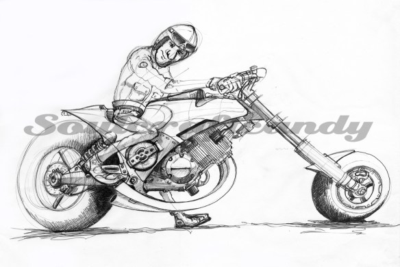
The image above is the latest to get the “I must finish that sometime” treatment. It would be safe to say that it has been hanging around in the pending file for too long. It stated life as a very quick and rough biro sketch in a rather ropey old A3 pad used for just such things (see below). And that’s where it stayed. Then one day it got scanned, the reason for which now escapes me, and finally was printed out as a test to see how the printer would cope with rough water colour paper, reduced to A4. For some reason only the tyres got the benefit of some paint, until this week when I finally surrendered, and decided to give it a bit more love and attention.

It is still really a test image in the sense that the greys are mostly of a new kind not used before, made by Schmincke, which needed road testing. Lovely paint. It comes in refreshingly old fashioned little metal tubes, at 5ml size, and has a depth to it that makes it great to use. The other trial aspect is wanting to see how these new greys worked up against the luminous intensity of the Dr. Ph Martin’s liquid water colours used on some of the smaller paintings. Choosing a bright orange for the main bodywork has taken the colour contrasts to an unexpected though very welcome level. Although water colour is a favoured medium it often leaves the image with a very dull feeling. Using the liquid colours enables me to get that “pop” back into the picture. Bikes are exciting things and it makes sense to communicate some of that through the colour. It is gratifying to realise that the persistence of the old drawings nagging has finally led to a very pleasing conclusion.

Here below is a reference pic of the liquid water colour. Available in two sizes, as shown, and available in most good art shops. Thoroughly recommended if you’re looking to pump up the colour intensity in a water colour image.

The Captain.

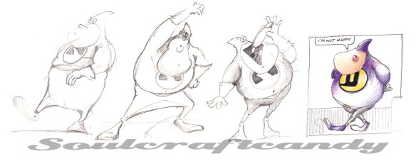
Here’s another slice of the mixed fruit cake of drawing that goes on around here. The picture above shows a guy I have been playing about with for some time, and he’s the closest I’ve ever got to developing a character. He arrived in my life some time ago whilst working on a communications project. An opportunity had arisen to use a character to promote certain messages the client had in mind. This guy was not a direct result of that exercise but was born during a moments idle sketching one evening. The project had been about communicating expertise and my mind had wandered in the opposite direction to contemplating ineptitude and how to communicate that. The idea of a bungling, idiotic and ineffectual “superhero” type had a strange appeal, someone with all the gear and no idea.

Not long after his arrival he was given a name, Captain Shark, after my small design business whose logo he wears on his chest, and for want of anything better at the time. He rapidly went from a slightly muscular bloke to this rather podgy individual graced with abundant enthusiasm, an overly fertile imagination and elevated sense of his own abilities. A sidekick in the form of a small dog appeared soon after and my sketchbook at the time bulged with sketches of him trying to engage with the world in one form or another. And there he has remained for some time now apart from a few select outings like the watercolour above. This has very much to do with not knowing exactly what to do with him.

Over the last year or so he has undergone some experimental name changes, I closed my company so the shark reference doesn’t have the same ring to it, and a dormant attempt to turn him into something else, like a mad inventor or suchlike. So he’s very much still a work in progress.

What he does have though is staying power as frequent visits are made to that particular sketchbook to move him on a bit further or simply play around with him.

Whatever fate awaits him, he is immense fun to sketch and draw. Because his body form consists of a series of rounded blobs he is moderately easy to pose and the tight fitting spandex outfit lends him a kind of elasticity that is fun to exploit. Being a cartoon he is a great vehicle for trying things out, for instance, if I’m stuck on something else like a posture it’s often faster and easier to work it out using his bendy body form first and then develop from there. He is essentially like a bit of 2 dimensional modelling clay and a handy catalyst for getting ideas moving. More about him soon.