Going with the flow.

Some years ago I was engaged in a process of attempting to understand creative acts and my own creativity in particular. This was brought about by a need to find out more about what made me tick. Like many creative people I’m sure, I’ve often found myself wondering what exactly it was that I was good at why being unsure about it was making working life quite confusing and unrewarding. Coincidentally my partner was beginning to investigate the meaning of creativity around about the same time and through her own investigations introduced to me the concept of flow.

I had never come across this idea before but, very quickly I understood that it was something I’d encountered many times in both my professional and private life. Like many of these kinds of things it’s a very simple idea but people manage to write whole books about it. In simple terms the best way I can describe it is that it is primarily a state of mind.


Have you ever engaged in an activity and lost all track of time? Have you ever been so engrossed in something that you’ve not heard the telephone ring, or suddenly looked up from a task and wondered where the day went? Have you ever been so into making something that all problems encountered are easily solved and progress seems to just come naturally? Well, if any of these has happened to you then most likely you have been in flow.


Understanding this concept has helped me hugely in recognising what I like doing most in work and play. It has enabled me to make much more informed choices about what work to take on and why sometimes I feel like I’m flogging a dead horse.


This finished colour representation of the second of my printed out sketches onto watercolour paper emerged from a concentrated afternoon spent mostly in flow. I have no idea how long it really took, not that it matters, and I got so engrossed in it that the day just vanished in a blur of paints, brushes and water. Not having really done a full colour drawing like this for some time I threw myself into rediscovering how to get the paints to move around the painting and what happens when you put paint on a wetted surface and a dry surface. It sounds simple but I’ve found it’s easy to forget all of the little tricks one develops for oneself to get things looking how you want them. There are a couple of things not quite right with it, like needing more variance in my greys. But there are also some great things about it too. I’d forgotten how vibrant the liquid watercolours I use for some parts can be (Dr. Ph. Martin’s Radiant concentrated water colours, hopefully available at all good art shops worth their salt). The red for the tank really helps the image to jump off the page which is such a satisfying outcome, for me anyway. I’m attending the 50th birthday party for a very old friend this weekend and I’m so pleased with this image I think I’ll give it to him as a present. He’s a bit of a bike nut too, so here’s hoping he’ll like it.


The first sketch, with the mechanic behind the bike, is very nearly done too so I’ll post that up in a day or so. The bigger biro drawing of the big single cylinder cafe racer is coming along well to and will be here soon. Watch this space.


Advertisement

A Teaser

In my last post I mentioned that I wanted to work up those two BMW inspired sketches in ink as a next step before playing around with some colour. Well, things as ever never go according to even the simplest of plans. Not through anything going wrong, far from it, but from being led up another path by my inquisitiveness.

When I’m playing about with colour on an image I’m always fearful of making a mess of it and spoiling a perfectly good drawing through the inappropriate application of paint or crayon. The latter you can sometimes remove with an eraser but, the former is a more tricky medium to shift. It always leaves a stain at the very least. So my thinking was that to avoid such situations I could print the sketch onto another sheet and play about with that. I’ve tried this before and it’s always been onto standard cartridge or stock printer paper. It’s a habit carried over from doing coloured design renderings back in the studio many moons ago, before anyone thought an Apple mac might be useful and anyone had any idea about Photoshop. The copier was my best friend.


My problem, or what I perceived as a problem was that I wanted to use some watercolours and these do not sit well with standard printer paper. The paint goes all streaky and the paper quickly starts to look like an unpressed shirt. I’d never thought to try printing onto watercolour paper as I’d always thought it would be too thick to go through my old Epson. How wrong I was. After a couple of false starts as the paper feeder got to grips with what must have felt like someone feeding it a doormat, it chugged through and the results are pleasing enough to warrant throwing some colour at it. As you can see from the picture above it’s not too shabby a result. I’ve printed out a couple of other scanned pencil sketches in the same way and I’ll pop those up on the blog as they come together and I get to grips with re-familiarising myself with my favourite paint medium.

Here is a bit of a teaser image for you too today. It shows me (though I’m not in the shot obviously) about coming up to half way through inking in a drawing of a massively engined single cylinder cafe racer I sketched out ages ago. I’d left it languishing in the sketch pile while I got on with other drawings but, coming across it the other day I thought I’d do something about it now. Of course I’ll put the finished article up on the blog as soon as it’s done for your delectation.


Also in the shot is one of my favourite tools. It’s a book, a fabulous book by a chap called Daniel Peirce and covers the story of a photographic project he undertook called Up-N-Smoke. It is essentially 140 pages or so of beautifully photographed bike engines. All vintages, all types and all lovingly lit. For me it’s a fantastic reference for shading in all of those apparently similar coloured metal parts, how reflections get cast on surfaces and bags of engineering details to feed the imagination for future drawings. It’s published by Veloce books (ISBN 978-1-84584-174-4 ).


There is art to be found in engines, that’s for sure.


Chasing the thief away.

Welcome back. Having covered the time thieving monster of procrastination on my last post I’m happy to report that I’m now starting to get over it. It is an undoubted truism that it can be laid to rest by the mere act of sitting down and starting something, anything. So today I’ve had a bit of a scribble and come up with a new header for the blog, something which I hope says more about what goes on here than the last one, and the one before that etc. It’s been a lot of fun doing it as I managed to persuade myself that playing with my colour paints would be a very good thing today. The sun is shining and a bit of colour injected into what has been a very dreary few days lifts the mood.

In the previous post I showed one of two sketches I’ve been playing with recently. Here is the second of the pair. It follows along the lines of the theme for the first one and continues with the idea of a frame which is more of a monocoque forming the bodywork of the bike as much as the support for the engine and chassis parts. Again it’s also fun to experiment with some kind of extreme engineered front end, I’m developing a soft spot for these single legged kind of forks, and have another great big engine slung in there to create a fun feeling of speed and power.

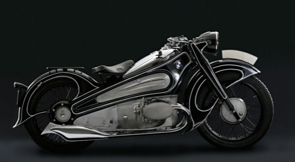
I was trying to work out where the inspiration for these two drawings came from. It’s interesting that often I’ll draw something and have no recollection of where the idea might have come from. I gather images of all kinds of stuff from books, the internet and photographs I take myself. In an attempt to be well organised I file them away on a hard drive somewhere and try to catalogue them so that I can refer to them later. But what often happens is that I rarely look at them at all whilst I’m drawing. As a consequence I often generate an initial sketch without their help but, some part of them must lodge itself in my mind somewhere as I can often find a link between a drawing and a stored image after the event. It’s a strange twist on post-rationalisation I suppose. The BMW R7 shown in the picture is where the main inspiration for these two drawings came from. It’s from the 1930’s as far as I know. I love it. It’s such a fantastic expression of futuristic thinking from that period. There is so much motion in the form language, extenuated by the white pin striping but it is the way that it appears to have no frame that catches my eye first. I’ve got a feeling this bike will influence a few more of my doodles before the effect wears off.

Anyway, this sketch above will get worked up along with the other one in ink to start with. I love it as it is in pencil so I’ll most likely work through onto another sheet with the light box and then revisit this image with more pencil work to get some more detail in there and some deeper tonal areas. I’d like to then scan the inked drawing and print a few out so that I can start to play around with some colour without risking mucking up the original, I’d hate to lose a good drawing through messing about with some paints. I’ll keep you posted on how it goes.