Trying something new.

Stoppie©JonTremlett2014

Most of the fabrication work on the bike refresh is now complete and, as I mentioned before, the last big bit of the jigsaw puzzle is coming up with a new paint scheme for the fuel tank and spraying it up. I’ve got something I’m pretty keen on and it’s sitting in the “mulling” section of my brain right now while I have a final think about the colours.

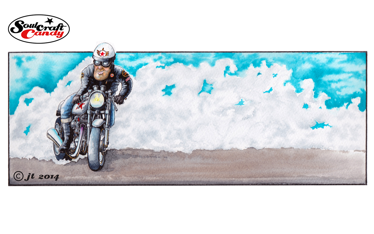
In the meantime here are some pictures in way of an update of what else is happening in the creative microcosm that is Soulcraftcandy. The first is a little sketch I knocked out a while back which immediately demanded a finished version. I’m unsure as to why it sent such a strong signal but I think it’s got something to do with putting the pink bits into the drawing as well as the stance and angle of the whole thing.

Stoppie_prog_1©JonTremlett2014

Needless to say the pink hasn’t survived the move to a more finished image but the idea of using bright colour has, and I’m hoping for quite a punchy little picture when it’s done.

Soulcarftcandy art by Jon Tremlett

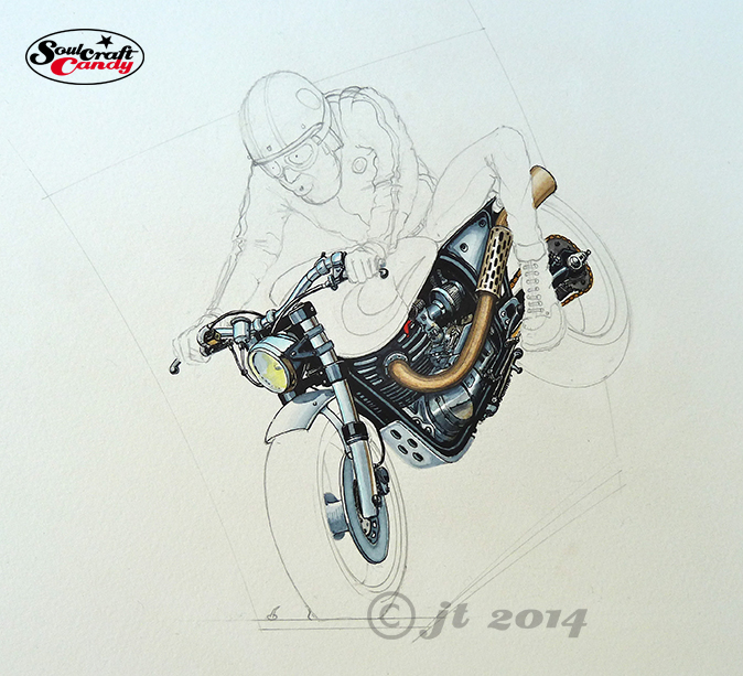
These two progress shots show working up the main part of the bike, painting and inking as I go. I find this a good way to work as it enables me to keep an eye on what I’m doing and keep things in control. I find that bringing focus to the picture as it moves along helps me see what I want to do with the next bit, rather than leaving it all rough and inking in everything at the very end. From here I’ll move on to doing the rider figure and then finally the background. Excuse the odd hue of the pictures, it seems to be a consequence of photographing these things in daylight as I can’t fit the backing board onto the scanning bed.

Soulcraftcandy art by Jon Tremlett

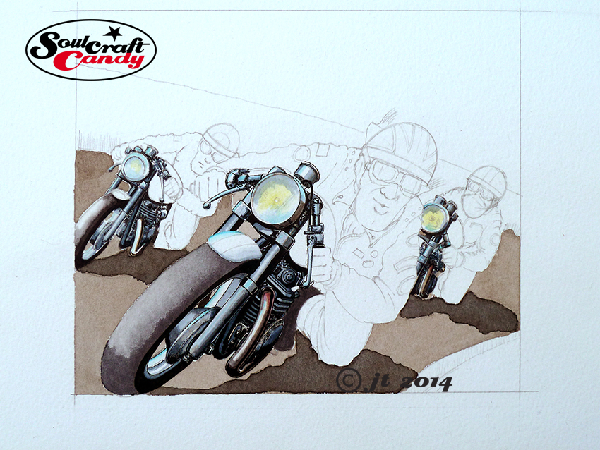
This last one is a slightly different animal, an image on which I’m trying to do something new (for me anyway). Firstly I’m trying to paint much more of a complete scene and this is forcing me to think harder about background, middle ground and foreground and the focal relationships between them. In all honesty I’m finding it quite difficult, but it’s rewarding to try and rise to the challenge. My difficulty probably stems from all those years of design drawing where one is not expected to create any sense of depth of field, presentation visuals being very two dimensional in nature, and so it all feels a bit alien and intimidating. So in order to help myself as much as possible I’ve divided the image into three planes, big bike at the front in focus, two smaller bikes on the second level and then the landscape on the third, mainly. The desire to try a bit of freer brush work, which I’ve mentioned before, now gets a chance to play on the background levels and will hopefully minimise my chances of making a muck of it all from the outset and build some much needed confidence in being a bit more loose with how I apply paint to the paper. I’ll keep you posted on progress.

Advertisement

Creative decisions that are right for you.

Taking my time to find the right position.

Taking my time to find the right position.

Time to take a look at cutting and fitting the new rear mudguard. There is much talk in bike building circles about getting the stance of your bike right as a prerequisite for coming up with anything good looking. There is a school of thought that is very prevalent currently to have the line of the bike very flat. That’s to say, the visual line from the back of the seat running through the base of the tank to the front suspension should be pretty much parallel to the ground. Hence you see lots of bikes that are all starting to look the same and share the almost totally flat seat which is almost ubiquitous in its manifestation. This is all well and good if you’ve got the time, money and the need to go down this route. Personally I haven’t. As I’ve mentioned before, without resorting to large amounts of frame modification  (read expensive welding bills and jiggery) and spending a whole pile of cash on different suspension equipment, there’s not much one can do beyond a certain point. The creative challenge is therefore to move away from the standard look enough to create difference and come up with something that works with the proportions one is presented with. This can be a lot harder than you think, but it is possible on a very limited budget and is generally a case of taking ones time in positioning, cutting and mounting components. Once you’ve cut metal there’s very little you can do to rescue things, so it pays to exercise patience and adopt a methodical approach no matter how quickly you want the project to be completed.

Position set, holes drilled, just the light to mount.

Position set, holes drilled, just the light to mount.

Of course, what “looks right” is a purely subjective conclusion. Because these kinds of projects are pretty personal in their nature, the result must first be right for you, in your own eyes. That’s the most important thing really. Decisions you make in a build are always contextualised by a whole host of factors and compromises that one has had to deal with on the journey to the final outcome. Others may not like your final iteration but then invariably they have little knowledge of this context. As a maker, of anything, one has the luxury of knowing that you could change or modify things in future if the urge takes you, but it’s an option that you can reserve to exercise if you so choose.

When I first built this bike I made a pile of decisions about how it would look based how I felt about the life it would lead, about practical issues like comfort and durability as much as aesthetic considerations. I reserved the right to change things if I wanted to but generally didn’t feel the need to do much other than periodic tweaking. Now, some time later, it is time to make some changes  based on living with it and riding it for a few years. There are still certain things about the stance I can do little about, but these are not a problem. The bike started life as a factory custom and so caries with it some small legacies of that life which I’m happy to live with, like the long forks and the steep rake of the tank.

A rather blurry shot courtesy of my iPad, but you get the idea.

A rather blurry shot courtesy of my iPad, but you get the idea.

So here are some shots showing the process of getting the new rear mudguard (fender) sitting in the right place, at the right angle in the right way. Once I’d cut the bare rolled section I’d bought to roughly the correct length I spent ages with bits of foam, tape and cups of tea trying it in different positions to get the look I was after. Once I was happy I marked the mounting holes for drilling and returned to the shed for some hole making. The critical factor was getting enough section over the wheel without it looking overly long but still having enough curve available to support the light/plate assembly at the right angle. I didn’t think things had changed much until I held up the new piece next to the old one to see that I’d actually reduced the length by about 150mm, very satisfying.

The final shot shows the guard in place with the light mounted and everything else ready to go. The final piece of this refresh is painting the petrol tank, which I’m currently working on a design for and I’ll be posting about that very soon.

Creative energy spreads.

102_Cafe_smoke©JonTremlett2014

With all of the making happening in the back garden and in the makeshift workshop that is the garden shed, it would have been so easy just to forget about the artworks for a few days. But these things never sleep, whatever’s on the drawing table in the studio lets you know it’s there every time you walk in the room. The hope was that some making activity would bring a fresh spur to the drawing work and so it proved. By splitting my creative time in this way, both fed off the energy that was now available seeing as I wasn’t going to be working for a few days.

This picture above was started a while back but was taking ages to finish. Procrastination had set in as a reaction to my being a little daunted by pushing it along. I wanted to see how I’d get on with some heavier textured water colour paper, and whether I could hold the detail given the rougher surface. It was also a challenge to figure out the best way of rendering all of that smoke, something I’d not had much success at in the past.

In the end the detail concerns were pretty unfounded, the technical pen worked out ok on the paper once it was fully dry, though I would say that it does tend to get a bit “hairy” if you labour the pen too much. The smoke bit on the other hand was a tad more tricky. I had kind of promised myself that I’d have a go at being a bit more free with my brush work a while ago and saw this as a perfect way to get some practice. Smoke being of a very “wafty” nature I thought it would suit a more loose approach. What I didn’t reckon on was actually how hard it was to do. I take my hat off to all those whose water colour style is more conventional than my own, the impressionistic feel they give to brush work is a hard won prize indeed. Initially I was far too deliberate, the cloudiness needed just wasn’t there and no amount of blending the marks I’d made seemed to work. In the end I plumped for just loading up a No.4 brush and smearing, can’t think of a better word for it, wash all over the required area and trying to blur it all with more water whilst still wet. It kind of worked but I failed to achieve any consistency across the whole area. Not wanting to overdo it I left it at that, though I will be having another few tries at getting the looseness I’m after on some other pieces which are coming along behind this one.