Creative energy spreads.

102_Cafe_smoke©JonTremlett2014

With all of the making happening in the back garden and in the makeshift workshop that is the garden shed, it would have been so easy just to forget about the artworks for a few days. But these things never sleep, whatever’s on the drawing table in the studio lets you know it’s there every time you walk in the room. The hope was that some making activity would bring a fresh spur to the drawing work and so it proved. By splitting my creative time in this way, both fed off the energy that was now available seeing as I wasn’t going to be working for a few days.

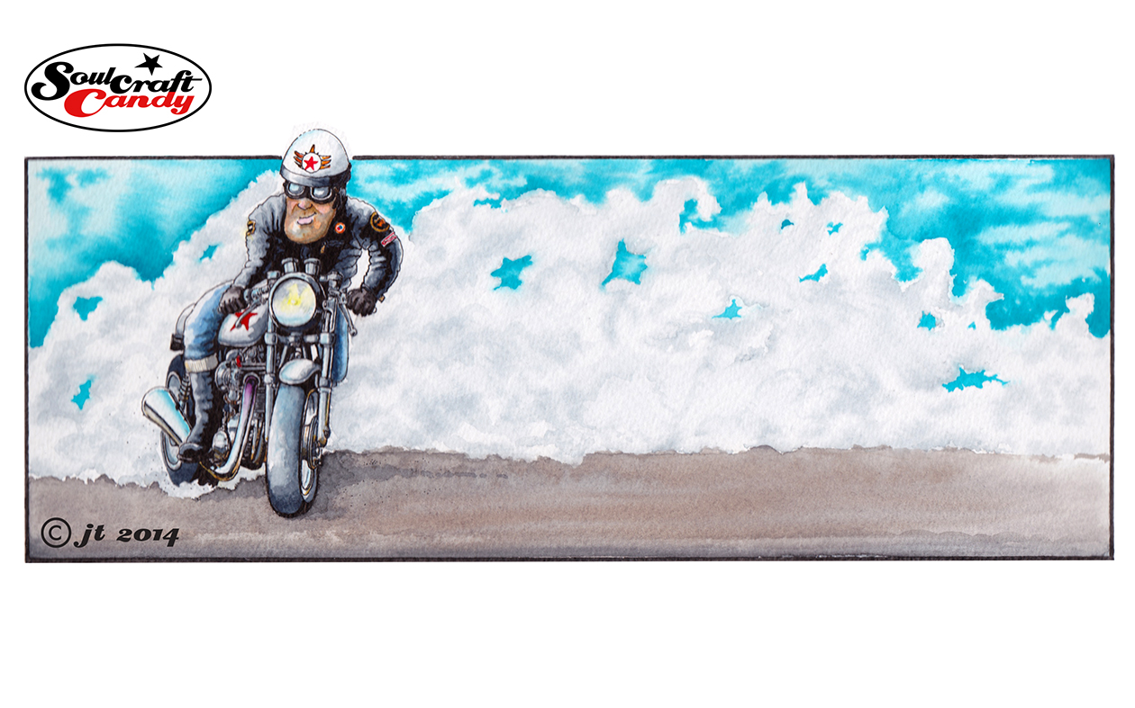
This picture above was started a while back but was taking ages to finish. Procrastination had set in as a reaction to my being a little daunted by pushing it along. I wanted to see how I’d get on with some heavier textured water colour paper, and whether I could hold the detail given the rougher surface. It was also a challenge to figure out the best way of rendering all of that smoke, something I’d not had much success at in the past.

In the end the detail concerns were pretty unfounded, the technical pen worked out ok on the paper once it was fully dry, though I would say that it does tend to get a bit “hairy” if you labour the pen too much. The smoke bit on the other hand was a tad more tricky. I had kind of promised myself that I’d have a go at being a bit more free with my brush work a while ago and saw this as a perfect way to get some practice. Smoke being of a very “wafty” nature I thought it would suit a more loose approach. What I didn’t reckon on was actually how hard it was to do. I take my hat off to all those whose water colour style is more conventional than my own, the impressionistic feel they give to brush work is a hard won prize indeed. Initially I was far too deliberate, the cloudiness needed just wasn’t there and no amount of blending the marks I’d made seemed to work. In the end I plumped for just loading up a No.4 brush and smearing, can’t think of a better word for it, wash all over the required area and trying to blur it all with more water whilst still wet. It kind of worked but I failed to achieve any consistency across the whole area. Not wanting to overdo it I left it at that, though I will be having another few tries at getting the looseness I’m after on some other pieces which are coming along behind this one.

Advertisement

Lining paper, a surprisingly good drawing medium.

This is a sketch for one of the remaining drawings that are left to do. This was done as a kind of experiment. It’s at least 60% bigger than any of the others for a start, which allowed me to be a little less precise with everything, and seeing what an increase in scale would look like proved a useful exercise. Sometime in the future it would be great to create some much bigger drawings and my first tentative steps in this direction are being taken now. As mentioned above it’s not significantly larger than any of the others but, creating it starts to give me a feel for what changes when you go up in size. How you deal with proportion, detail and tonal variation across the drawing. One also has to consider the implication on ones preferred medium. I’m not sure that working in biro across an A1 sheet or larger is going to be a fruitful or spirit crushing experience. Only one way to find out I suppose.


It’s drawn directly, no pencil rough out, on to heavy duty (1400 weight) lining paper, the stuff you stick on your walls at home to even out a wall surface before painting. It’s not good quality paper for sure but, it does have this kind of hard textured surface which works really well with a medium point biro, almost making it feel like using a pencil such is the subtlety of shading one can achieve. Being quite thick allows you to work into the paper a good deal to achieve the thick black areas but, the pay off is not the usual warping and distortion you get with other, albeit finer, papers.


Yes, it can be a bit scratchy and coarse but it’s great stuff, cheap as chips and comes on a roll, so you can cut sheets to any size. I would mention though that at first it was a challenge to get it to lie flat, at all. Leaving it under a pile of books for a couple of days didn’t work, so I ended up ironing it with a hot but dry iron and then left it in a pile under a couple of pads. Much better. This weeks top tip for ploughing through sketches without worrying about using up your expensive art shop bought sketch pads. I’m going to have a look at lighter weights of lining paper to see if the texture is different and check out how they perform. An update will hit the blog soon.


Time well spent?

At last, managed to finish the first big scribble drawing last night. At last, because this thing took far, far longer to do than first imagined. Although the style might look quite quick (and it seemed as much at the start) it required a lot of time to move around the drawing, continuously teasing out the many details in order to create the right feeling of depth and movement. It is a very satisfying process but requires a lot of patience. This technique is definitely one where knowing when to stop is an undefined line somewhere amongst the thousands of little bits of shading.

Capturing the little sideways glances of the riders as they vie for supremacy is my favourite bit, although it’s a close run thing between that and the slightly out of focus nature of the image, which lends to the feeling of movement.

Another one has already been started (am I a glutton for punishment?), again using a fine nibbed Steadler 430 biro and an A2 sheet of 220 gsm heavyweight cartridge paper. What with all of the other things I’m playing with it may be a while before an update on its progress can be posted. Watch this space.