It’s been a long time coming.

"Catch me if you can", a biro drawing by Jon Tremlett for Soulcraftcandy.

Finally, finally, finally, today it’s time to reveal the latest finished drawing. For now it’s called “Catch me if you can”, and I think it will probably stay that way. This one has taken rather a long time to complete, though I’m hoping you’ll see why and understand my excitement at seeing it done. As I’ve mentioned before it is inspired by an idea thrown at me by Steve Carpenter over in California, a nod to the underlying disregard for authority and convention that underpins our shared love of motorcycles and what we do with them. Having said that I would add that this is by no means meant to celebrate bad behaviour or law breaking (much).

As with some of my previous drawings this one is drawn using a yellow barrelled fine tipped Bic biro (c’mon guys where’s that sponsorship ;D) on 250gsm Bristol Board at A3 size. For some reason, and I think it might have something to do with not having done a biro drawing for a while, I approached this with a level of conscientiousness that I found quite surprising. Hence the time it’s taken to finish. I even got to the point of wrapping tape around the barrel of the pen to remind me where I needed to hold it to get a particular line weight and thickness. They say that God lives in the details, and perhaps that’s where He is in this one, not in the picture but in the bit of blue tape wrapped around my pen?

For much of its gestation the picture was just the bike and the pursuing police car but, following what I did on the V-Bob picture recently, see the post here, I decided to put in some street scene to provide some context and stuff. I think it works quite well. Aside from the cartoon nature of the depiction, like the hand gesture and the light flying off the car roof, the street scene offers the perfect opportunity to inject a little bit of extra humour into the composition. It’s something I’ll be working on more in future, it appeals to my sense of the ridiculous. I’ve been wandering around my neighbourhood here in Ealing taking lots of pictures of local shops, pubs and buildings so that I can build a little reference archive to use for future inspiration.

As usual I’ve put this up as a low resolution image, so apologies if you’re struggling to see the detail. Please feel free to share it but, I would ask that you don’t use it for any other purpose for the time being. Much obliged and thanks for dropping by today, I hope you enjoyed it.

Here are some details from the drawing for you.

Details of "Catch me if you can" by Jon Tremlett ©2014.

It’s never too late to finish something.

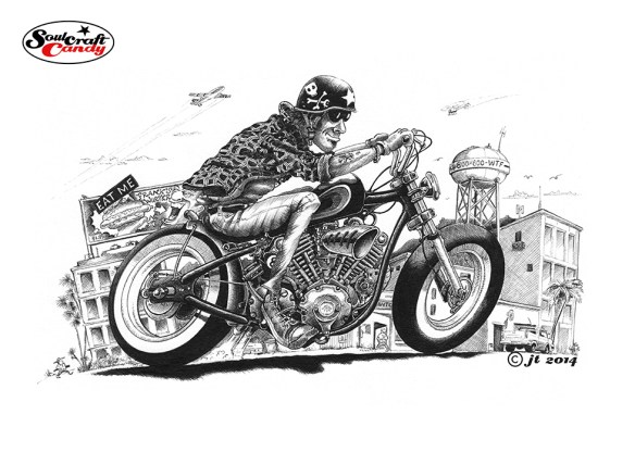
V-Bobber by ©JonTremlett 2014

While work on the “Catch Me” picture progresses and it moves slowly to its conclusion I thought I’d post a couple of other things in the meantime. For me it’s really important to have more than one work in progress at any one time, it helps to keep me inspired, assists in keeping my drawing hand active and my eye “in”, and most importantly of all, prevents me from getting bored.

So first up is this picture which some long term followers may recognise, it having made its first appearance on the blog about two years ago. Back then it was just a picture of a bloke on a bike, sat in the middle of an empty page, and since then it has sat in a drawer here waiting for me to finish it. Every now and again I’ve taken it out of the drawer, put some pencil lines in the background and promptly put it away again, unhappy with what I imagined would be a fitting background. I’d lost count of how many times this had happened. Here’s a link to that original post.

The other day though, something clicked, a penny dropped and I finally discovered what I wanted to do with it. Based on the idea that the guy riding the bike is going somewhere, I imagined him escaping the world he occupies during the working day, jumping on his bike and heading out somewhere better. It’s probably a context shared by many of us who wind up spending a great deal of our time in those slightly crumbling semi suburbs around the edges of cities, full of light industrial activity, crappy cafes and diners and run down buildings festooned with strange advertising hoardings. It puts a little back story behind the image and brings it to life a bit more. Why I hadn’t thought of any of this before escapes me. Creating this background reminded me that this is a great way to inject a bit of humour into a picture and include a level of detail that draws the eye to the image beyond the great big bike stuck in the middle of it. I’m so glad I did it this way and it has prompted a whole string of thinking about dealing with some other images I have failed to finish and are lying in a drawer waiting for their moment. I hope you like it too.

That’s more like it.

Pencil layout by Jon Tremlett 2014 for Soulcraftcandy

As I mentioned in the previous post, the composition of the first picture for Mr. C needed further work resulting in a bit of a redraw. It’s funny how it works sometimes. In your mind you’ve got this image that you think is what you want. Then you draw it out and it’s a million miles away from what you are actually after. So after staring at it for a good while you redraw, thinking that this is going to be a bit of a marathon, and “pop” out comes what you were looking for in the first place. This is not the first time this has happened, so I don’t waste any energy thinking every first rendition will be the right one.

So what you see above is the tightened version made from the blue pen sketch. I use my small home built light box for doing this. It’s essentially a tracing exercise where all of the details are positioned where I want them and I sort out the final angle projections for the wheels and stuff. The hardest bit is getting the position of the figure right, and this will often involve several bits of paper as I try and find the right one. For example, the lower leg and foot in this picture was particularly problematic, for some reason I just couldn’t “see” it. I have a Japanese made posable figure here which I use in situations like this, he’s a very useful piece of kit.

Police car by Jon Tremlett 2014

I also had to do a fair amount of work on the chasing police car down in the lower right hand corner. The one in the main picture here is a kind of modern version based on something they might use right now but, it doesn’t sit well with the overall feel I’m looking for. Something more retro was called for as I want to create a notional connection with the original age of the bad boy Cafe Racer. Searching the web, as you do, turned up some fabulous old pics of what we would call here in the UK, Jam Sandwiches and Panda cars. Just like all modern societies we seem to relish the opportunity to give anything to do with law enforcement a nickname. So the force, “Plod” would drive “jam sandwiches”, essentially white cars with a dirty great red stripe down the side. These superseded the “Panda” cars which were oddly light blue with white doors and very slow. I digress. The other picture here today is my final choice for the police car. An early “Jam Sandwich” of the Triumph 2000 variety, suitably festooned with period accessories including the big illuminated box on the roof (a massive air brake), crappy roof mounted spots and a great big siren mounted in the middle of the bonnet to aid engine cooling. It takes me back to my youth tearing about the neighbourhood on my old Yamaha avoiding these characters.

From here there follows another light box session to transfer this onto Bristol Board ready for the final step which is the biro inking stage, which oddly I’m looking forward to a great deal as I haven’t done one of these for some time. I’ll keep you posted on how it goes, and thanks for dropping by today.