Supporting a good cause.

113_CycleBerlin©JonTremlett2016

This blog of mine started out as something that happened in the background as I pursued my life as a freelance designer and maker, providing a motivator for my interest in developing my drawing and other creative outlets. Over time it has started to include, every now and then, things that happen in my professional life as well. Being a freelancer, though an often precarious existence, allows you to branch out from your core skills when the urge takes you. As a result I have been able to undertake some graphic and illustrative work which is interesting, challenging and different. Some of it is paid work, which helps to balance the books, and at other times it is not. The great thing is that the choice to undertake unpaid work is mine and mine alone, and so what often precedes this is the question of whether or not the subject interests me.

In this case it did. The image above is a small water colour and ink drawing that I have recently finished. My niece Rose, who is currently resident in Berlin, is involved in a campaign to promote the many benefits of cycling in the city. As part of their strategy to increase awareness of these benefits they are exploring ways to communicate the freedom that cycling gives both the city’s inhabitants and visitors alike. Hence she asked me if I could come up with an image that did this that they could use on promotional materials that they could sell, helping to raise funds for the campaign. It was a very open brief and one I felt I could find an answer to.

Needless to say there was a good deal of head scratching and sketching, and at one point I began to doubt my ability to find something to work through. And then out popped this idea, centred around the idea of cycling being a means of spreading freedom, joy and good health. The heart shaped balloon (symbolic of love, joy and good health) flying over the city, powered in a highly sustainable way by a cyclist, hints at the freedom that cycling gives you to go pretty much anywhere whilst benefitting yourself and the city at the same time. The inclusion of the iconic television tower as a recognisable Berlin landmark contextualises the scene and helps to bring a lighter more comedic flavour to the sense of freedom that the picture hints at. Rose peppered her request with words such as quirky, whacky and unusual, and I tried to bring these to life in the “mad inventor” character and his extraordinary machine, drifting high above the city much to the astonishment of local bird life and observers in the tv tower.

The final image was first traced in pencil onto some heavy water colour paper on the light box and then stretched onto a board. I’ve discovered that stretching the paper after you’ve placed a drawing onto it doesn’t seem to distort it in any way, and can save you hours of painstaking redrawing from your original sketches. With some photographs of the tower and views of the city it was then simply a case of laying the greys and colours on in light tints to slowly build up the the tones that I needed to achieve. This takes a while, but enables you to bring the image up to where you want it without overdoing things. Painting the cityscape was the hardest part, forcing oneself to be abstract is a good deal harder than I realised. When all the colour was down and the image dry, it was then a case of outlining with technical pens to bring some definition to bear.

I’m told that it has been very enthusiastically received, though I am yet to see what they will do with it. I really hope it brings some further recognition to their campaign and puts a smile on a lot of faces. It was certainly worth doing and I’m very happy with the result. I hope you like it too.

T-shirts, prints and shop fronts, it’s all go.

Bonnie_girl_design©JonTremlett2016

At the time of the last post I’d just sent the second batch of t-shirt ideas over to my contact to see if he would go for any of them. I didn’t have to wait too long this time for a reply, he picked the one shown here. It would be tempting to be a little disappointed with this result after all the work that’s been done, but this is outweighed by the knowledge that I learned a great deal during the process, and have actually ended up with some images that I really like and can do something with in the future.
So, one of the things that I’m going to do is create some hand made prints. This is something that I have wanted to do for a long time. With all these fresh images to now play with it seemed like as good a time as any to have a go. The way the designs have worked out, in very obvious black and white format, they will hopefully lend themselves very easily to a basic printing process.

Lino_cut_1©JT2016

To be honest with you I haven’t done anything like this for a very long time. Wondering which printing process to try led to lots of questions, the answers to which became self evident quite quickly. There are lots of different approaches to take ranging from the utterly basic to highly involved, simple block printing through to complex etching processes. I plumbed for the simple and settled on having a go with lino cut printing. The last time I dabbled with this process was back at school many years ago, so any learning that I had gained back then was gone and forgotten. Again, another opportunity to learn something new. The shot here shows my starting point. On the left is the design I wanted to transfer onto the lino sheet ready for cutting, on the right is it drawn out onto said lino. I have reversed the image, so that it will print the right way around and started to make some tentative cuts into the surface to create the relief to take the ink. This is as far as I’ve got for now and I’ll update the next steps in a subsequent post.

Bill_B's_New_shop_front2016

The final image here is something else entirely. Regular visitors to the blog may remember that back last summer I designed some t-shirts for my local bike shop, Bill Bunn Motorcycles, here in Ealing. It’s great to report that they’ve been selling well and the guys there wear their shirts religiously when working in the shop. I visited there a couple of weeks back only to find that they have undertaken the next steps in their shop refresh and gone and had new front signage made based around the shirt design. I had to take some pictures. They tell me the box signs are back lit, so at night it’s all illuminated which I’m looking forward to seeing sometime soon. I’m immensely chuffed that they have considered the design good enough to take it to this end. A big thanks to them for boosting my confidence and paying my work such a compliment.

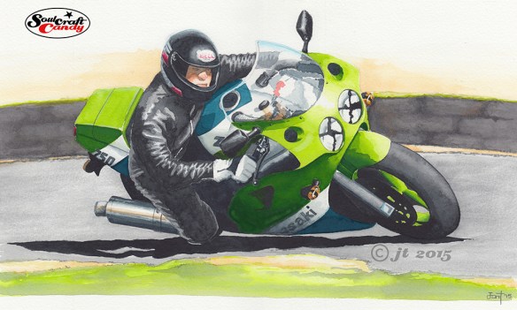
The big Green Meanie – it’s finished.

A personal commission by Jon Tremlett for Soulcraftcandy.

For once, having said in the previous post that I was close to finishing a picture, I have done exactly that, and faster than I thought I would too. So here is the finished article. The pictures are the wrong way around today, finished one first, purely because it’s great to open a post with a completed picture. I’m pretty happy with how it has come out.

You will notice that I have left the top of the picture plain white rather than include the very dark area at the top of the reference photo. What drove my decision in the end was the thought that I wanted the main subject to really stand out, surrounding it in big dark bits would have dulled it off too much. So there’s just a hint of ochre wash back there to lift it further.

A personal commission by Jon Tremlett.

This view, and apologies for my iPad’s inability to take a decent photo in my studio, shows things at about the half way stage. With such dark areas in the image it was a bit of a juggler getting the various tones down in an order where they didn’t conflict too greatly. What helped was mixing two different kinds of grey, one for the riders leathers and the other for the bike area shadows, so I could maintain a distinction between them. The shadow areas go down in a couple of passes with the brush, but the leathers took rather longer, slowly building the tone with much thinner washes. The really tricky bit, doing the helmet and face, came last and again was a slow build. I’m not afraid to admit I find faces and flesh tones quite difficult so going slowly with a small brush gives me the best chance of getting it right. Finally, once all the above is dry, my attention switches to the ground area and their associated shadows, making sure I don’t include too much detail so as to keep your eye focused on the big green thing in the middle.

There is always a process of final fiddling and fettling at the end of the main paint stage. Each time your eye returns to the image after a short break you pick up on little things which just need a small tweak so out comes the tiny brush for some edge honing, some white gouache to bump some highlights up and a colour pencil or two. Some things you can’t adjust so there’s only so much you can do, your biggest challenge is knowing when to stop. This one turned out to be more of a painting than a drawing, something I don’t do that often, but I don’t think it loses anything because of that. Yes, it was a challenge but, it was a fun one to undertake which is just as important.

Thanks for dropping by today and hopefully you’ve enjoyed the post.