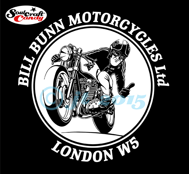
The finished design at it will look on the shirt back.
It is an old english adage that the centre of any small community is the local pub, a hub around which much of the activities of the local people revolves. This is invariably true and in larger communities it is also true that local shops and tradespeople make a huge contribution to the life and vibrancy of a place. Now more than ever it falls upon us, particularly here in the Uk, to support these small local businesses as more and more areas fall victim to the scourge of the megastore. I’m trying to do my bit, buying bread from the baker, meat from the butcher and sundries from the local hardware store. Being an avid motorcyclist I’m also making myself a regular customer down at my local bike shop.
Bill Bunn Motorcycles, a small family business, has been in existence for about 50 years and is the epitome of what your local bike shop should be; compact, friendly and happy to handle everything from an engine rebuild to changing your oil. The guys there are always helpful, good humoured and armed with years of hard won wisdom and experience to help you keep your machine(s) on the road. They are a top team and deserve to stay in business for many years to come. Fortuitously, for me at least, it turns out that they are fans of my work, having found it via the blog last year sometime. A resulting chat, enjoyed whilst dropping the little Suzuki off for a new tyre fitting, revealed that they’re refreshing the store this year, sprucing it up a bit with fresh paint and a general sort out. So, along with some lovely old photographs they have, the guys wanted to hang some prints of my cartoons on the walls too. One should never pass up this kind of opportunity and I’ve supplied some framed prints to them with some prices if anyone might want to purchase one. They also asked about perhaps doing a design for a t-shirt based on one of the drawings so that they could get some shop shirts printed up. I said yes.
How to turn this into a vector artwork?
The title image to this post is the final design for the first shirt, we’re thinking of doing more if these prove popular, and will be printed on white on the back of the shirts with a shop logo on the front. I’ve never really spent much energy before working up stuff for a t-shirt print, though I have been thinking about it a lot recently, so this was a great chance to work out how to do it.
Although there are now lots of options open to anyone wanting to have some shirts printed, from simple transfers to laser cut vinyls, the one technique that still stands above the others in terms of crispness and quality is screen printing, and for that most of the printers require vector file artwork. So I needed to get from highly detailed dot shaded hand drawing to vector line art and I had no clear idea how. I knew that all the relevant software needed was sitting in front of me, I just hadn’t used it in this way before. Time to learn some new tricks and jump into the web for tips, advice and a whole host of helpful tutorials on Youtube.
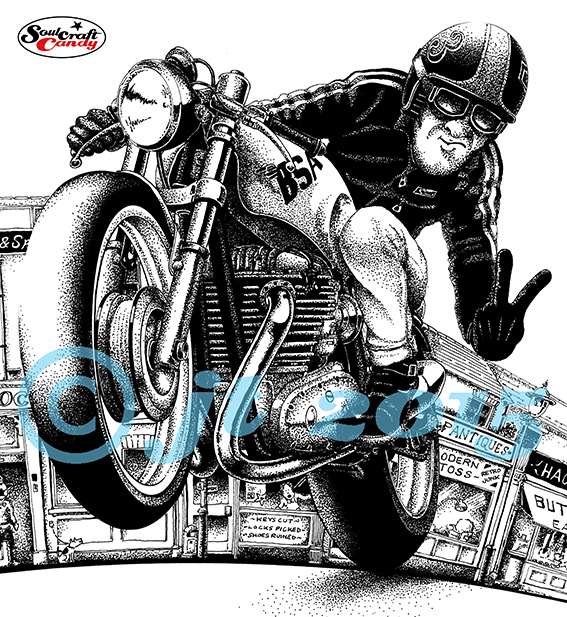
Starting with a high resolution scan of the source image in Photoshop and converting it to a bitmap image, it was relatively simple to cut it out from the background and start tidying it up. What caught me by surprise was how long it would take to remove all of the dot shaded areas and then touch up the picture with erasers and brushes so that line thicknesses and detail areas were not so fine as to get lost in the subsequent tracing process in Illustrator. I admit that I had to go back and forth between the programs several times before things started to look right. Eventually I got it how I wanted it and dropped it into a layout for the final design.

Vectorised and ready.
The second thing that took me by surprise was the reversal process to create the artwork. Screen printing requires that the artwork, what’s to be printed, is presented in black on a white background. With this shirt the print will be white ink on a black shirt, so the artwork for the drawing needs to be reversed so that it’s the white bits that get printed and not the black bits. I hope this makes sense. The tricky bit here was making sure that when reversed the highlight areas in the normal image weren’t so small as to disappear during printing. This reversal had to be done in Photoshop before the tracing process took place but, it worked out pretty well.
The shirts are now ordered and I’m looking forward to getting my hands on one, it will be he first properly printed t-shirt I’ve ever designed, and that it in itself a really big step for me. As a result I’ve been pushing on with a couple of my own designs and I’m hoping to get those to print before too long. If they’re any good I’ll put some up in the blog shop. Watch this space.
Before I go, a quick apology for the blue copyright stuff across the images today. Like many I suffer from image appropriation and this is a small gesture to try and eliminate a bit of it.


