Putting your learning into practise.

Girl_T_Comp©JonTremlett2016

As you will have read in the previous post, I have been expending a lot of energy recently learning how to draw women as part of a project to try and produce some designs for t-shirts for women. It has not been as easy as it sounds, and to be honest with you I’m still not sure that I have cracked it, though I feel I’m certainly making progress.

The journey from the collection of sketches to some finished proposals has been a long one involving lots more sketching and redrawing in an effort to get some kind of unifying style working across the various ideas. This process is invariably made all the more challenging by the considerations and resulting constraints that come from thinking clearly through the whole process of how these shirts are made and printed. The quality of the final printed image is reflected in, and can be traced right back to, the quality of the picture you create in the first place. The shirts made from any of the selected images will be screen printed which means I need to aim for crisp line work and clearly defined details.

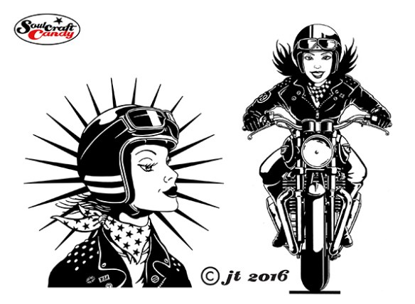
In the absence of a more detailed brief I decided that I would go forward with a combination of ideas. Firstly I picked two rather obvious ideas based firmly on a girl riding a bike, and then chose a couple of others based around a more emblematic approach. Each one was worked up as an inked drawing to start with, and done as neatly as I could manage. The girls on the bikes were reasonably straight forward to do in a general sense though I was really conscious of introducing something to try and bring some increased movement to the images. I’m not a fan of using speed lines and blurring to do this, my drawing style doesn’t work that well with them, so elected to simply try and show movement by trying to mimic hair blowing in the wind. The second two choices came from trying to approach them more like logos than pictures and incorporating some recognisable cues from the cafe racer scene like chequer pattern and jacket decoration.

Girl_T_Comp2©JonTremlett2016

Drawing these things is time consuming enough, but tidying up the high resolution scans can be even more so. Again, it’s back to the quality of the image you start with. Screen printers will invariably ask for vector based artworks and so each drawing needs converting from a scanned bitmap image to vectors in a program such as Adobe Illustrator. The software handles this with ease, but you have to ensure that your starting image is as clean, crisp and high contrast as possible. The vectorising process essentially traces your drawing creating paths and fills as it goes. By adjusting various controls in a dialogue box you are able to influence the fidelity with which the software does this task. The cleaner your starting point, the fewer options the process has for including or excluding small elements of the drawing and details. Once the drawings are vectorised though, you can easily include them in more complicated designs in Illustrator, edit them further, or simply use the resultant artwork as it is. If I was more proficient in Illustrator to begin with I might be able to draw these things directly in the program, but sadly my skills aren’t there yet. At least using this approach I end up with both a good quality digital artwork and a nice ink drawing for the portfolio as well. Because the digital images are now editable, one can make limited changes to them if need be, without the need of doing a whole new drawing.

112_T-shirt_comp1©JonTremlett2016

Finally I thought it would be fun to show the ideas as shirts rather than just images on their own. Plundering an image search for white T’s being worn, it was simply a case of pasting the designs into place to lend a degree of realism to the whole thing. I then sent these to my client/contact and began the waiting process. Let’s see what he comes back with.

Advertisement

That’s more like it.

Pencil layout by Jon Tremlett 2014 for Soulcraftcandy

As I mentioned in the previous post, the composition of the first picture for Mr. C needed further work resulting in a bit of a redraw. It’s funny how it works sometimes. In your mind you’ve got this image that you think is what you want. Then you draw it out and it’s a million miles away from what you are actually after. So after staring at it for a good while you redraw, thinking that this is going to be a bit of a marathon, and “pop” out comes what you were looking for in the first place. This is not the first time this has happened, so I don’t waste any energy thinking every first rendition will be the right one.

So what you see above is the tightened version made from the blue pen sketch. I use my small home built light box for doing this. It’s essentially a tracing exercise where all of the details are positioned where I want them and I sort out the final angle projections for the wheels and stuff. The hardest bit is getting the position of the figure right, and this will often involve several bits of paper as I try and find the right one. For example, the lower leg and foot in this picture was particularly problematic, for some reason I just couldn’t “see” it. I have a Japanese made posable figure here which I use in situations like this, he’s a very useful piece of kit.

Police car by Jon Tremlett 2014

I also had to do a fair amount of work on the chasing police car down in the lower right hand corner. The one in the main picture here is a kind of modern version based on something they might use right now but, it doesn’t sit well with the overall feel I’m looking for. Something more retro was called for as I want to create a notional connection with the original age of the bad boy Cafe Racer. Searching the web, as you do, turned up some fabulous old pics of what we would call here in the UK, Jam Sandwiches and Panda cars. Just like all modern societies we seem to relish the opportunity to give anything to do with law enforcement a nickname. So the force, “Plod” would drive “jam sandwiches”, essentially white cars with a dirty great red stripe down the side. These superseded the “Panda” cars which were oddly light blue with white doors and very slow. I digress. The other picture here today is my final choice for the police car. An early “Jam Sandwich” of the Triumph 2000 variety, suitably festooned with period accessories including the big illuminated box on the roof (a massive air brake), crappy roof mounted spots and a great big siren mounted in the middle of the bonnet to aid engine cooling. It takes me back to my youth tearing about the neighbourhood on my old Yamaha avoiding these characters.

From here there follows another light box session to transfer this onto Bristol Board ready for the final step which is the biro inking stage, which oddly I’m looking forward to a great deal as I haven’t done one of these for some time. I’ll keep you posted on how it goes, and thanks for dropping by today.

Going large, how blowing up images changes their character and impact.

Vinyl banner print by Jon Tremlett for Soulcraftcandy.

Another project that has spent many a month in the pipeline is the continuation of an experiment I started last year, where I wanted to see what impact it would have if I blew up one of the drawings to something like life size. While I’m still very much trying to figure out a way of being able to draw at this scale, it seemed like a good idea to get something printed in order to be in the position to make some judgements about how to approach such a challenge in the future. Initially I’d enlisted the help of a good friend, an architect with a big format plotter, to run out a couple of A0 sized sheets with the sketch image of the above drawing on. Taped together, these looked pretty impressive though the paper wasn’t too keen on staying very flat for long. Follow this link to that particular post.

After some further investigation, and with one eye on the possibility that I could use such prints for other purposes, it became clear that the best thing to do was get something printed on vinyl as a kind of banner. So this is what you see above, hanging in my dining room. It’s a metre and a half square, roughly 60 inches across and high, and is a thing of beauty, even though I say so myself. Well, I would, wouldn’t I ?

Vinyl banner print detail by Jon Tremlett for Soulcraftcandy

The jump up to such a scale causes you to regard the image in a very different way. The first is that it challenges your perceptions in that one hardly ever sees a cartoon at this size, so one is confronted by a strangely proportioned interpretation of a man and his machine. Some things fit and others don’t. The other change is that the print doesn’t hold any of the information in it back. Every single mark, line and cross hatch is revealed in all its glory, and so what appears a very neat drawing at normal size takes on a looser and more sketchy feel. As the creator, this change is not unlike revealing ones inner secrets of technique and skill to the viewer. Letting them see every stroke of then pen, every guiding thought and inevitably, every mistake. All unexpectedly liberating to see everything laid bare in this fashion. The good thing is, though I may stand to be corrected by others, that the drawing doesn’t suffer for this jump up in size in my mind, it still looks like a drawing, just a very big one done with a very big pen.

I’ve resolved to have some more of these prints done, and it would be really interesting to see what happens to one or two of the colour drawings. To see how every small daub of paint is shown in minute detail. The main challenge will be choosing which one to reproduce. Some would suggest that a painting should never be enlarged beyond its original size but, we do this to photographs so why not something made by hand?

Before I go I’d just like to mention that although vinyl banner printing is a widely available service, it pays dividends to find a printer one can talk things through with before placing the order. So many companies offer a web based service and instant file upload facility, but it’s the ability to see what your final print will look like where many fall short. Luckily I found one who did, so I’ll be visiting them again. If you need to know who they are please contact me.