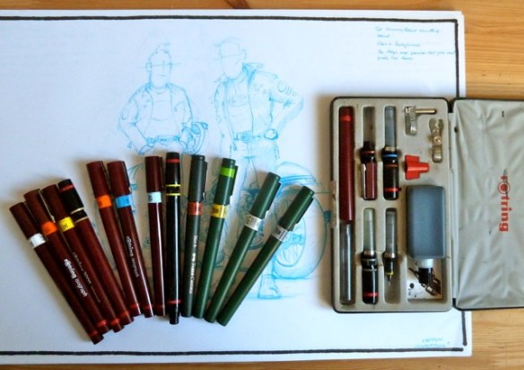
A good pen is an expensive tool, look after it.

The finished workshop polo shirt.

The finished workshop polo shirt.

So here is the shirt design for Bill Bunn Motorcycles, my local bike shop, in its finished form. The guys very kindly gave me a polo shirt in way of payment, which makes one feel very good about the idea of bartering. The quality of the screen printing is really good and the level of line and detail they have managed to keep is very high. A great result.

This black and white block reductive drawing is becoming strangely addictive. Partly I think it has to do with the process being quite quick, you see results quite fast but, it also has much to do with the simple pleasure of pen use and the decision making process. Areas of the drawing are either black or white and that’s it, this way or that, simple. As more drawings take shape it becomes easier to decide which way to go, ones ability to “see” what gets left out becomes clearer. It is amazing how the eye and brain are able to build a complete image from only a rather basic framework of information.

Big_Ink_CB750©JonTremlett2015

This activity is also helping me to complete some drawings which have been lying dormant in the drawing chest because I couldn’t decide on how to finish them. This indecision invariably comes from a lack of confidence and a worry about messing something up having invested a great deal of time and effort into it. For some reason this temerity seems to disappear once I start thinking of completing them in this style. One example is the drawing above. It must have sat in the drawer for about a year while I dithered over the final execution. However, armed with a couple of freshly filled Rotring pens it all came together rather quickly. there is still some background to complete to bring it on a bit further but essentially a neglected work has taken on new life.

Techy pens1

One aspect of working in this way is that I’ve realised that I actually have a rather unhealthy pen fetish! I’m actually a bit of a technical pen nerd in reality. It is a necessary part of using these things that one has to be rather fastidious about their cleanliness in order to get the best out of them, and I find myself enjoying this often messy job. There’s something terribly satisfying about making the first lines after a thorough clean and refill of my most oft used pen. What strikes me as a bit excessive is why I have to have so many of the things? At least a dozen at the last count, though not all are in working order. Long neglected at the bottom of a drawer, one or two are utterly dried up and solid with ink residue, a rock hard shellac like substance that seems to be impervious to most solvents. Prolonged soaking in cleaning fluid, often weeks, helps to release things but often the smaller sized nibs are beyond help. I have no idea why I have so many, like many bits of drawing equipment we just seem to accumulate them unwittingly over time. I remember purchasing my original Rotring box set over 30 years ago, second hand from a market stall but where the others have come from is anyones guess. Likely bought because I’d forgotten I had that size already or they were so bunged up I just went and got a new one rather than bother cleaning them out. Profligate and lazy days to be sure. One thing being a freelancer teaches you though, is looking after your stuff so hopefully m nibs can look forward to a more pampered and productive life from here on.

Advertisement

Dot shading and the tale of two fingers.

Two Fingers, an ink artwork by Jon Tremlett for Soulcraftcandy 2015

We’ve all done this at some point surely?

It has often crossed my mind that there is something mildly masochistic about certain aspects of pursuing a creative life. Obviously there are all of the usual traits that we exhibit like the vocational tug toward a certain specialism, the need to express ourselves, a slavish attention to detail and a preparedness to burn the midnight oil to meet a deadline but, there is also this uncontrollable little monster that drags you back toward things which make you uncomfortable and disinclined to take an idea forward. I’ve come across lots of these over the years and generally, once one succumbs to the temptation (can’t think of a better way to put it) you find you’re off on another journey that prior to that moment you said you’d never take again. And oddly, you’re quite enjoying the trip. These are perhaps slightly too strong words to describe it but I think it’s true nonetheless. The little monster that is the subject of todays post is dot shading.

I’ve written about the challenges of using this technique before, it is incredibly time consuming and can sap your will power if you let it, and have even gone as far as saying I wouldn’t use it again. But you see, and this is where the masochism comes into play, for some reason I just can’t resist it. It is an utter monster of a technique but, and this is where it really gets you, it just gives great looking results, pure and simple. Never say never again, I don’t think so. There a change in attitude in the air today which suggests I’ll happily be engaging with this technique a lot more from now on. It’s got me hooked, the evil thing.

Now I’ve got that off my chest here’s a bit about the picture above. I was really happy by the look and feel of the “Catch me if you can” picture, the shape and composition, the background idea and the naughty hand gesture. Wanting to do another similar piece got me thinking and I realised it was the hand gesture that was holding my attention. It’s irreverent, slightly rebellious and hints to so many aspects of our lives on two wheels. It evokes great memories of shared teenage rebelliousness, our desire not to be dictated to by The Man and a general “Piss off” to the establishment. We’ve all done it at some point in time whether in jest or otherwise. Plenty of reasons in my mind for it to feature in some other pictures. You’ll notice I’m also still playing with the idea of the detailed street scene background. For me it’s a great way to get a bit of humour into the pictures and place the central character in a relatable context. Here’s a detail panel so you can see what’s going on in that section.

Detail of artwork by Jon Tremlett for Soulcraftcandy 2015

For those of you who are not familiar with it, the “V” sign is an almost uniquely English thing, though it is apparently shared across some of the Commonwealth nations like Australia and New Zealand. Essentially it means “f*** off”, and should not be confused with the contemporary peace sign or the victory salute loved by a certain Mr. Winston Churchill, where in both cases the back or the hand faces the giver rather than the receiver. With the back of the hand facing forwards, this becomes a potent symbol of abuse. No One really knows where it first came from, but the most popular myth is that it was used by English long bowmen during the 100 years war with the French, a lengthy conflict spanning the 14th and 15 centuries. It was said that captured archers had their bow string fingers cut off by the enemy, so on the battlefield the English archers would wave their fingers at the French to taunt them and show that they still had them intact. It’s a great story but, as I said, no one knows if it’s true.

Don't confuse the two.

Don’t confuse the two.

Thanks for dropping by today and I hope you enjoyed the post.

Tail end Charlie.

Cartoon motorcycle art by Soulcraftcandy

“Come in No. 9, your time is up”!


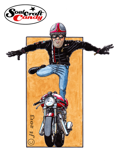
So let’s hear it for No.9, the last one in the series and called Triumph Wings. Try as hard as I might, it wasn’t really possible to complete the group without doing one with a standing figure and in portrait format. I’ve mentioned before wanting to have nine of these pictures for a reason, and that reason is that I wanted to subsequently see what they would look like arranged in a 3×3 grid as a single image. At least with this one I know where it will go in the grid, in the centre as it’s the only one in portrait. Putting that collective image together, in Photoshop most likely, won’t be easy as there are all slightly different in aspect ratio so turning them all into some kind of square format will need some thinking about.


This one was a bit more tricky than some of the others, I had to redraw the figure a few times to get the posture how I wanted it, and there was more than one moment spent standing in front of a mirror with one leg stuck out trying to figure out the way denim jeans fold in that posture. The things we do for our art eh? The bike proved far simpler, being a head on view and so fairly light on detail.


The plan now is to have a small number of these printed as cards and offer the collection through the Soulcraftcandy store. That will be very soon so I’ll let you know the minute they are available, it will be soon. Watch this space.