Going large, how blowing up images changes their character and impact.

Vinyl banner print by Jon Tremlett for Soulcraftcandy.

Another project that has spent many a month in the pipeline is the continuation of an experiment I started last year, where I wanted to see what impact it would have if I blew up one of the drawings to something like life size. While I’m still very much trying to figure out a way of being able to draw at this scale, it seemed like a good idea to get something printed in order to be in the position to make some judgements about how to approach such a challenge in the future. Initially I’d enlisted the help of a good friend, an architect with a big format plotter, to run out a couple of A0 sized sheets with the sketch image of the above drawing on. Taped together, these looked pretty impressive though the paper wasn’t too keen on staying very flat for long. Follow this link to that particular post.

After some further investigation, and with one eye on the possibility that I could use such prints for other purposes, it became clear that the best thing to do was get something printed on vinyl as a kind of banner. So this is what you see above, hanging in my dining room. It’s a metre and a half square, roughly 60 inches across and high, and is a thing of beauty, even though I say so myself. Well, I would, wouldn’t I ?

Vinyl banner print detail by Jon Tremlett for Soulcraftcandy

The jump up to such a scale causes you to regard the image in a very different way. The first is that it challenges your perceptions in that one hardly ever sees a cartoon at this size, so one is confronted by a strangely proportioned interpretation of a man and his machine. Some things fit and others don’t. The other change is that the print doesn’t hold any of the information in it back. Every single mark, line and cross hatch is revealed in all its glory, and so what appears a very neat drawing at normal size takes on a looser and more sketchy feel. As the creator, this change is not unlike revealing ones inner secrets of technique and skill to the viewer. Letting them see every stroke of then pen, every guiding thought and inevitably, every mistake. All unexpectedly liberating to see everything laid bare in this fashion. The good thing is, though I may stand to be corrected by others, that the drawing doesn’t suffer for this jump up in size in my mind, it still looks like a drawing, just a very big one done with a very big pen.

I’ve resolved to have some more of these prints done, and it would be really interesting to see what happens to one or two of the colour drawings. To see how every small daub of paint is shown in minute detail. The main challenge will be choosing which one to reproduce. Some would suggest that a painting should never be enlarged beyond its original size but, we do this to photographs so why not something made by hand?

Before I go I’d just like to mention that although vinyl banner printing is a widely available service, it pays dividends to find a printer one can talk things through with before placing the order. So many companies offer a web based service and instant file upload facility, but it’s the ability to see what your final print will look like where many fall short. Luckily I found one who did, so I’ll be visiting them again. If you need to know who they are please contact me.

It feels good getting back in the saddle.

SC_Sketch_1©JonTremlett2014

Wow, it’s been two months since the last post!  I don’t for a moment think that that is a good thing but, the time has now passed so there’s little point worrying about it. Summer is always a busy time and this year is no exception, though I would have preferred it if one of the things that’s been happening in the meantime wasn’t the premature termination of my working contract. Hey ho. At least I wasn’t fired, I just became the resultant collateral damage of a major falling out between other parties who couldn’t resolve their differences. Such is the unpredictability of freelance working I suppose, and something that we all have to get used to by necessity rather than choice. As you can imagine, finding the next thing to do is a challenge which drags me away from keeping my blog up to date.

But enough about that. Today the creative itch has finally got the better of me and sketches have been scanned, paper has been stretched and the need to draw is whispering in my ear. So, what am I going to work on next?

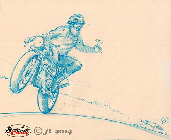
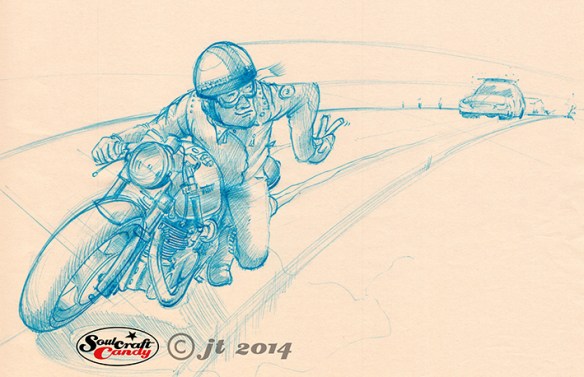
SC_Sketch_2©JonTremlett2014

Some time ago, far too long to be considered as recently, I was contacted by a guy in California, a certain Mr Steve Carpenter, who has made a very successful business out of building cafe racers for select customers. He wanted to know if we could do something together. I said yes, of course, the guy’s a very respected builder and a very creative chap. I feel rather honoured to be asked, frankly. So my next project is to create some specific artworks for Steve in my black biro style, based around some ideas we’ve talked about.

So here are a couple of initial sketches, done in blue pen on newsheet, which are my first attempts at capturing what Steve and I have chatted about. I think you can get the gist of what we’re thinking from the images. These two are first thoughts and are not yet exactly what I’m after. There are a stack of post-it notes here covered in notes about what I want to change about them, I find this the best way to document my thoughts and satisfy my inner editor, so the final image will be different. But these are a solid start in trying to capture the feeling I’m after and get a feel for the overall “shape” of the picture I want to create. Mr. C knows I do this as a hobby, so he’s not applying any pressure, I’m very capable at doing that myself (!), but looking at these sketches today and reading through the notes makes me want to get on with it and rev up the creative engine again.

It’s good to be back.

Shotgun dragbike – Finalising the layout.

Shotgun layout by Jon Tremlett 2014

It’s been a very busy month since my last post, one that has seen this picture progress to being finished along with some other stuff too. rather than jump straight to the final image, here is a slightly retrospective look at the process I have been through in completing this commission.

So this first image is of the final layout sketch which will now dictate how the picture will be in its final form. This one is traced through, using my little lightbox, on to an A3 sheet of good quality drawing paper using the previous sketch as an underlay. This stage is when I do most of the adjusting, moving things around slightly, changing some proportions here and there, and generally tightening things up. For the first time the drawing takes on a kind of crispness which really helps in being able to see properly what’s what and get the view finalised. Once I’m happy with this version, it’s pretty much ready to go and ready to be transferred onto the sheet of Bristol Board for the final rendering. This transfer stage is normally quite quick and easy, but this time was a rather fraught event. The size of the Bristol Board sheet was too large for the lightbox, the last thing you want is to crease or damage the paper whilst tracing through. Instead I had to rig up a makeshift lightbox using a small glass topped table and some desk lights and kneel on the floor to draw. It was hot day and the heat from the lights made the whole thing a rather nerve wracking affair, the board starting to warp after only twenty minutes. But it got done soon enough and I was really itching to get cracking with the colour phase.

Shotgun_engine©JonTremlett2014

So this image is of the the engine after a couple of painting sessions. I don’t know exactly why, but I always like to start at the centre of the picture and work outwards. With the bikes this invariably means doing the engine area first. It’s actually a really good way to get started. The main constituent colour here is Payne’s Grey, either on its own or mixed with other colours for different hues and shades. Keeping the paint quite thin, colour and tone are built slowly in layers, it gives more control, and allowed to dry every now and then to stop paper warp and the surface from degrading through sogginess. Once I’m happy with an area I’ll get the technical pen out and start the process of outlining and blacking to start to bring the whole thing out of the surface and give it some punch. This also helps to set the early tone for the drawing and acts as a guide for putting down subsequent colour areas. Looking good so far.