Keeping it punchy.

72_Desert_repairs

Ok, so here’s the next one in the now growing collection of small pictures coming together here in the studio. This one is lifted from one of the worksheets done a couple of weeks ago. There were a couple of characters sat behind the bike in that version but I decided to take one of them out and slightly change the context of the picture.


These are proving really fun to do. It’s not just the drop in scale and the subsequent shortening of making time that provides the pleasure, as much as the change in approach to the punchiness of the colours and handling a different level of detail. It is logical to think that going smaller should also mean going simpler, and I would agree to some extent, though I would also argue that if you take too much away you risk losing something, be it the attention of the viewer or the impact of your picture. With less area of paper to accommodate the image one must work that little bit harder on maintaining a level of detail that still makes the image interesting to look at, hence all the little stickers and badges, and possessing an impact in some way, hence the use of bright colours. These are after all fun images of fun subjects, and so to me it pays to put the work in to help them jump off the page.


Keeping it cartoony.

71_Dirt_rider_2

Here’s the picture from the previous post all inked up and finished. This is as far as I want to take it. In contrast to the previous version of this picture, the one with the yellow fuel tank, this one was done with a black biro pen, I was interested to see the difference, and it works quite well though I have to admit to preferring the much blacker lines of the previous version. A good experiment to try though, and for me validates the decision to push the slightly more cartoony style on these smaller pictures. Because biro pen has the ability to give such a variety of line weight and density it’s always tempting, and indeed a struggle sometimes not, to get all carried away with layer upon layer of shadowing and tone which confuses the drawing. The stark simple lines created using the technical pens work well with the colouration to keep the drawing in cartoon territory which is what I’m after with these. It is also helping me get over my biro addiction.


Of course it would be a simple case of going over everything a bit more with the pen to blacken things up but the essence of the picture is already there in my mind, and that would simply look like trying to emulate one kind of rendering style with another. You’ll notice that the boundary box is grey rather than black in an effort to bring a bit of softness to the holding device as well. There are some grey pens here which I’ll experiment with to try and find my ideal solution. So, I hope you enjoyed seeing this one finally. On to the next one. More again soon.


Engines, old and new.

Before getting on to the main purpose of todays post, an update on another of the biro drawings, there is just enough time to show you one more of the Cyclomotor drawings unearthed the other day. As you can see this is a colour one and as far as I can remember it was quite a big one, something like A1. What does remain firmly in the memory is how it was done. My tutor at the time insisted we make some of our drawings in colour and as this was a drawing project brushes were out. I had had a small tin of these oil pastels kicking around at home for a few years but had never used them, so this was a perfect opportunity to give them a try. They are called Neocolour by Caran D’Ache and are quite hard in their consistency. They are not at all appropriate for any kind of detail work but for big jobs they rule. They go down quite evenly for a pastel and what is really nice is that you can smudge them in a very controlled way with your finger and blend the colours into each other with some control. I’m wondering if I can use them for some of these bike drawings if I can get the scale up big enough, could be fun.


Looking at this old drawing today gives me real pleasure. It represents something that I work constantly to rediscover these days, a kind of naive confidence in the way the drawing is made that lies beyond the bounds of the years of formal training that followed this period of my experience. The errors in perspective and construction seem easily carried by the sheer boldness of the enterprise. I still have some of those pastels somewhere, perhaps it’s time to dig them out.

Drag bike half done

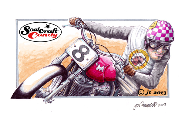
On to the main thrust of the post, oddly a much shorter paragraph, and this is a kind of progress snap shot of the second drag racing picture being worked up in biro. This one is taking a little time as I’m kind of learning as I go. In a break from usual practice this one’s being done on a different paper than usual, Fabriano Drawing Paper, whiter than cartridge with a slightly different texture. It’s a learning exercise as the pen engages with the surface in a softer way which means needing to be much more delicate with any pressure. It also tends to be much harder to hold a crisp line, though having said that it does give shaded areas a looser feel than that achieved with Bristol Board. The big test will be to see how it deals with larger areas of black and the fine feathering used on wheels etc. It is probably better suited to larger drawings where a softer medium can be used like pencil or crayon. I’ll persist though and see how it turns out.