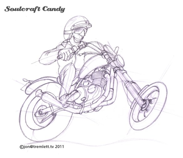
Lining paper, a surprisingly good drawing medium.

This is a sketch for one of the remaining drawings that are left to do. This was done as a kind of experiment. It’s at least 60% bigger than any of the others for a start, which allowed me to be a little less precise with everything, and seeing what an increase in scale would look like proved a useful exercise. Sometime in the future it would be great to create some much bigger drawings and my first tentative steps in this direction are being taken now. As mentioned above it’s not significantly larger than any of the others but, creating it starts to give me a feel for what changes when you go up in size. How you deal with proportion, detail and tonal variation across the drawing. One also has to consider the implication on ones preferred medium. I’m not sure that working in biro across an A1 sheet or larger is going to be a fruitful or spirit crushing experience. Only one way to find out I suppose.


It’s drawn directly, no pencil rough out, on to heavy duty (1400 weight) lining paper, the stuff you stick on your walls at home to even out a wall surface before painting. It’s not good quality paper for sure but, it does have this kind of hard textured surface which works really well with a medium point biro, almost making it feel like using a pencil such is the subtlety of shading one can achieve. Being quite thick allows you to work into the paper a good deal to achieve the thick black areas but, the pay off is not the usual warping and distortion you get with other, albeit finer, papers.


Yes, it can be a bit scratchy and coarse but it’s great stuff, cheap as chips and comes on a roll, so you can cut sheets to any size. I would mention though that at first it was a challenge to get it to lie flat, at all. Leaving it under a pile of books for a couple of days didn’t work, so I ended up ironing it with a hot but dry iron and then left it in a pile under a couple of pads. Much better. This weeks top tip for ploughing through sketches without worrying about using up your expensive art shop bought sketch pads. I’m going to have a look at lighter weights of lining paper to see if the texture is different and check out how they perform. An update will hit the blog soon.


Is it now a painting?

Finally got around to putting the finishing touches to this one the other evening and so wanted to get it up on the blog as soon as possible. As much as I like the final result, it’s proving difficult to decide what to say about it today other than to ask the question, “is it now a painting?”

Certainly the character of the image is completely different, the starkness of the ink drawing is replaced by a softness afforded by the colour treatment. What’s also interesting is that even though a stronger connection to reality is forged with the addition of colour, it has also brought a stronger emphasis to some of the more comic elements.

The purpose of the exercise however was not to set up some kind of competition between the two images, more to explore how colour would effect the final outcome and to get my rusty painting hand back into action. Some details proved easy and enjoyable to do whilst others remained a challenge, so there is still work to do before getting to that point where one is confident in creating what your minds eye can see, on the page in front of you. They say that in order to truly become an expert at something you must practice it for something like ten thousand hours, quite a way to go if expertise is the goal. Thankfully it is not, well not yet anyway, re-learning to play with some colour media is. So there will be more of these.

Enjoy the view.

Comfort in the familiar.

With the lightbox constructed the speed and easiness with which I can transpose drawings onto fine quality paper is greatly improved. What I really like about it is the ability it gives you to not only see where you are with the drawing as you go but, also it’s become much easier to make those fine adjustments to the composition. I appreciate that this all sounds wonderfully old fashioned but there is a beauty in that.

Another problem I’ve been dealing with on a relatively regular basis is that of getting into the rhythm of drawing on days when it doesn’t come easily. I’m not an artist and as such I’m not in the habit of engaging with my work on a daily basis. There are often gaps and I find that my eye takes time to get back in when I return to the page and the pen. Normally I find a good scribble gets me into the swing but there are other times when nothing progresses beyond that. Angles, proportions and perspectives are all out of my creative reach.

What I’ve found helps me get over this hurdle is to go back to something familiar and draw that. Something that I know intimately and when it comes to drawing bikes there’s nothing more familiar than your own machine. As I’ve mentioned before, I’m lucky enough to have two, but it’s the smaller one which always gets the job. Having spent a month modifying it a couple of years ago, and riding it a lot since then I know it inside out.

Above is a “getting into the rhythm” sketch of the little 250 that eventually went all the way to a finished drawing, below.

Like many of my other images I’m still fiddling about with what device to use to ground the picture and have so far only scratched something rough in using Photoshop. What I find happens when I follow this path to warming up is that the familiarity of the object in some way makes it easier to distort the view and the drawing. Sitting here writing this I’m actually struck by the fact that I haven’t needed to draw the 250 for a couple of weeks, so things in general must be getting better and easier to engage with.

Here’s pic of the bike. I mentioned ages ago in a very early post that I would tell some of the story behind this little special build. This is supposed to be a blog about drawing and making after all. So I shall sprinkle some of that into the mix over the next few posts.