Engines, old and new.

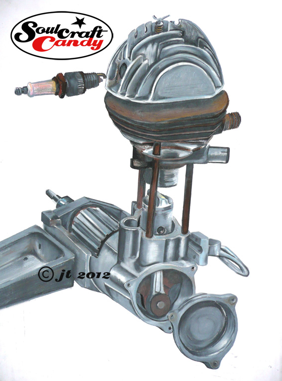
Before getting on to the main purpose of todays post, an update on another of the biro drawings, there is just enough time to show you one more of the Cyclomotor drawings unearthed the other day. As you can see this is a colour one and as far as I can remember it was quite a big one, something like A1. What does remain firmly in the memory is how it was done. My tutor at the time insisted we make some of our drawings in colour and as this was a drawing project brushes were out. I had had a small tin of these oil pastels kicking around at home for a few years but had never used them, so this was a perfect opportunity to give them a try. They are called Neocolour by Caran D’Ache and are quite hard in their consistency. They are not at all appropriate for any kind of detail work but for big jobs they rule. They go down quite evenly for a pastel and what is really nice is that you can smudge them in a very controlled way with your finger and blend the colours into each other with some control. I’m wondering if I can use them for some of these bike drawings if I can get the scale up big enough, could be fun.


Looking at this old drawing today gives me real pleasure. It represents something that I work constantly to rediscover these days, a kind of naive confidence in the way the drawing is made that lies beyond the bounds of the years of formal training that followed this period of my experience. The errors in perspective and construction seem easily carried by the sheer boldness of the enterprise. I still have some of those pastels somewhere, perhaps it’s time to dig them out.

Drag bike half done

On to the main thrust of the post, oddly a much shorter paragraph, and this is a kind of progress snap shot of the second drag racing picture being worked up in biro. This one is taking a little time as I’m kind of learning as I go. In a break from usual practice this one’s being done on a different paper than usual, Fabriano Drawing Paper, whiter than cartridge with a slightly different texture. It’s a learning exercise as the pen engages with the surface in a softer way which means needing to be much more delicate with any pressure. It also tends to be much harder to hold a crisp line, though having said that it does give shaded areas a looser feel than that achieved with Bristol Board. The big test will be to see how it deals with larger areas of black and the fine feathering used on wheels etc. It is probably better suited to larger drawings where a softer medium can be used like pencil or crayon. I’ll persist though and see how it turns out.



Better, but still work to do.

Cafe Gold.

Following the chromatic onslaught of yesterdays post, and those neon bushes, I’m rather hoping that everyones retinas have recovered sufficiently to absorb another blast of colour. Sincerest apologies go out to anyone mildly traumatised by the experience.


Todays featured image is the second attempt at the same picture and it is hopefully less bold than the first, but just as eye catching in its own way. This time around I made a serious effort to take a good look at the first image and learn from it, to analyse as much as address what problems existed. After all, technique isn’t going to get any better without being able to self criticise and understand not just what’s happening, but also to learn to know what to do about it. Without a tutor or associate looking over your shoulder all the time this is not always as easy as it sounds.


This second image took rather longer than the first as paint went down in a much more considered fashion.Firstly the base drawing was tightened up a bit. The rather “dauby” approach of the first is starting to be replaced by a tighter method. When employing wet on wet technique over areas of the picture it is a real skill to be able to control it and achieve the desired level of detail. One has to be confident but not overly so and using a smaller brush helps despite many manuals telling you otherwise. I also elected, and rightly so I think, to limit the creation of all grey areas in only two main colours. Winsor & Newton Payne’s grey, it’s got a lovely blueish hue, for all of the metal parts, and Schmincke Payne’s Grey, much more black in nature, for the tyres, leather and other details. This has  helped give various areas of the picture a more distinct separation than in the first where they are all mixed up. The golden yellow of the bodywork was tricky but worked out OK in the end. It was a deliberate choice to avoid trying to recreate perfect reflections in the tank and panels as I felt this just sucks you into a realm of photorealistic worrying and potentially ends up making the rest of the image look out of place. It’s an honest attempt to achieve a consistent feel across the whole image.


The background resulted from trying a few things out on other sheets of paper and a bit of photoshopping. Again it was about finding something simple that complimented the bike but didn’t overshadow it. I like it, it kind of works, and evokes memories of summer afternoon rides out through the countryside on small deserted roads with only the wind for company.


The third version is already underway and this will be a bit different again. Whether it ends up being any better is up for grabs. Here’s where it stands today.


Go easy with that colour.

CB based CR, first sketch.

The water colour paints that I have been experimenting with in my recent forays into the world of colour fall into three easily discernible groups. First there are those which come in small block form in a handy painting box. These are what you might call “classic” watercolours and although offering apparently quite vibrant yellows and reds, they are generally rather earthy in nature. The box I have here contains eighteen blocks, quite enough for most things. The second group are in liquid form, like toothpaste, and come in small tubes. My small collection of these covers some Payne’s Greys and some tinting greys of various hues. The third group are those Radiant Liquid Water Colours that look more like inks and come in small bottles with a pipette in the top.


The first and second groups are reasonably easy to get along with although there are moments when certain paints do weird things when applied to certain papers. I’m yet to get to the bottom of that one. The third group, those radiant fellows, are where all the danger lies and one must approach them with some caution. Through their vibrancy they tempt you to get a bit over excited with their application. One finds oneself forever walking a fine line between creating an image with a lovely glow to it, and utterly overdoing it, ending up with a riot of colour that could almost make your eyes bleed.


The “sketch” above, to me anyway, is one such moment when I stepped over that line. Thinking I’d go for a simple vegetative backdrop I piled on the colour like there was no tomorrow. Once I’d started I found I couldn’t stop myself. What was meant to be a rather subdued background ended up being furnished with nuclear powered bushes. The scan almost doesn’t do them justice and I had to go and do something else for a while rather than attempt a sky. It remains without said sky, the white mimicking the grey overcast look of a typical english day. It is stuck to the studio wall now, where it serves as a reminder to take it easy.


I do like the way the bike turned out though, which is what the sketch was all about in the first place. I traced this drawing off on the light box a couple of times so that I could monitor more what I was doing through working on the same picture a number of times. Version 2 will feature in the next post.


Finally, if you are reading this Larry, you can see that I’m using the pictures of your bike to inspire some images. The Honda CB750 is a handsome beast and serves as a great starting point for some future images. There is still work to be done but the process has started and you will be able to follow my progress here on the blog.