Overcoming Bull-headedness.

Bike sketch in brown ink by Jon Tremlett ©2013

For those of you who have been following the saga of the large biro drawing, known around here as “The Bull”, you will note that todays offering is not it, it’s something else, something a little different. Why? Well to be honest with all of you, I’m having a bit of a battle with it, and as a consequence it remains unfinished. I’m beginning to wonder who the bull really is. It is truly the drawing or perhaps it’s me, as I find myself repeatedly charging full pelt at a gate which is refusing to give way. A concerted effort last week to resolve the impasse bore nothing but a large pile of scrunched up tracing paper, wasteful certainly, and enough to provide bedding for a hamster for about a year. I have since decided to leave it alone for a while.


Having got utterly steamed up about it, backing off and calming down has led me to realise that this conflict is nothing new. It is one of the uncomfortable truths that surround any creative process. It is certainly not unusual to find oneself completely bereft of ideas during a concept design phase in the studio. Having “brain dumped” for several hours in a morning it is not a surprise to find out that your mind is totally empty and your imagination has gone walkabout. The energy previously expended in generating new ideas gets refocused into frustration and before you know it you’ve got a nice little vicious circle going.  Backing away, doing something else for a while unblocks the pipes and lets things flow again. So for now the drawing is sat on the other side of the room, the recipient of the occasional glance but nothing more. It will come to me when it’s ready, but probably not before.


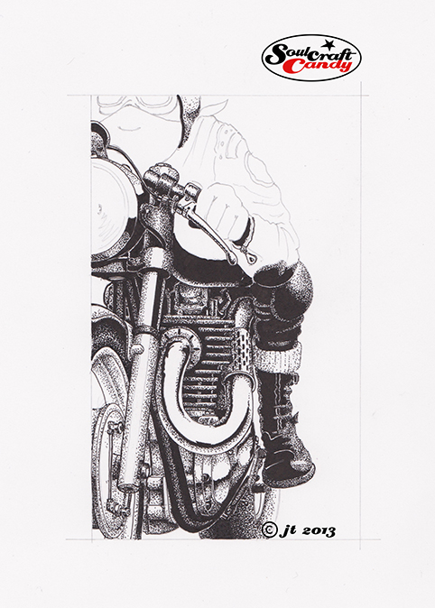
So what’s with this brown thing? Well, it’s a sketch I made a while back, always good to have a back up plan for a post if things go awry, whilst playing with the idea of drawing in other colours. Being a sucker for a cheap pen I’d purchased a tasteful set of biro pens in assorted colours and was intrigued by what they might bring to the party. Initial scribbling revealed that some of the colours, yellow in particular, might not be strong enough, but the brown showed immediate promise. You may remember the cartoon of the authentic biker a while back, that was done with this pen. The basic pen itself gives the drawing a lovely aged feel but it’s a bit limp when it comes to creating good contrast. As luck would have it I’d also found a brown gel rollerball pen, which when used with the biro gives a degree of heft to the dark bits and lends the whole thing a much needed punchiness. This is very much a learning exercise but one that worked out well. Now to get my hands on some cream coloured paper and find out where I can get brown biro refils without the need to buy a whole set when it runs out, which it will, soon.


Two wheels on my wagon.

Biro drawing by Jon Tremlett for soulcraftcandy 2013.

Yes, I know, it’s not finished yet. But things have moved on somewhat from where it was for the last post. As you can see there are now some wheels present and the main underlying structure of the bike is pretty much done now. This is becoming a labour of love, but a very rewarding one given the amount of time I’m taking over it. The paper being used is a heavy weight kind of textured drawing paper which, whilst being great for delicate shading, requires much more work with the pen to achieve the true blackness you need for certain details. It’s starting to look really punchy though, and that bodes well for the final result. One must just make sure that one doesn’t overdo it with the background and swamp it, a lighter touch may be required for that. Here below is a detail shot of the drawing to give you a better idea of the technique I’m using.

drawing detail by Jon Tremlett at soulcraftcandy 2013

The last week has been spent drawing detail sketches for the design of a large piece of medical laboratory equipment, who says design isn’t exciting (!), so it will be a welcome relief to put some energy into this picture over the weekend and have a go at completing some other stuff that is just crying out to be finished. One such piece is this little fellow below. To be honest I started this ages ago and kind of lost heart a bit.

Drawing detail by Jon Tremlett at soulcraftcandy 2013

Lovely though it is, the dot technique is laborious to say the least, and I’ll readily admit that maintaining concentration when “dotting” is hard. My inner procrastinator tells me to just leave it alone, but that would be too easy, a cop out, the true test of things like this is to grit ones teeth and push to the finish and learn from the experience. Lots of creative projects suffer from mid-term blues, but rarely get to the end in the same state. So, one final lunge to the finish line should see it done, and who knows it might look quite good by then.


Seeing red.

The Traffic Light Special by Jon Tremlett for Soulcraftcandy 2013

Applying the thousands of ink dots that make up the shadow areas in the “Slugger” picture featured in the previous post, got me thinking about what the image would look like if it was in colour. This short period of playful thought led to the creation of this second image based on the same drawing. It seemed like a fun idea to start by turning the bike into a street machine, but something built for short sprints like dashing between sets of traffic lights. So it needed lights, some different handlebars and a license plate, all fairly easy to include. It also felt right that it should be brightly coloured, a reflection of the exuberance of the activity it was created for.


So the main body of the picture employs the watercolour and pen technique used a good deal lately. I love the way it gives the pictures such a punchy look, almost jumping off the page and into your eyeballs. I so liked the dotted tyre shading from the last version I kept it in, contrasts nicely with the grey.


The bit I’m most pleased with though is the background, the bike really needed something big and bold behind it. I had a good fiddle in Photoshop before doing it, playing around with some ideas based around red, amber and green, the traffic light palette, but these merely made the whole thing look like some odd homage to Rastafarian culture. Needless to say they got dumped, too weird, too complicated, but the red element remained as it worked really well with the bright orange of the bike. This final version is simply primary red overlaid by a darker tint made by adding black. The background is air brushed using gouache paint. I covered the whole picture area with lo-tac film and cut around the bike very carefully with a craft knife, it always surprises me how little pressure is needed to cut the film so it pays to exercise the upmost patience. A solid red was then sprayed on and left to dry before removing the film. Another piece of film was then laid over and the lines for the wave forms were put on in very soft pencil. These were then cut out, again with a fresh bladed craft knife, and sprayed with tint made from the same red with some black added. Even though the picture already had a black ground line, the above process was repeated once more so that pure black could be sprayed on to give the gradient shading of the black area dissolving into the red. Challenging, messy and rather time consuming but the outcome is everything I wanted.


It’s called “The Traffic Light Special”.