From blank sheet to finished picture – part 1.

With five of the small Cafe Racer colour pictures done and posted there is one left to do which will complete this set. Rather than merely post up the final finished version of it I thought it might be interesting for people to see more of the process I go through when creating these images. So for this one I’ve scanned the various stages as I complete them.

Norton_biro_1

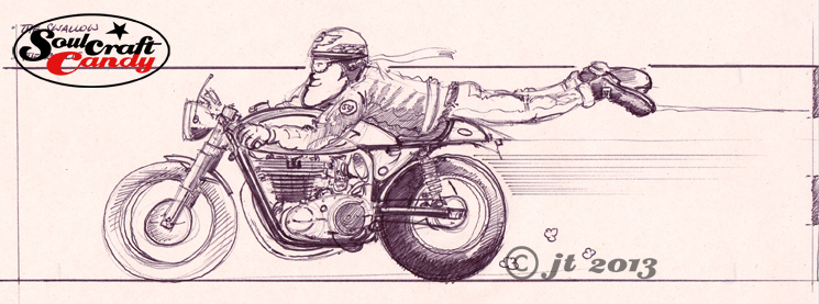
The first step, once the overall composition had been decided, happens on the newsprint pad where I rough out a couple of sketches to get a feel for what I’m after. Often this involves sketching it out a couple of times as in this case. The first sketch is really just  about working out the proportions, rider position and the general look of the bike in the image. Once you’ve got something then you’re in a position to make changes as you see fit.

Norton_biro_2

So with this done, I decided that I wanted a slightly different looking bike and to move the rider up the tank a bit, good reason to do another sketch. I wanted to base this drawing around a twin cylinder Norton and a quick search on the net yielded the right picture which could inform me about engine details and other bits and bobs. I can now start to work these into the drawing.

Norton_pencil

With these two sketches done there is enough information on the sheets to allow me to transfer the image onto the A4 Bristol Board for the final version. This is where my handy little light box comes into its own. If there is a need to blow up or reduce the sketch size for this stage then it is simply a matter of printing out a quick scan at the right size before hitting the light box. For the pencil stage I need a good point to the pencil so use a 2mm leaded technical push pencil, with an H grade lead, which keeps a point well and isn’t so hard as to leave big grooves in the paper when you erase it. Most of the drawing is done freehand though I resort to my ellipse guides to get the wheels nice and tight. At this stage I’m building in all of the details gleaned from reference pictures like the engine case shapes, cylinder head position and brake details. I love density in these drawings so put a lot of effort into distorting things slightly and filling in all of the big gaps that normally exist when looking “through” a motorcycle. It’s also a good time to get all those tiny details in. I don’t necessarily need accuracy here but I do like things to be reasonably believable, if that makes sense. With the bike and rider done, I loosely put a box around it which will approximate the background block. By the time this pencil layout is done, my mind has already started to think about what colour to paint the bike, the riders helmet design and the background colour. Time to get the brushes out and a look at the various painting and inking in the next post.


A new picture and an inspiring book.

81_FlyBy_2

This is the second version of FlyBy. There wasn’t anything wrong with the first one, it just seemed like a good idea to do another one, and bring in some more of the classic cafe racer details like a black leather jacket with patches on and a big silver tank on the bike.


The background got really patchy on this one but once it had dried out fully it didn’t seem too bad after all. The colour works really well with the bike image and it would have been foolhardy to think that it could be rescued or changed in any way by adding more liquid. I’m really pleased with the reflections on the exhaust and the engine side cover, I confess I referred to some photographs to truly try and get a handle on these parts. There is certainly a “way” of doing these things, and it is reliant on being able to pick the information  you want from a photo as it is in being able to access ones embedded knowledge. The former certainly feeds the latter, the photos serving purely to inform what I’m doing rather than be representative of the only way things can be rendered. More of these to come.

This is a great book.

This is a great book.

On another note today, here’s a really great book to recommend. It’s called “An Illustrated Life” by a chap called Danny Gregory. Essentially it is a collection of features on various creative people and their sketchbooks, including he author, though the books are very much the heroes. It is a fascinating look into other worlds where the books are used as journals for recording everyday life, through to how various artists use them as repositories for ideas and laboratories for creative experimentation. To accompany all of this visual candy there is also plenty to read, each featured person is given plenty of column inches to explain what they use their books for, how they do it and, just as importantly, why they do what they do. It is all very enlightening and interesting stuff, I can’t recommend it enough as a source of energy, inspiration and delight. For any of us who spend any time slowly filling sketchbooks all this might at first seem a bit intimidating, but go with it and it soon becomes clear that we are all doing the same thing, just differently and individually. It’s readily available through all the usual channels. Here’s a link: To the book.

Illustrated_Life2 Illustrated_Life3 Illustrated_Life4


Worksheets, organising your ideas.

Worksheet_1

I mentioned in the last post how hard it can be sometimes to keep track of ideas, organise them and maintain connection with them as you go. Those thoughts were prompted by a session going through the piles of loose sheets that don’t get put on the wall in the studio and the ideas that they contain. It’s amazing how fast one can build a pile of paper, and how much time one can spend subsequently sifting through them.


The new year has brought with it a desire to try and bring some kind of order to how ideas are collated and stored, and then how to access them a little more quickly. A solution, which I’m now trying to make a habit of, was found in a book and I don’t mind admitting as much. I’m lucky that here in Ealing I have access to a public library which has escaped closure. It is a fantastic resource for all kinds of things aside from books and is completely free. They have quite a good arts section and a good few books about all aspects of drawing and painting. One publication I borrowed recently was by a cartoonist and animator. An interesting book though much of it was very specific to his latter trade, but what struck me was how he organised his work. There were many examples of worksheets he created for each project which explored everything from frame compositions to colour palettes and other tiny details. Although most of it was way too complicated for my needs, it was the central concept of the worksheet that stuck with me. The sheet above is one of my first worksheets, or ideas sheets. I haven’t gone as far as making a grid of boxes to sketch in or scribble notes in but getting the ideas down this way helps with any grouping I may want to create, and more importantly it is now possible to increase the density of ideas stuck up on the wall by a considerable degree. So simple, so effective.