No.8 and a trip to the Tate.

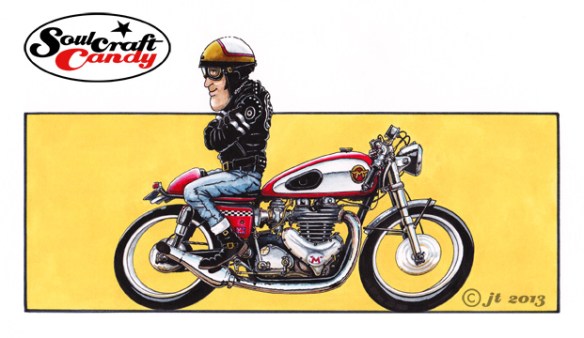
Matchless cafe racer by Jon Tremlett

This is number eight, the penultimate picture in this series and for me one of the best ones. Finding that the limits of my embedded knowledge were being reached I had resorted to flicking through one of the many reference books here in an attempt to top it up a bit. I find with great books that each different viewing often reveals a new set of surprises. In this case a lovely picture of an old Matchless jumped off the page and at once demanded to serve as inspiration for this picture. As with all these drawings the final picture is never really a true rendition of the reference, they all get pushed and pulled about a fair bit to suit the original vision, but this one’s got a bit more truth behind it than some. One detail in particular stands out, and is one that reveals how an utterly simple approach can be just as effective as a far more complex solution to the same problem. The simple curving shadow line along the fuel tank, to delineate reflection, very clearly says “polished metal” without the need to apply any more shapes, shadows or colour areas. A triumph of less being more, and oh so simple.


Yesterday I was lucky enough to get a ticket to the Roy Lichtenstein retrospective currently running at the Tate Modern Gallery in London. Although a fan of various aspects of Pop Art, I’d never really considered any of his work other than the large comic format pictures repeatedly paraded in front of us like Whaam! So it was very interesting to see a much more varied collection of pictures across a number of periods which followed the development of his unique style and approach. From his early experiments with abstract expressionism, through flat graphic interpretations of objects and on to landscapes inspired by chinese scroll paintings, with a fair bit of work in between, it proved an enlightening journey through the canon of an artist many might dismiss as a one trick pony. The landscapes and seascapes in particular, were both surprising and stunning, his Benday dot screen technique combined with some fantastically bold colours producing images that were both strangely mechanical and oddly dreamy at the same time. If you are  anywhere near London and the show is still running I would recommend going to see it. Rumours of ticket non-availability proved wrong, we got some without any problems. It’s on until May 27th.

 

Advertisement

From blank sheet to finished picture – part 1.

With five of the small Cafe Racer colour pictures done and posted there is one left to do which will complete this set. Rather than merely post up the final finished version of it I thought it might be interesting for people to see more of the process I go through when creating these images. So for this one I’ve scanned the various stages as I complete them.

Norton_biro_1

The first step, once the overall composition had been decided, happens on the newsprint pad where I rough out a couple of sketches to get a feel for what I’m after. Often this involves sketching it out a couple of times as in this case. The first sketch is really just  about working out the proportions, rider position and the general look of the bike in the image. Once you’ve got something then you’re in a position to make changes as you see fit.

Norton_biro_2

So with this done, I decided that I wanted a slightly different looking bike and to move the rider up the tank a bit, good reason to do another sketch. I wanted to base this drawing around a twin cylinder Norton and a quick search on the net yielded the right picture which could inform me about engine details and other bits and bobs. I can now start to work these into the drawing.

Norton_pencil

With these two sketches done there is enough information on the sheets to allow me to transfer the image onto the A4 Bristol Board for the final version. This is where my handy little light box comes into its own. If there is a need to blow up or reduce the sketch size for this stage then it is simply a matter of printing out a quick scan at the right size before hitting the light box. For the pencil stage I need a good point to the pencil so use a 2mm leaded technical push pencil, with an H grade lead, which keeps a point well and isn’t so hard as to leave big grooves in the paper when you erase it. Most of the drawing is done freehand though I resort to my ellipse guides to get the wheels nice and tight. At this stage I’m building in all of the details gleaned from reference pictures like the engine case shapes, cylinder head position and brake details. I love density in these drawings so put a lot of effort into distorting things slightly and filling in all of the big gaps that normally exist when looking “through” a motorcycle. It’s also a good time to get all those tiny details in. I don’t necessarily need accuracy here but I do like things to be reasonably believable, if that makes sense. With the bike and rider done, I loosely put a box around it which will approximate the background block. By the time this pencil layout is done, my mind has already started to think about what colour to paint the bike, the riders helmet design and the background colour. Time to get the brushes out and a look at the various painting and inking in the next post.


Keeping track of ideas.

Comp_for_blog_1

One of the consequences of conducting ones creative activities in a small studio room, essentially a converted child’s bedroom measuring barely 10×6 feet, stuffed with bookcases, desks, computers and all the required paraphernalia, is that keeping track of things is a perpetual challenge. The question “now where did I put that?” rings in my ears all the time. Any activity, creative or otherwise, brings about default behaviours in us like how we file things, store items and arrange our work area. We create our own individual systems which are very particular and often not logical in the eyes of others. I’m also sure it’s a truism that we spend countless hours every year modifying our little systems in the search for an ideal solution. I know I do, and it’s not always about easing the process of finding stuff. Being able to see your ideas is a very important part of stimulating the creative process. In the past I’ve enjoyed the luxury having lots of sketches and drawings laid out to view, it helps with seeing where you’ve been and also where you’re going, or would like to go with an idea. The challenge is being able to maintain that connection between your vision and the work in progress. This applies as much to images we collect as reference as to our own output.

Comp_for_blog_2

I have a wall in here upon which I stick sketch sheets and stuff, but it never feels big enough. As a result it constantly changes, acting as a road map for current work and keeping the connection going with ideas and thoughts which still hold my attention. It would be fantastic to sit in a studio the size of an aircraft hangar, but that’s not going to happen any time soon, so making the best use of what’s available really counts. The computer, which holds a huge resource in my image bank, and provides access to the universe of the net only has a screen that is so big. So to cram as much into this space as possible these compositions of ideas, as shown here, are a great way for me to see lots of ideas all at once, make decisions about them, and assist myself in direction finding.