Starting the Shotgun commission.

Shotgun_sk_1©JonTremlett2014

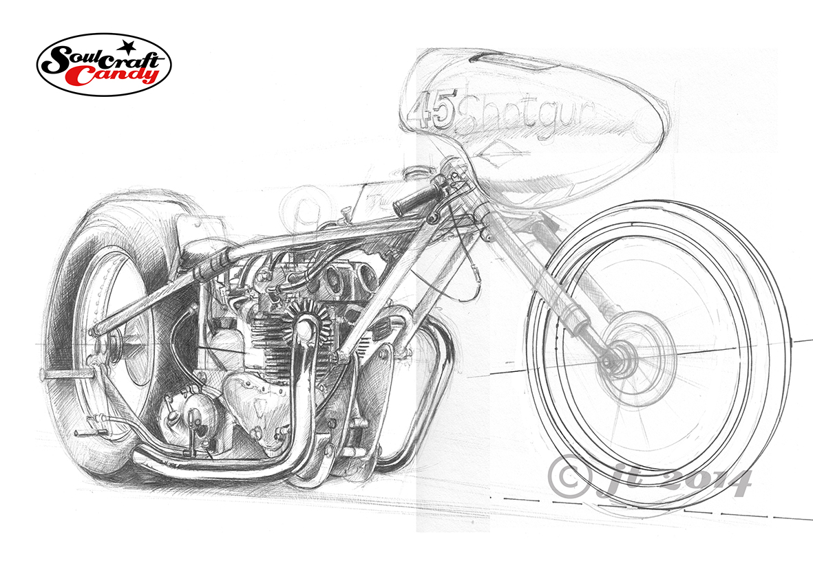
A couple of posts ago I put up some colour photographs of a lovely red vintage drag bike called Shotgun. I’ve been asked by its owner, Nik Fisk, to create a picture of the bike for him. It’s taken a couple of weeks to get going but here is the first layout sketch done in preparation for the final picture. It’s done in black biro on heavy weight lining paper. When I was taking the photographs we discussed in some detail the view we wanted to achieve in the finished piece, something that hinted at the length of the bike, but also showed off the overall shape well and the fantastic old Triumph engine that sits at the heart of the beast. Having the right hand exhaust pipe nearly vertical we reckoned this would allow the curvature of the left pipe to be a feature and would also create a strong central element to the picture.

It would be far simpler, and probably much easier, to sketch directly over a printed photograph, or do it digitally using something like Corel Painter, but that would defeat the object of this exercise. In asking me to create a picture for him, Nik is looking for something created in a particular style, which we reckoned would be called something like “factual caricature”. This is not about creating a facsimile image, more about giving the image a degree of character which a photograph just can’t do. So with a picture up on the screen as reference I like to work freehand directly onto the paper, working out the relative positions and proportions of things as I go. It’s a rather organic process, one which not only makes you look carefully at the subject, but also embeds knowledge about that subject into your minds eye as you go. I find this part of the process invaluable and it enables me to make the slight scale and proportional changes which bring the caricature into the image. It allows me to do things like make the engine slightly bigger and bulk up the exhaust pipes to increase the sense of power of the unit for example. I always like to increase the fatness of tyres on bike pictures, in makes them look more planted in my view, but at the same time I need to make sure that the ellipses that outline the wheels are as correct as possible. This sketch shows a revised front wheel from the original sketch, done with some ellipse guides at a smaller size (my templates only go so big), rescanned and photoshopped into place. So when I’m freehanding the outline drawing for the final picture I’ve got some decent guidelines to work to.

The drawing is about 380mm from the back of the rear wheel to the tip of the front and sits very nicely on an A2 sheet, so a really good size which will allow lots of details to be shown. The next step is to check over this one, make some notes for adjustments and then use the light box to start the process of getting it onto the Bristol Board I’ll use for the final painting. This is going to be a lot of fun and I’ll be posting progress reports as things take shape.

It’s very green.

103_Nail_It©JonTremlett2014

Just a brief post this time as there is still much to do at the end of this Bank Holiday weekend and we are all back at school tomorrow.

So here above is the finished picture that was shown in a part done state a couple of weeks ago. Safe to say it’s very bright and colourful and has turned out pretty much exactly as I planned. I love using a bright orange on the bike tanks and so it seemed only logical to offset that with a blazing green for the background block. And because the bike’s standing pretty much on its nose, then angling the coloured area around it seemed like a good way of emphasising the the dynamic of the image.

This one’s done on a much smoother water colour paper than the usual fare and it makes a real difference to how the inking goes down and the control that one can exercise in the coloured areas. I hope you like it as much as I do. Gotta dash.

Creative energy spreads.

102_Cafe_smoke©JonTremlett2014

With all of the making happening in the back garden and in the makeshift workshop that is the garden shed, it would have been so easy just to forget about the artworks for a few days. But these things never sleep, whatever’s on the drawing table in the studio lets you know it’s there every time you walk in the room. The hope was that some making activity would bring a fresh spur to the drawing work and so it proved. By splitting my creative time in this way, both fed off the energy that was now available seeing as I wasn’t going to be working for a few days.

This picture above was started a while back but was taking ages to finish. Procrastination had set in as a reaction to my being a little daunted by pushing it along. I wanted to see how I’d get on with some heavier textured water colour paper, and whether I could hold the detail given the rougher surface. It was also a challenge to figure out the best way of rendering all of that smoke, something I’d not had much success at in the past.

In the end the detail concerns were pretty unfounded, the technical pen worked out ok on the paper once it was fully dry, though I would say that it does tend to get a bit “hairy” if you labour the pen too much. The smoke bit on the other hand was a tad more tricky. I had kind of promised myself that I’d have a go at being a bit more free with my brush work a while ago and saw this as a perfect way to get some practice. Smoke being of a very “wafty” nature I thought it would suit a more loose approach. What I didn’t reckon on was actually how hard it was to do. I take my hat off to all those whose water colour style is more conventional than my own, the impressionistic feel they give to brush work is a hard won prize indeed. Initially I was far too deliberate, the cloudiness needed just wasn’t there and no amount of blending the marks I’d made seemed to work. In the end I plumped for just loading up a No.4 brush and smearing, can’t think of a better word for it, wash all over the required area and trying to blur it all with more water whilst still wet. It kind of worked but I failed to achieve any consistency across the whole area. Not wanting to overdo it I left it at that, though I will be having another few tries at getting the looseness I’m after on some other pieces which are coming along behind this one.