Keeping it punchy.

72_Desert_repairs

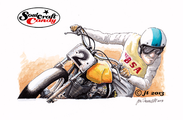
Ok, so here’s the next one in the now growing collection of small pictures coming together here in the studio. This one is lifted from one of the worksheets done a couple of weeks ago. There were a couple of characters sat behind the bike in that version but I decided to take one of them out and slightly change the context of the picture.


These are proving really fun to do. It’s not just the drop in scale and the subsequent shortening of making time that provides the pleasure, as much as the change in approach to the punchiness of the colours and handling a different level of detail. It is logical to think that going smaller should also mean going simpler, and I would agree to some extent, though I would also argue that if you take too much away you risk losing something, be it the attention of the viewer or the impact of your picture. With less area of paper to accommodate the image one must work that little bit harder on maintaining a level of detail that still makes the image interesting to look at, hence all the little stickers and badges, and possessing an impact in some way, hence the use of bright colours. These are after all fun images of fun subjects, and so to me it pays to put the work in to help them jump off the page.


Challenge yourself, try something new.

70_Dirt_rider_1

An intrinsic part of the creative life is to challenge things. To challenge existing norms, preconceived notions, behaviours and expectations, as well as a whole host of other aspects of our existence. One of the most rewarding is when we challenge ourselves. Sometimes it is not important wether we succeed in this endeavour, but more so that we engage in the process as a learning experience. Developing new skills and learning new approaches is a key goal behind moving forward.


Last year was the year of the biro pen and I pushed myself as far as I could in finding and developing a technique that allowed me to express myself fully with that particular medium. I pretty much reached my limit and some of the resultant drawings, particularly the Cafe Racer series, were very rewarding to complete. Now don’t get me wrong, I’m not about to turn my back on all that work and take off in a new direction. Investing so much time and effort would be wasted if that were the case, and anyway doing these things is like playing a musical instrument, you have to keep your hand in shape through practice, so more will undoubtedly follow.


What is driving a fresh desire to push some other personal artistic boundaries this year showed its hand a bit towards the end of last year with the advent of more colour images. Again it was kind of pleasing to do them that way, essentially refining the biro pen technique and applying watercolour, but I couldn’t escape the fact that they were taking an enormous amount of time to complete. This year I want colour to play a larger part, but I also want to be more productive in the time available, to see more of the many ideas generated become finished pictures rather than footnotes in a pile of loose paper.


So the first approach is to work smaller and work faster, still incorporating many of the things like boxing and cropping explored last year, and to develop a punchy technique which works well with these new format images.


The Dirt Rider above is my first attempt. It is smaller, about 19cm across. I’ll be posting some more very soon and will tell you how I’m making them then. I sincerely hope you enjoy this one and those that are to come.


Back to black.

On goes the ink.

A catchy title to todays post but, for all music fans out there I’m not going to be offering comment on the great studio album by the late, great Amy Winehouse, though I would say that Tears Dry On Their Own is my favourite track by far. Anyway I digress.


As you can see above The TT racer is nearing completion with a healthy dose of inking being done. As the title of the post implies this is very much an exercise in chasing all of the colour washed areas back towards black in the darkest shadows. This has proved quite tricky for a couple of reasons. Firstly it is incredibly easy to get a bit carried away and over do it, so teaching oneself when to stop is a constant challenge. The second reason is more techy in the sense that it’s about the touch of the pen on the drawing surface. Water colour paper is quite heavily textured relative to normal papers and so maintaining a delicate touch across areas is quite hard as you are not engaging with a smooth surface, so the line can be a bit inconsistent. It’s just something you have to get used to and work with. This also catches those little blobs of ink that gather on the pen tip every now and then so constantly cleaning the nib is a must do habit to get into.


It is coming together well though and should be finished soon. Then I’ll be able to release the paper from the back board, give it a proper scanning without there being a large bit of wood attached to it, and post it up here. Here’s a close up which reveals some of the dodgy line work.