It’s enough to make you dotty. A dragster in monochrome.

Dragster cartoon©JonTremlett2013 at Soulcraftcandy

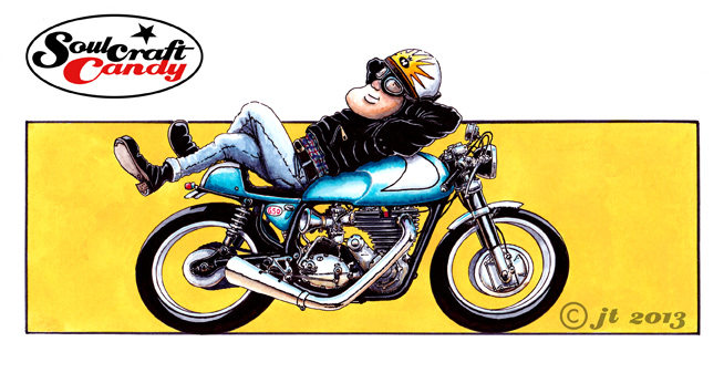
Maintaining momentum, and keeping the creative juices flowing, is always one of the challenges one has to overcome when engaging in an artistic pursuit which has to fit in around the everyday goings on of ones life. It’s easy to loose the flow, and returning to an unfinished image rarely results in picking up the thread exactly where you left it. I suppose that one of the key disciplines of any artist is to develop techniques which enable you to do this as seamlessly as possible. I don’t have any hard and fast routines that I follow in order to make this easier but one thing I do do is always try and have a number of little projects on the go at any one time, all at different stages. This means that when I’m deep in thought about how to solve a problem on one picture, there is always another close by which I can engage with, one where the work is at a stage where I don’t have to overcome any issues in the execution. So dipping in and out of things keeps the creative ball rolling rather than running to a dead stop as endless time is wasted staring at a problem until the answer comes. In fact this act of “dotting about” helps me to uncover the answers that I’m looking for.


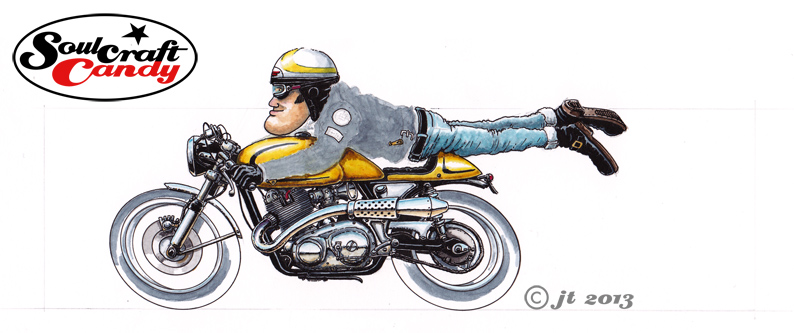
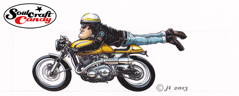
So whilst pondering what to do about the background for the picture featured in the last post, I had a good look through the “pending ideas you should really finish” pile and pulled one out to serve as the “other” project. I had a dabble last year with some sketches following a visit to a drag race meeting, made a couple of drawings, and then promptly left it there. I’m not sure why. This drawing above was all ready for some treatment having been carefully pencilled out onto a nice bit of drawing paper, I just hadn’t thought much about how to take it further. I’m not sure what inspired my choice of technique, it could have been my recent visit to Tate Modern to see the Roy Lichtenstein show or something else entirely. Doing something different really appealed though and so out came the trusty old technical pens and I set to work.


Although the dot shading is a madly labour intensive way to do things, this drawing proved to be very enjoyable to do and a pleasant alternative to the paint and ink technique I’ve been doing a lot of recently. You have to take a break every now and then though as all the little specks of black make your eyes go a bit funny after a while. It’s a lovely way to gradually build up tone though and really plays to the cartoon nature of the drawing. I’ve called it “The Slugger” after a certain baseball bat, a blunt though effective instrument that gets the job done. I hope you like it.


Nearing completion.

soulcraftcandy cafe racer by Jon Tremlett

As mentioned in the previous post things are moving relatively swiftly towards the time when the complete collection of nine of these small “stunt” pictures are done. Not for want of trying has it taken rather a while to get to this stage. As things progress one is challenged by a double edged sword of execution. On the one hand, making more of these images should become quicker as one gets used to the routines and techniques being employed. Conversely, as you become increasingly involved in the process behind each one, you get more and more focused on achieving the levels of finish and detail that you know you’re looking for. Thus one edge gives you time while the other happily takes it away again. Enthusiasm however is not diminished and the end goal of nine is now firmly in sight.


This one above is the latest to be finished. I think it’s based on some kind of BSA though looking at it now it appears more of a “bitsa”, an agglomeration of various parts assembled into something that satisfies the required function. A bit like cafe racers of old perhaps and so true to the spirit of the genre I think.


From blank sheet to finished picture – part 3.

Norton_wash3

The next stage in the application of colours to the picture is probably the most nerve wracking and delicate, though it is hugely rewarding when completed to ones satisfaction. Although in your minds eye you feel you can “see” exactly how you want things to to turn out, the reality is that one is merely aiming at achieving that vision, as actually it’s not at all clear until you’ve put paint to paper, and sometimes by then it is too late to make a change. You have to kind of feel your way towards your goal. I’d decided the bike should be a golden yellow colour. The first stage is to put some shadow tones onto the areas that require them like lower edges and vertical faces. With these you have to think what colour the yellow would be in shadow as these things are invariably never a case of simply adding black or grey to your base colour. In this case doing that would make everything a dirty green colour, not good. So using small quantities of darker ochres and browns these areas are touched in and left to dry. Having decided on highlight size and position it’s time for the yellow, applied in a thinned wash to start with and then built with some less diluted colour as the from appears. Knowing when to stop is as much judgement as experience, so slowly, slowly, catchy monkey as they say. The yellow on the helmet follows and then finally the base layer for the leather jacket making sure I leave clear all the small details I want to stand out in the finished picture.

Norton_ink3

When all the above is fully dry it’s time for the last of the inking stages. Using a fatter pen than usual, a 0.5 point, the tyres are done first, leaving hard edged areas for the highlights rather than a more messy looking feathered edge. Back to a fine pen and the jacket comes next where it’s very much a case of working slowly down or across the shape, again leaving small slivers of grey to denote highlight areas where the leather wrinkles. You could argue that areas like the jacket should be more gradated and “realistic”, but if you do that then the rest of the picture doesn’t “fit” and you end up having to apply the same approach to everything. All that’s left to do now is add any small colour touches into any helmet and jacket badges, the spark plug cap and small reflections of the yellow that appear on metal parts facing the coloured area. A final tickling process takes some time, constantly scanning the image for little white gaps and spots where a bit more colour or black is needed, but it serves to lift small parts of the picture that you perhaps didn’t see before.


The picture is now nearly done, all that remains is to choose the right colour for the background block, one that gives enough contrast with the bike colour but doesn’t drown the image in the process. That’s all in the next post, see you then.