Distractions, distractions.

Head_on_CafeRacer_©JonTremlett2013

Drawing and painting onto wood, drawing on metal with a Dremel, designing t-shirts, jewellery making, wood carving, sculpting, transferring images onto glass, painting rocks(!), etching, wire modelling, making enamel badges and resin casting. These are all ideas that have flown my way over the last few weeks. Whilst they are all valid, they are all residing in the possibilities box at present. Some are self generated and others come from those around me. Some arrive with the word ‘should’ tacked on the front somewhere, whilst others take a more open approach with the word ‘could’. I prefer the latter, it speaks of a freedom to chose, of open ended possibilities and creative potential, whereas the former does not, sounding often like a form of well meaning edict, but an implied command none the less. Anyway, there they all sit in the great lottery ball tumbler of options waiting for possible selection. While they are in there they churn around, the subconscious busy doing what it does best, sampling, analysing and interrogating each one in turn. I’ll report on what this process reveals in coming posts I’m sure.


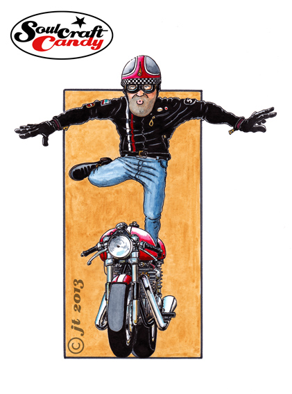
This is a great thing but, my word does it create a mountain of distractions which have led to a kind of treacly inertia needing to be overcome each time the drawing board is occupied. I know that the best time to grab a new idea is when you can feel fired up about it, knowing that you will do something with it quickly rather than sit mulling it over. I can feel that moment coming but it ain’t today, or possibly tomorrow either. So in the meantime focus has returned to the drawings and paintings that have suffered from my neglect. The image above is where I’m at with a pen and watercolour rendition of one of those Rocker guys whose style seems to be popping up everywhere at the moment. Enjoy, and don’t forget, the store is open and has a limited stock of those greetings cards for anyone stuck for a gift for a biking mate.

Finally, with new followers arriving all the time, a big thanks to you all for your support and loyalty, it means a great deal and is a welcome spur to keeping going.


Tail end Charlie.

Cartoon motorcycle art by Soulcraftcandy

“Come in No. 9, your time is up”!


So let’s hear it for No.9, the last one in the series and called Triumph Wings. Try as hard as I might, it wasn’t really possible to complete the group without doing one with a standing figure and in portrait format. I’ve mentioned before wanting to have nine of these pictures for a reason, and that reason is that I wanted to subsequently see what they would look like arranged in a 3×3 grid as a single image. At least with this one I know where it will go in the grid, in the centre as it’s the only one in portrait. Putting that collective image together, in Photoshop most likely, won’t be easy as there are all slightly different in aspect ratio so turning them all into some kind of square format will need some thinking about.


This one was a bit more tricky than some of the others, I had to redraw the figure a few times to get the posture how I wanted it, and there was more than one moment spent standing in front of a mirror with one leg stuck out trying to figure out the way denim jeans fold in that posture. The things we do for our art eh? The bike proved far simpler, being a head on view and so fairly light on detail.


The plan now is to have a small number of these printed as cards and offer the collection through the Soulcraftcandy store. That will be very soon so I’ll let you know the minute they are available, it will be soon. Watch this space.


No.8 and a trip to the Tate.

Matchless cafe racer by Jon Tremlett

This is number eight, the penultimate picture in this series and for me one of the best ones. Finding that the limits of my embedded knowledge were being reached I had resorted to flicking through one of the many reference books here in an attempt to top it up a bit. I find with great books that each different viewing often reveals a new set of surprises. In this case a lovely picture of an old Matchless jumped off the page and at once demanded to serve as inspiration for this picture. As with all these drawings the final picture is never really a true rendition of the reference, they all get pushed and pulled about a fair bit to suit the original vision, but this one’s got a bit more truth behind it than some. One detail in particular stands out, and is one that reveals how an utterly simple approach can be just as effective as a far more complex solution to the same problem. The simple curving shadow line along the fuel tank, to delineate reflection, very clearly says “polished metal” without the need to apply any more shapes, shadows or colour areas. A triumph of less being more, and oh so simple.


Yesterday I was lucky enough to get a ticket to the Roy Lichtenstein retrospective currently running at the Tate Modern Gallery in London. Although a fan of various aspects of Pop Art, I’d never really considered any of his work other than the large comic format pictures repeatedly paraded in front of us like Whaam! So it was very interesting to see a much more varied collection of pictures across a number of periods which followed the development of his unique style and approach. From his early experiments with abstract expressionism, through flat graphic interpretations of objects and on to landscapes inspired by chinese scroll paintings, with a fair bit of work in between, it proved an enlightening journey through the canon of an artist many might dismiss as a one trick pony. The landscapes and seascapes in particular, were both surprising and stunning, his Benday dot screen technique combined with some fantastically bold colours producing images that were both strangely mechanical and oddly dreamy at the same time. If you are  anywhere near London and the show is still running I would recommend going to see it. Rumours of ticket non-availability proved wrong, we got some without any problems. It’s on until May 27th.