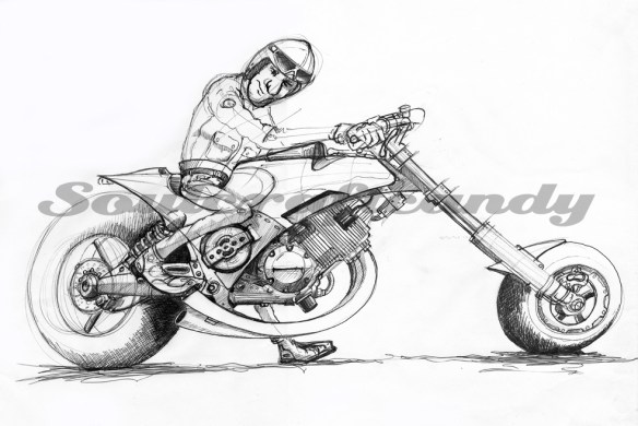
Less is more.

Cafe Racer No.2

Hot off the scanner today is the second completed drawing from the Cafe Racer series. After much humming and hawing over how to finish it off, it seemed most appropriate to mirror the rather stripped down nature of the bike itself with a minimal approach to context. So a simple single line, curving to instill a light sense of speed and motion, got put in under the main image. Attempting to satisfy the persistent and sometimes nagging feeling that a fuller background should be present, I merely ended up filling the waste basket with tracing paper. In some instances, less is more, and certainly in this case it works best. Needless to say I’m more than happy with the outcome.


The first drawing of the series, which featured here a couple of posts ago is now framed, submitted and waiting to be hung in a local open art show here in Ealing. For successful submission it needed a title, and is now called “Full Throttle” which seemed to fit nicely. Enquiring of the gallery staff I learned that they were expecting up to perhaps 300 submissions. A healthy number in anyones book, and indicative of what a creative community we have here in the borough. It will be fascinating to attend the private view tomorrow night and meet some of the other artists. Very exciting, this is the first time I’ve ever shown a drawing and who knows, somebody might take enough of a shine to it to part with some money.


For anyone who might be interested in coming along and having a look, the exhibition runs until the 21st April and can be found at the Walpole gallery which is situated in Walpole Park just by Ealing Broadway, West London. And it’s free to enter.


The remaining drawings in the series are progressing well. My initial selection of sketches to work up seems to be constantly changing. Another idea popped up the other day during a free sketching session during a lunch break, always handy to have a pad and pen nearby, and is shown below. It’s an apparently simple view though I’m looking forward to getting to grips with it, and it should provide a great opportunity to work on my techniques for faces and clothing which are still proving difficult to master.


Accessing embedded knowledge works.

An early drawing using early knowledge.

Following the magnitude of the last post it feels as if my brain needs a kind of rest, a short period to recoup and spend some more time considering drawing from imagination, what is starting to feel like a very big subject area. This won’t be the last time it comes up for discussion but, a bit more thinking time is required to crystalise my thoughts further. More often than not, insights arrive at unexpected times and from unexpected directions and letting them do this randomly relieves the pressure of sitting down and trying to think of what they could be before their arrival. It’s a bit like having your best ideas whilst having a bath I suppose.


It can be so easy to get distracted from ones core activity, in my case creating my pictures, and this has been happening a good deal of late. The process of clearing the backlog of drawings for posting needs to come to an end and there’s only one way that’s going to happen, putting them up here. This posts title image was done just over nine months ago, and why it didn’t get posted remains unanswered. What’s interesting about it now is how different it is from the later drawings that have gone up over the last couple of months. In the previous post I wondered whether familiarity breeds more embedded knowledge that we can access subsequently. Looking at this drawing I would posit that the answer to that question is yes. Later drawings are much more detailed and intricate, partly through design but also due to the mere fact that I know more about the subject matter, and crucially can access that new knowledge without necessarily realising it. Result.

The idea wall in action.

One other aspect of this exercise that has caused some pondering is that of subject focus. Since starting this whole bike drawing thing I’ve quite happily jumped from one type of subject to another. A dragster, then a road bike, then something else etc etc. All well and good you might think, but actually it was starting to be problematic in the sense that it was becoming hard to separate certain specific thoughts and ideas for one image from another. In simple terms, details for one drawing were ending up on another and vice versa. This probably had, or has, something to do with my habit of having two or three drawings on the go at any one time. As an attempt at remedying this a different approach was needed. So now instead of multiple drawings of multiple themes, the latest project concentrates on a core theme with multiple drawings around it. It already feels a better way to work as there seems to be a greater cohesion in what’s being created. This first series is about cafe racers and I’ll explain more about it in the next post. For now here are some of the preliminary sketches that are currently adorning the small wall of the studio.

Messing with different views.Speech bubbles could make a comeback.


Pleasingly vibrant.

Back at the start of January there was a post about clearing the decks to make way for fresh projects. It’s safe to say that this process is fully underway, though it’s a truism that as much as you try and finish off one set of things, you often can’t help yourself from generating more that only add to the pile. Not sure what that’s called but there must be a word for it somewhere.

The image above is the latest to get the “I must finish that sometime” treatment. It would be safe to say that it has been hanging around in the pending file for too long. It stated life as a very quick and rough biro sketch in a rather ropey old A3 pad used for just such things (see below). And that’s where it stayed. Then one day it got scanned, the reason for which now escapes me, and finally was printed out as a test to see how the printer would cope with rough water colour paper, reduced to A4. For some reason only the tyres got the benefit of some paint, until this week when I finally surrendered, and decided to give it a bit more love and attention.

It is still really a test image in the sense that the greys are mostly of a new kind not used before, made by Schmincke, which needed road testing. Lovely paint. It comes in refreshingly old fashioned little metal tubes, at 5ml size, and has a depth to it that makes it great to use. The other trial aspect is wanting to see how these new greys worked up against the luminous intensity of the Dr. Ph Martin’s liquid water colours used on some of the smaller paintings. Choosing a bright orange for the main bodywork has taken the colour contrasts to an unexpected though very welcome level. Although water colour is a favoured medium it often leaves the image with a very dull feeling. Using the liquid colours enables me to get that “pop” back into the picture. Bikes are exciting things and it makes sense to communicate some of that through the colour. It is gratifying to realise that the persistence of the old drawings nagging has finally led to a very pleasing conclusion.

Here below is a reference pic of the liquid water colour. Available in two sizes, as shown, and available in most good art shops. Thoroughly recommended if you’re looking to pump up the colour intensity in a water colour image.