Keeping it cartoony.

71_Dirt_rider_2

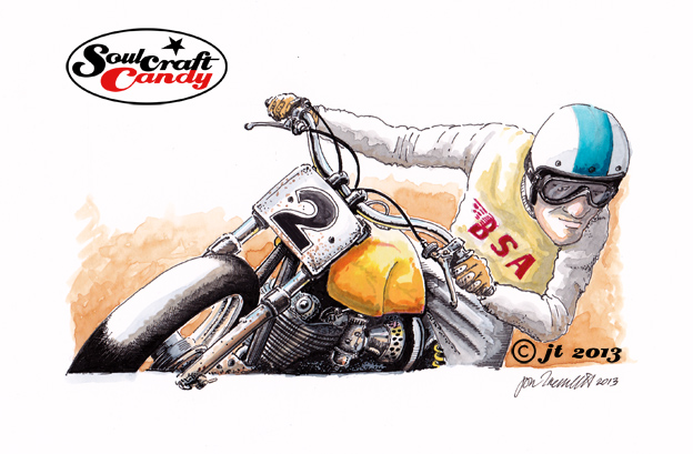
Here’s the picture from the previous post all inked up and finished. This is as far as I want to take it. In contrast to the previous version of this picture, the one with the yellow fuel tank, this one was done with a black biro pen, I was interested to see the difference, and it works quite well though I have to admit to preferring the much blacker lines of the previous version. A good experiment to try though, and for me validates the decision to push the slightly more cartoony style on these smaller pictures. Because biro pen has the ability to give such a variety of line weight and density it’s always tempting, and indeed a struggle sometimes not, to get all carried away with layer upon layer of shadowing and tone which confuses the drawing. The stark simple lines created using the technical pens work well with the colouration to keep the drawing in cartoon territory which is what I’m after with these. It is also helping me get over my biro addiction.


Of course it would be a simple case of going over everything a bit more with the pen to blacken things up but the essence of the picture is already there in my mind, and that would simply look like trying to emulate one kind of rendering style with another. You’ll notice that the boundary box is grey rather than black in an effort to bring a bit of softness to the holding device as well. There are some grey pens here which I’ll experiment with to try and find my ideal solution. So, I hope you enjoyed seeing this one finally. On to the next one. More again soon.


Challenge yourself, try something new.

70_Dirt_rider_1

An intrinsic part of the creative life is to challenge things. To challenge existing norms, preconceived notions, behaviours and expectations, as well as a whole host of other aspects of our existence. One of the most rewarding is when we challenge ourselves. Sometimes it is not important wether we succeed in this endeavour, but more so that we engage in the process as a learning experience. Developing new skills and learning new approaches is a key goal behind moving forward.


Last year was the year of the biro pen and I pushed myself as far as I could in finding and developing a technique that allowed me to express myself fully with that particular medium. I pretty much reached my limit and some of the resultant drawings, particularly the Cafe Racer series, were very rewarding to complete. Now don’t get me wrong, I’m not about to turn my back on all that work and take off in a new direction. Investing so much time and effort would be wasted if that were the case, and anyway doing these things is like playing a musical instrument, you have to keep your hand in shape through practice, so more will undoubtedly follow.


What is driving a fresh desire to push some other personal artistic boundaries this year showed its hand a bit towards the end of last year with the advent of more colour images. Again it was kind of pleasing to do them that way, essentially refining the biro pen technique and applying watercolour, but I couldn’t escape the fact that they were taking an enormous amount of time to complete. This year I want colour to play a larger part, but I also want to be more productive in the time available, to see more of the many ideas generated become finished pictures rather than footnotes in a pile of loose paper.


So the first approach is to work smaller and work faster, still incorporating many of the things like boxing and cropping explored last year, and to develop a punchy technique which works well with these new format images.


The Dirt Rider above is my first attempt. It is smaller, about 19cm across. I’ll be posting some more very soon and will tell you how I’m making them then. I sincerely hope you enjoy this one and those that are to come.


Daring to be different.

TT Racer

There were only a few lines to finish and a couple of pieces of text to finalise but getting them done took way too long. That said the TT Racer image is now complete and here it is. I’m pretty chuffed with how it turned out.

There are always an awkward few moments upon finishing an image when you have to push yourself to bring your critical eye to bear on it. The euphoria of finishing and regarding your completed work often promotes a kind of inner forgiveness where it’s comfortable to overlook things that perhaps you could have done better. So a good shove is required to jolt us into action. So here goes.

I would probably change the tank shape from the flared form shown to something more rounded to bring some extra lightness to the centre of the image. Tonally the bike and rider could be separated a bit more and while I was at it his face could do with a little less inking. It is a great relief to see the blue washed background giving the image a good degree of punchiness but, a bit more effort to make it less blotchy wouldn’t go amiss. I like text boxes but I’m not yet fully convinced. It will likely turn out that there are times to use them and times when it’s best to leave them out, it all depends. As a first stab at inking over water colour on rough paper I’d say this is something to keep working at for sure.

In that vein here’s a shot of the next one already started. You’ll notice that it is a slightly modified version of a previous drawing done in black and white a couple of weeks ago. I have changed some small details like the riders helmet and some bits on the engine to create some difference. For this one I thought I’d try and be a bit more bold with the colours, as you can see, to try and capture or express some of the more exuberant approaches that custom builders bring to their craft. No one ever said a frame had to be black after all. We’ll see how it goes, it should be fun, and I’ll be trying hard to benefit from all the little lessons learned from the previous drawing above.