Time to sell some prints.


A kind of hotrod.

So, another unscheduled gap in posting comes to an end, thankfully. Regularity and consistency remain difficult habits to develop but, this is very much a work in progress. It has been a busy time lately with much happening in the background, more about that in a moment, and the occasional distraction, for example a first time visit to Santa Pod raceway to see some drag racing and feed the imagination. All I can say at this juncture about that experience is that I have never heard anything quite as loud in my whole life. And spectacular too, despite it being a “nostalgia” meeting, much of the machinery looked anything but old or remotely passed its best.


What’s been happening in the background has been much more exciting though on a personal level. Prompted by a steady flow of positive comments, and encouraged to make something more of this drawing project I’m engaged in, it’s time for others to have the opportunity to enjoy the drawings as real things, beyond the virtual world on screen. As a result I am in the process of setting up a small internet shop through which you will be able to purchase high quality art prints of a selected group of drawings. I have been lucky enough to find a fantastic printer who I know I can rely on and whose attention to detail and quality of output are superb, so I am very enthusiastic about moving forward. The shop is not live yet but, getting this far has been an interesting journey through online service suppliers, low level brand fiddling, design, learning about print technologies, and cardboard tube sourcing. Currently the final details are being sorted out in readiness for the grand opening and are reminding me that there is no substitute for putting in the effort and getting it right first time. So the next couple of weeks is promising to be very interesting as things come together, and I will be posting regular progress updates as Soulcraftcandy enters a new era.


I have found a little time to do some drawing too. Not as much as I’d like but enough to keep the hand and eye in. Todays picture is a sketch in which I’m trying to do two things. The first is to draw at a slightly larger scale than before. This drawing is about 20 inches across, which is quite a bit larger than previous pictures and challenges my ability to make all of the proportional changes needed to jump up in size. Harder than it sounds.


Secondly I’m having a go at trying to concentrate the detail and tonal density of the drawing at the centre of the page whilst the outlying areas of the drawing fade away, and couple this with leaving the rider figure outlined but unrendered. The eye and brain, working together, have an incredible ability to complete an unfinished image, to fill in the gaps, if you can give them enough basic information to start with. This drawing may not be finished in the true sense of the word, but in another way it already is. In some ways it’s already a bit overdone but, finding that fine line between the two seems to be something worth spending some time trying to find.


Finally here is a very loose preliminary sketch for the above bike and I’ve got a funny feeling this isn’t the last time this one will be influencing another drawing. You will also notice the inclusion of a new logo, a small sign that things are changing. More about that next time. Watch this space.

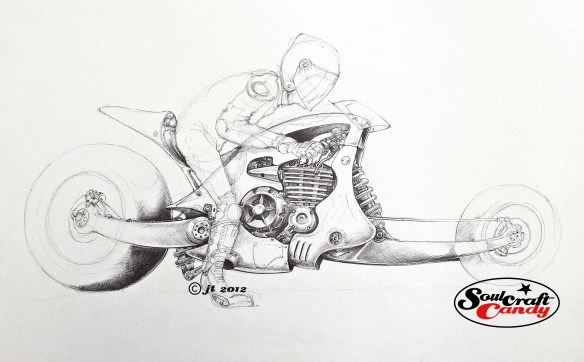
Hotrod sketch


Lining paper, a surprisingly good drawing medium.

This is a sketch for one of the remaining drawings that are left to do. This was done as a kind of experiment. It’s at least 60% bigger than any of the others for a start, which allowed me to be a little less precise with everything, and seeing what an increase in scale would look like proved a useful exercise. Sometime in the future it would be great to create some much bigger drawings and my first tentative steps in this direction are being taken now. As mentioned above it’s not significantly larger than any of the others but, creating it starts to give me a feel for what changes when you go up in size. How you deal with proportion, detail and tonal variation across the drawing. One also has to consider the implication on ones preferred medium. I’m not sure that working in biro across an A1 sheet or larger is going to be a fruitful or spirit crushing experience. Only one way to find out I suppose.


It’s drawn directly, no pencil rough out, on to heavy duty (1400 weight) lining paper, the stuff you stick on your walls at home to even out a wall surface before painting. It’s not good quality paper for sure but, it does have this kind of hard textured surface which works really well with a medium point biro, almost making it feel like using a pencil such is the subtlety of shading one can achieve. Being quite thick allows you to work into the paper a good deal to achieve the thick black areas but, the pay off is not the usual warping and distortion you get with other, albeit finer, papers.


Yes, it can be a bit scratchy and coarse but it’s great stuff, cheap as chips and comes on a roll, so you can cut sheets to any size. I would mention though that at first it was a challenge to get it to lie flat, at all. Leaving it under a pile of books for a couple of days didn’t work, so I ended up ironing it with a hot but dry iron and then left it in a pile under a couple of pads. Much better. This weeks top tip for ploughing through sketches without worrying about using up your expensive art shop bought sketch pads. I’m going to have a look at lighter weights of lining paper to see if the texture is different and check out how they perform. An update will hit the blog soon.


A change of scale.

It is most likely true that if you asked any creative person who produces stuff, if they just worked on one thing at a time, in a beautifully seamless procession of sequential order, they would likely say they did not. It seems to be in our nature to have as many things in the pipeline as we can manage, and then more. Our work spaces are doubtless littered with bits and pieces which remain unfinished, partially forgotten and “in development”. Our ability to accumulate projects is often quite astounding, and that’s before you even start talking about what’s in the brain bank, the unseen material hidden in the grey matter.

This is very much the case at Soulcraftcandy Mansions. Both the brain bank and endless pages of notebooks are filled with things that might be, one day. Sketches, doodles and diagrams all waiting patiently to be given life through some creative expression.

One such idea has been receiving such attention this week, small drawings in series. With the bigger drawings churning away nicely it was time to look at another idea for a while, to give my creativity a rest by way of a change of scale, pace and medium. Small drawings have always held my attention and this goes way back to when to being in a design studio and a winning idea would first appear in the corner of a page as a little thumbnail sketch. Of course the same thing happens these days but I’m now just as interested in the drawing as the idea it expresses.

The former situation would require enlarging the sketch and then investigating its potential as a design. Now the process is kind of reversed, rather than adding detail to the original sketch the process is reductive, what can be left out. The drop in scale really makes you think about what is the minimum required to get what you’re after. How do you compress all the complexity, mechanisms and complicated forms into a small space. Comic artists are consummate masters of this discipline. The hope is that it will refresh an appreciation for the details when returning to a larger format, but that might be hoping for too much.

Some might be tempted to sidestep this issue of detail by simply scaling down an already scanned drawing in Photoshop and printing it out, but that only gives you little dense balls of ink and not much else. So the idea was to draw as close to the required scale as possible to start with. Then, in the same way that we used to play with the photocopier all those years ago, it’s a question of cleaning up the image and changing the size until you’ve got something workable. Scanning, cleaning out unwanted lines, knocking back saturation levels and printing until I’m happy. Four of these images get gathered together and printed out in a 2×2 matrix on A4.

The old Epson A3 printer that’s sat here stopped doing beautiful ages ago but has a great ability for handling all manner of different kinds and weights of paper which my newer Canon is not that interested in doing.

This facility means that it’s also easy now to play with differing media on these different papers and, to play around with different colour combinations for the images. Colour crayons, inks and paints will all get a look in. So far it’s the crayons that have held my attention and the results are promising though there is certainly room for improvement. I’m using Derwent Studio crayons by Rexel Cumberland and they have a lovely soft waxiness to them, but they don’t stay sharp for long and laying on deep colour often requires you to labour them a bit. The paper too, is a bit coarse but picks up colour well so it will be a case of finding the right balance between these two attributes in order to get the desired level of intensity.

There are some liquid water colours ( Dr Ph Martin’s)sitting in a box on the shelf here. It will be interesting to see how they work on some fine surfaced water colour paper in the next experiment.