Seeing red.

The Traffic Light Special by Jon Tremlett for Soulcraftcandy 2013

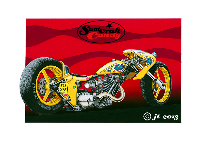
Applying the thousands of ink dots that make up the shadow areas in the “Slugger” picture featured in the previous post, got me thinking about what the image would look like if it was in colour. This short period of playful thought led to the creation of this second image based on the same drawing. It seemed like a fun idea to start by turning the bike into a street machine, but something built for short sprints like dashing between sets of traffic lights. So it needed lights, some different handlebars and a license plate, all fairly easy to include. It also felt right that it should be brightly coloured, a reflection of the exuberance of the activity it was created for.


So the main body of the picture employs the watercolour and pen technique used a good deal lately. I love the way it gives the pictures such a punchy look, almost jumping off the page and into your eyeballs. I so liked the dotted tyre shading from the last version I kept it in, contrasts nicely with the grey.


The bit I’m most pleased with though is the background, the bike really needed something big and bold behind it. I had a good fiddle in Photoshop before doing it, playing around with some ideas based around red, amber and green, the traffic light palette, but these merely made the whole thing look like some odd homage to Rastafarian culture. Needless to say they got dumped, too weird, too complicated, but the red element remained as it worked really well with the bright orange of the bike. This final version is simply primary red overlaid by a darker tint made by adding black. The background is air brushed using gouache paint. I covered the whole picture area with lo-tac film and cut around the bike very carefully with a craft knife, it always surprises me how little pressure is needed to cut the film so it pays to exercise the upmost patience. A solid red was then sprayed on and left to dry before removing the film. Another piece of film was then laid over and the lines for the wave forms were put on in very soft pencil. These were then cut out, again with a fresh bladed craft knife, and sprayed with tint made from the same red with some black added. Even though the picture already had a black ground line, the above process was repeated once more so that pure black could be sprayed on to give the gradient shading of the black area dissolving into the red. Challenging, messy and rather time consuming but the outcome is everything I wanted.


It’s called “The Traffic Light Special”.


Distractions, distractions.

Head_on_CafeRacer_©JonTremlett2013

Drawing and painting onto wood, drawing on metal with a Dremel, designing t-shirts, jewellery making, wood carving, sculpting, transferring images onto glass, painting rocks(!), etching, wire modelling, making enamel badges and resin casting. These are all ideas that have flown my way over the last few weeks. Whilst they are all valid, they are all residing in the possibilities box at present. Some are self generated and others come from those around me. Some arrive with the word ‘should’ tacked on the front somewhere, whilst others take a more open approach with the word ‘could’. I prefer the latter, it speaks of a freedom to chose, of open ended possibilities and creative potential, whereas the former does not, sounding often like a form of well meaning edict, but an implied command none the less. Anyway, there they all sit in the great lottery ball tumbler of options waiting for possible selection. While they are in there they churn around, the subconscious busy doing what it does best, sampling, analysing and interrogating each one in turn. I’ll report on what this process reveals in coming posts I’m sure.


This is a great thing but, my word does it create a mountain of distractions which have led to a kind of treacly inertia needing to be overcome each time the drawing board is occupied. I know that the best time to grab a new idea is when you can feel fired up about it, knowing that you will do something with it quickly rather than sit mulling it over. I can feel that moment coming but it ain’t today, or possibly tomorrow either. So in the meantime focus has returned to the drawings and paintings that have suffered from my neglect. The image above is where I’m at with a pen and watercolour rendition of one of those Rocker guys whose style seems to be popping up everywhere at the moment. Enjoy, and don’t forget, the store is open and has a limited stock of those greetings cards for anyone stuck for a gift for a biking mate.

Finally, with new followers arriving all the time, a big thanks to you all for your support and loyalty, it means a great deal and is a welcome spur to keeping going.


From blank sheet to finished picture – last part

84_Rollie

Finally, at last, eventually here is the finished picture, brought to you after some rather unexpectedly focused procrastination and first order dithering. Admittedly there was a good deal of fiddling about trying to get the right colour for the background block, but that’s no excuse. I knew I wanted a blue of some kind to provide a contrasting coolness to the yellow of the bike and getting the mix and density right was a bit tricky but finally something came together to give me the feel I was searching for. The liquid water colours I use behave in an unpredictable way when you start mixing them and then diluting the resultant blend. In this case you will notice that some of the pigments take to the paper almost instantly, creating areas of dark, or patches of mauve depending on the speed of your brush movements. The results are always a surprise therefore, but this is an aspect of the making process which rewards as much as detracts from one’s satisfaction upon completion.


So that’s six of these done with another three to do. I want nine in total for a little project I’m thinking about. I’ll be posting about that soon. Thanks for watching.