Keep it simple, stupid.

Cafe Racer cartoon from soulcraftcandy ©Jon Tremlett 2013

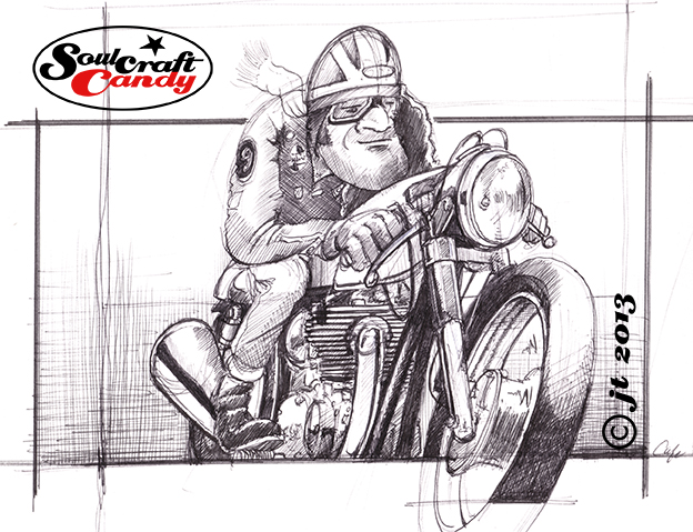
Ok, so I air-brushed it. Some may construe this as giving up, caving in and taking the easy way out, but I don’t see it that way. The concentric rings of colour idea was something I wanted to try, but knowing that it might not go according to plan, it was only common sense to have a solution tucked in the back pocket. Try as I might, I could not get it to work manually. The twin evils of watery paint and a shaky hand conspired to create a cringe making collection of patchy coverage and hopelessly imprecise curving lines. If it was a report card it would have had “Messy, must try harder” written large over it in red ink. I thanked myself for at least taking the trouble to try it out on a separate sheet of paper. 


I’m sure it might have been less traumatic if I’d tried it in acrylic paint, or mixed up house paints, as a good friend has since suggested. But I really didn’t want to make another trip to the art store to purchase even more stuff that I would have to find a home for in the now bulging shelves of the studio. 


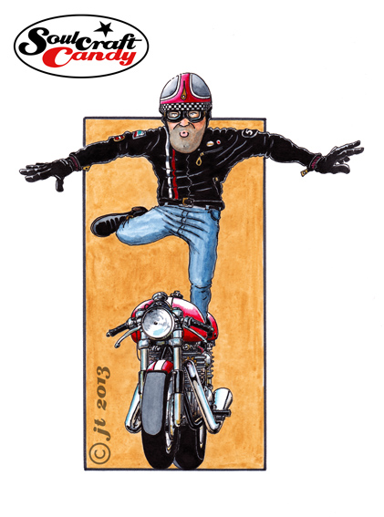
The air brushing was not without its moments either. Purchased many years ago to apply even coats to a rather expensive model I was making, the airbrush has spent most of its life in its box, venturing out occasionally to be fiddled with but never wealded as a precision instrument. As far as using it to create a picture, the last time I tried that was at art school thirty years ago, and the results were pretty poor even viewed through rose tinted specs. I’ve never bought a compressor, resorting to cans of air such is the infrequency of its use. Anyway, armed with some low tac Frisk film I set about carving the concentric lines with a scalpel to create pieces of removable mask. I had completely forgotten how difficult it is to replace a curving piece of film accurately onto the page and that any overspray on the surrounding mask adheres immediately to your finger tips and goes everywhere you don’t want it. Result: another shocking mess. Finally, realising that the KISS principal (Keep It Simple Stupid) was my only option I recovered the piece in another piece of film, cut around the drawing to reveal the background space, and sprayed the whole thing in one go with blue emanating from one corner and the yellow from another. All the film was then lifted off when it was all totally dry. Et voila, finished, and despite being the result of expediency as much as desire it looks pretty good considering. The compromise may not be ideal but it saves me from looking at a finished piece with the perpetual frustration of knowing that a simpler solution would have yielded a better result.


In between times.

Cafe Racer sketch ©Soulcraftcandy 2013

There always seems to be a kind of unintended lull between the end of one project and the commencement of the next. It’s a time of reflection yes, moments spent considering the quality of the recently finished work but, it’s also a period spent shuffling bits of paper around whilst ones butterfly mind flits from one thing to another in an attempt to decide on what to tackle next. I am coming to the end of one of these phases at present. Whilst every impression is given that this is somehow wasted time, much more has been happening in reality.


Previously I mentioned wanting to get the nine small colour Cafe Racer pictures made into cards. Well, I did and they turned out pretty well. Using an online printing service that did some business cards for me a while back, Moo.com, I elected to have a small batch printed. The advantage of services like this is that you can order very small print runs which keeps your financial exposure to a minimum as you test the water, as it were. I ordered twenty of each design, so twenty sets in total. I also ordered twenty five each of three greetings cards based on the black and white biro drawings done last year. The intention is to try and sell them via the Soulcraftcandy store on Big Cartel. Well, that was the intention, and it still stands, though a good friend who’s starting up a bike building workshop and store has just taken virtually all of my stock off my hands, leaving me with a few greetings cards. However these will hit the store soon.


Time has also been spent thinking a lot about making stuff, something I haven’t done for a while and need to do more of. There are some fresh t-shirts sitting here waiting for an introduction to some printed transfers of some of the drawings, just to see how they’ll come out and to spur me into developing some specific images for printing on shirts in the future. Two books from the library about working in precious metal clay sit on the shelf awaiting further investigation, though I have no idea if I possess any latent jewellery making ambitions, and I’ve been checking out the costs of various sheet metals because I’ve got some mad idea that it might be fun to try and draw on metal with a Dremel tool. So, not much whizzing round the grey matter!

Cafe Racer © Soulcraftcandy 2013

To keep the hand and eye in shape, a couple of new drawings are about to start too, the first of which you’ll see here in rough sketch and tuned up pencil versions. I’ll try an ink and wash version, perhaps a biro one and, having just found an old dip pen in the drawer, perhaps an old fashioned inky thing. Time to get cracking.


Tail end Charlie.

Cartoon motorcycle art by Soulcraftcandy

“Come in No. 9, your time is up”!


So let’s hear it for No.9, the last one in the series and called Triumph Wings. Try as hard as I might, it wasn’t really possible to complete the group without doing one with a standing figure and in portrait format. I’ve mentioned before wanting to have nine of these pictures for a reason, and that reason is that I wanted to subsequently see what they would look like arranged in a 3×3 grid as a single image. At least with this one I know where it will go in the grid, in the centre as it’s the only one in portrait. Putting that collective image together, in Photoshop most likely, won’t be easy as there are all slightly different in aspect ratio so turning them all into some kind of square format will need some thinking about.


This one was a bit more tricky than some of the others, I had to redraw the figure a few times to get the posture how I wanted it, and there was more than one moment spent standing in front of a mirror with one leg stuck out trying to figure out the way denim jeans fold in that posture. The things we do for our art eh? The bike proved far simpler, being a head on view and so fairly light on detail.


The plan now is to have a small number of these printed as cards and offer the collection through the Soulcraftcandy store. That will be very soon so I’ll let you know the minute they are available, it will be soon. Watch this space.