The right way to go.

Just when you think you’ve got a strong idea in your mind it has to be admitted by this scribbler that my minds ability to create an image is far more polished than my hand/eye combo. Full of a new found confidence and a belief that I’d finally started to crack a nut that had been bothering me for some time, I leaned back and presumed things would just flow out. No, it was a lot harder than that. Sketch after sketch after sketch. Locked into a kind of one man battle with a pad of layout paper I just went round and round in circles. Over a cup of desperately needed coffee I laid everything out on the floor and had a think about what I was doing. Doing this is such a great way of seeing where you are with a project and a practice ‘d completely neglected to incorporate into my working.

By turning over all of the skamps that I felt weren’t going anywhere I ended up with three or four which showed promise. I rarely throw any drawing away, no matter how crappy, you never know what you might see in them on another day with fresh eyes. So I had a pile of duds and a select few to work on further.

I stuck with pencils and layout paper. One has a beautiful progressive nature to it, in that it allows you to press as softly or hard as you wish and the line quality is a direct reflection of your actions and, the other is opaque enough for a good background but thin enough to allow you to place drawings underneath the top sheet and trace through. The two sketches in this post are preliminary drawings for others that I’ve now done in ink.

Because I’d been thinking about context and how to create it in the drawings I’d decided to always draw a rider on board unless he’s close by doing something to the bike and it’s stationary. I kind of thought that that, and the attitude of the bike in the picture would be enough to keep me going for now and that I’d worry about fuller backgrounds later on. I wanted to master drawing the bikes first. I also wanted to try and find a style of drawing that was comfortable and more importantly, repeatable, in the sense that layout and other elements would come more naturally rather than feeling forced in any way.

A new direction.

Finishing the big drag bike drawing was a kind of watershed moment. I had a strong feeling that I didn’t want to do full colour images just yet, which I’ve covered in previous posts. There was also something else bothering me about it. It had elements to it that ticked the right boxes as far as content was concerned; the exaggerated engine, slightly extraordinary profile, big wheel(s) etc. But it lacked other things too. Straight off it was an image that said “bike as object”, not what I was after. It also lacked any context or connection to anything and a human element. Without a rider, or a place to go and do what it does, a bike is just a collection of parts that remain inert. What I wanted to get into the drawings was some of that action, some dynamism and direction.

I put away all my previous sketches and took out a fresh pad, a pencil and started again. the drawing above is what came out.

Now this is more like what I was after. Apart from the fact that drawing in soft pencil was an absolute pleasure, the drawing is starting to encapsulate the elements that had up until now eluded me. Putting a rider on the bike brings a fresh perspective and gives the image some new found purpose. It acts to lend a much needed sense of scale to the image and presents me with a whole host of small details to play with to influence my reaction to it. Facial expressions, arm and leg position, outfit and pose all come into play. It’s still elevational but I’ve started to bend the viewing plane to give some perspective to the extremities of the wheels. This bending, as if looking at the whole thing through a wide angled lens, also starts to give the feeling of motion.

It’s still a cartoon, which is a good thing, just a much better one than I’d been doing before. It gave me a huge spur to push things more into this new direction.

Tmts-The last part.

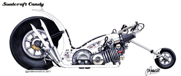
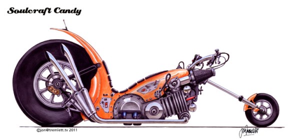
With the metal parts done I still had no idea what I was going to do about the bodywork colour. I knew that I wanted it to be bright, but I also wanted it to be right. By deciding to apply colour to the wheels and other smaller details I thought I’d be able to postpone making up my mind a bit longer and that the presence of these other pieces of the drawing would give me some indication of which direction I wanted to go in.

The wheels are a big part of any bike drawing. As much as any other part they lead the eye in emphasising any perspective used,can give an image direction and motion, and anchor the drawing to any ground plane. They are also, or can be at least, big blobs of colour. In this case there’s no perspective to worry about so their main function is to complete the drawing and ground it.

We perceive tyres as being bklack but in reality they are anything but, ranging from almost white highlights to virtually black  in the shadows. I like to keep these things simple and so chose to start with black, for shadows etc and then applied white to give gradated greys and lend the tyre some basic form, nothing more.

And now the time for the bodywork.

Orange, definitely orange I’d decided. A bright, fast colour that makes me think of sport, racing and speed. It’s a great colour for bikes, think KTM and Kawasaki. Wanting to build it up slowly I applied it with colour pencil, and quickly realised that Bristol Board requires quite a bit of pressure to build up a good layer. Finally doing the exhaust and inserting a fat ground line finished it off.

I’m quite pleased with the result given that it’s a fairly simple image. I could fuss over it for another hour or so but I’ll leave it as it is for now. The colours worked ok in the end and lend the drawing a bit of that “punch” that lifts it off the page. But it’s what is not there that slightly bothers me. It’s a contextual thing, the lack of a background or other device holding it back. In all my subsequent drawings this is something I’m still figuring out.

I could have, of course, avoided a great deal of this mucking about by simply scanning the black line drawing into Photoshop and just playing around for a while. But I decided not to. There are a number of reasons for this. Firstly I find it’s too easy to create something on screen and then be utterly unable to repeat it on paper,  colour matching being a perfect example of this. Also, the texture of the paper can have a quite strong influence on the colour medium that is applied to it, and I find it utterly laborious trying to replicate this on screen, especially when all I’m doing is having a quick look at how something might look.

Secondly, and this is a process issue more than anything, I find it burns up my time and plonks me squarely in left brain mode when all I want is to be in right brain, creative mode for a bit longer. Left brain is the logical half of the partnership and I find it starts to restrict my thoughts and actions, particularly when I’m working on a drawing. Perhaps I have yet to learn how to be truly creative with a computer program, but I find even the simplest of menu sequences takes me into left brain territory and keeps me there like some kind of hostage. I’m sure this is a subject that I will return to a lot more later on.

In an earlier post I mentioned that I felt like I’d gone too far with full colour and wanted to draw more before getting into all that. So from this point onward I went back to monochrome, pencil or pen, in an effort to get myself drawing more and thinking about colour less.