Background noise.

As mentioned before on the blog there are always things going on in the background while work on the larger finished drawings is progressing. Sometimes this takes the form of working sketches which will form the basis of larger works, at other times they are small drawings that are used to practice techniques or develop an idea.

Above are a small group of what are known here as bikeheads. Invariably the larger drawings contain a character or two and it is often a challenge to get them looking right for the given context that they find themselves in. Finding the correct pose and body shape is never simple and the same goes for facial expression, and how this reflects the characters personality. The former are dealt with purely through sketching out varying forms but, the latter is harder, especially when you realise that even the slightest variation in line can change a facial expression completely. So as an aid to get things going I have started a kind of character bank in which to keep all the doodles of heads and faces that appear through the sketch sheets. It will then be easier to have a look through and find some inspiration when it’s needed. Adding some colour to these helps to bring out the character and keeps my colour pencil technique up to scratch too if it’s not being employed elsewhere.

Which leads me neatly onto this second group. Back in December a post contained some small groups of varying bike styles I was playing with at a reduced scale. Those had been completed in crayon and ink. These above were done purely to see what would happen if they were done using liquid inks and watercolours. To find out how intense the colours would be and how much of the detail could be held  given the very liquid nature of the medium and the coarser paper used. Very fine Rotring pen has been applied too, to firm up[ the outlines and add extra black where desired. The paper was fine for the paints but proved to be a bit too “wooly” for the finer stuff subsequently done with the pen. Next up will be a test on harder paper.

Some say you can’t learn to draw from a book. This may be so, or not, but a couple of really useful books I refer to regularly are Action Cartooning by Ben Caldwell, here, and Cartooning The Head & Figure by Jack Hamm, here. Both are invariably out on the desk when character sketching. Neither will teach you a style but, both will inform whatever your personal style may be. Great books.


Scribbles.

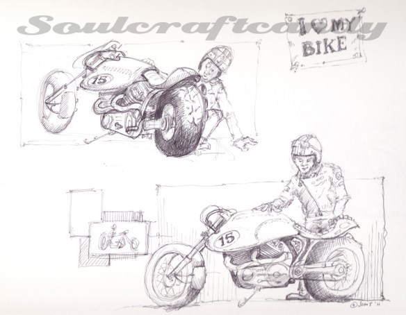
Despite much evidence to the contrary it is still a feature of the drawing activity (for me anyway) that one finds oneself staring blankly at a clean piece of paper without the slightest notion of what to put on it. You find yourself a bit stuck. Somewhere back in the annals of the blog this subject has probably already been mentioned, but the other day it happened again and a long forgotten way to get round it emerged from the deepest recesses of the ol’ grey matter.

As a child, art class at junior school was always something to look forward to with relish. as a consequence we needed absolutely no encouragement to throw ourselves head long into cramming the available paper sheet with images. It was as if our naivety gave us a courage to overcome any fears we may have harboured about subject matter, scale, detail and colour in our image making. The sheer joy of being creative for an hour or two gave us the energy to be unconstrained by any and all compositional constraints. What a lot of fun it was but, sadly it wasn’t the same for everyone and things don’t stay this way for ever. In fact I remember certain kids who suffered being utterly intimidated by a blank sheet of paper or a full palette of paints. Gregory King wasn’t one of them though, oh no, he knew exactly what he was going to paint or draw every time, a big red racing car. The bigger and redder the better. These remained a bedrock of Greg’s creative output for as long as I knew him. When charged with the task of rendering a nativity scene he would find a way to squeeze a big red racing car in there somewhere. We could analyse Greg’s fascination but I digress. The essence of this is that he had found a way to never be short of an idea.

As we learned more and knew more, our creativity changed too. The free flowing rampage across the paper of pencil, charcoal and paint fell victim to learned concerns about proportion, composition and fidelity of colour. It was as if a pendulum was swinging towards its other extreme and would culminate in either total mastery of ones medium or the frozen wastes of the blank sheet of paper. For any of us who’ve accessed our artistic creativity for most of our lives, learning to steer the pendulum towards the former outcome rather than the latter is a lifelong challenge which we confront relatively frequently. Moments of absolute flow are matched by others of a kind of creative block. Only we ourselves can solve the problem and navigate these moments. These strategies are not hard to learn, the challenge lies in finding those which work for you and remembering them when needed.

For some all it takes is simply making a mark on the paper, drawing a random line to get you going. For others it starts with an inky fingerprint or a splash of paint. Some people choose to merely copy something to get the process started. The sketch at the top of this post began with a personal favourite, hovering over the paper with a pen and gently touching the surface as the hand engages in a random series of movements. In a way it’s just like starting with a random line but feels very different and prescriptive. Anyway sooner or later something begins to appear. It doesn’t take much and off the imagination goes down some path. As the sketch emerges I maintain this hovering approach with the pen and move around the drawing adding bits here and there, slowly building elements and detail. Using a pen means not being able to erase anything, which has interesting side effects and introduces a gentle kind of discipline to the process. Though having said that, the slightly non-comital nature of line creation helps to keep the whole thing a bit more fluid. This more scribbly way of making an image is quite liberating and definitely helps to loosen up the mind as well as the hand.

In a way the drawings created are never really finished, you can stop whenever you choose to, and this lends them a liveliness often lacking from more formal sketches and drawings. Their quality might only be appreciated through the eyes of the beholder, but if they’ve unlocked the block then their purpose is complete. Here’s the next sketch that popped out straight after the one above.

A change of scale.

It is most likely true that if you asked any creative person who produces stuff, if they just worked on one thing at a time, in a beautifully seamless procession of sequential order, they would likely say they did not. It seems to be in our nature to have as many things in the pipeline as we can manage, and then more. Our work spaces are doubtless littered with bits and pieces which remain unfinished, partially forgotten and “in development”. Our ability to accumulate projects is often quite astounding, and that’s before you even start talking about what’s in the brain bank, the unseen material hidden in the grey matter.

This is very much the case at Soulcraftcandy Mansions. Both the brain bank and endless pages of notebooks are filled with things that might be, one day. Sketches, doodles and diagrams all waiting patiently to be given life through some creative expression.

One such idea has been receiving such attention this week, small drawings in series. With the bigger drawings churning away nicely it was time to look at another idea for a while, to give my creativity a rest by way of a change of scale, pace and medium. Small drawings have always held my attention and this goes way back to when to being in a design studio and a winning idea would first appear in the corner of a page as a little thumbnail sketch. Of course the same thing happens these days but I’m now just as interested in the drawing as the idea it expresses.

The former situation would require enlarging the sketch and then investigating its potential as a design. Now the process is kind of reversed, rather than adding detail to the original sketch the process is reductive, what can be left out. The drop in scale really makes you think about what is the minimum required to get what you’re after. How do you compress all the complexity, mechanisms and complicated forms into a small space. Comic artists are consummate masters of this discipline. The hope is that it will refresh an appreciation for the details when returning to a larger format, but that might be hoping for too much.

Some might be tempted to sidestep this issue of detail by simply scaling down an already scanned drawing in Photoshop and printing it out, but that only gives you little dense balls of ink and not much else. So the idea was to draw as close to the required scale as possible to start with. Then, in the same way that we used to play with the photocopier all those years ago, it’s a question of cleaning up the image and changing the size until you’ve got something workable. Scanning, cleaning out unwanted lines, knocking back saturation levels and printing until I’m happy. Four of these images get gathered together and printed out in a 2×2 matrix on A4.

The old Epson A3 printer that’s sat here stopped doing beautiful ages ago but has a great ability for handling all manner of different kinds and weights of paper which my newer Canon is not that interested in doing.

This facility means that it’s also easy now to play with differing media on these different papers and, to play around with different colour combinations for the images. Colour crayons, inks and paints will all get a look in. So far it’s the crayons that have held my attention and the results are promising though there is certainly room for improvement. I’m using Derwent Studio crayons by Rexel Cumberland and they have a lovely soft waxiness to them, but they don’t stay sharp for long and laying on deep colour often requires you to labour them a bit. The paper too, is a bit coarse but picks up colour well so it will be a case of finding the right balance between these two attributes in order to get the desired level of intensity.

There are some liquid water colours ( Dr Ph Martin’s)sitting in a box on the shelf here. It will be interesting to see how they work on some fine surfaced water colour paper in the next experiment.