In between times.

Cafe Racer sketch ©Soulcraftcandy 2013

There always seems to be a kind of unintended lull between the end of one project and the commencement of the next. It’s a time of reflection yes, moments spent considering the quality of the recently finished work but, it’s also a period spent shuffling bits of paper around whilst ones butterfly mind flits from one thing to another in an attempt to decide on what to tackle next. I am coming to the end of one of these phases at present. Whilst every impression is given that this is somehow wasted time, much more has been happening in reality.


Previously I mentioned wanting to get the nine small colour Cafe Racer pictures made into cards. Well, I did and they turned out pretty well. Using an online printing service that did some business cards for me a while back, Moo.com, I elected to have a small batch printed. The advantage of services like this is that you can order very small print runs which keeps your financial exposure to a minimum as you test the water, as it were. I ordered twenty of each design, so twenty sets in total. I also ordered twenty five each of three greetings cards based on the black and white biro drawings done last year. The intention is to try and sell them via the Soulcraftcandy store on Big Cartel. Well, that was the intention, and it still stands, though a good friend who’s starting up a bike building workshop and store has just taken virtually all of my stock off my hands, leaving me with a few greetings cards. However these will hit the store soon.


Time has also been spent thinking a lot about making stuff, something I haven’t done for a while and need to do more of. There are some fresh t-shirts sitting here waiting for an introduction to some printed transfers of some of the drawings, just to see how they’ll come out and to spur me into developing some specific images for printing on shirts in the future. Two books from the library about working in precious metal clay sit on the shelf awaiting further investigation, though I have no idea if I possess any latent jewellery making ambitions, and I’ve been checking out the costs of various sheet metals because I’ve got some mad idea that it might be fun to try and draw on metal with a Dremel tool. So, not much whizzing round the grey matter!

Cafe Racer © Soulcraftcandy 2013

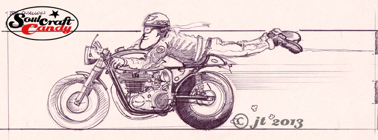
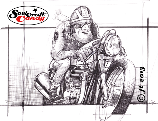
To keep the hand and eye in shape, a couple of new drawings are about to start too, the first of which you’ll see here in rough sketch and tuned up pencil versions. I’ll try an ink and wash version, perhaps a biro one and, having just found an old dip pen in the drawer, perhaps an old fashioned inky thing. Time to get cracking.


Advertisement

From blank sheet to finished picture – part 1.

With five of the small Cafe Racer colour pictures done and posted there is one left to do which will complete this set. Rather than merely post up the final finished version of it I thought it might be interesting for people to see more of the process I go through when creating these images. So for this one I’ve scanned the various stages as I complete them.

Norton_biro_1

The first step, once the overall composition had been decided, happens on the newsprint pad where I rough out a couple of sketches to get a feel for what I’m after. Often this involves sketching it out a couple of times as in this case. The first sketch is really just  about working out the proportions, rider position and the general look of the bike in the image. Once you’ve got something then you’re in a position to make changes as you see fit.

Norton_biro_2

So with this done, I decided that I wanted a slightly different looking bike and to move the rider up the tank a bit, good reason to do another sketch. I wanted to base this drawing around a twin cylinder Norton and a quick search on the net yielded the right picture which could inform me about engine details and other bits and bobs. I can now start to work these into the drawing.

Norton_pencil

With these two sketches done there is enough information on the sheets to allow me to transfer the image onto the A4 Bristol Board for the final version. This is where my handy little light box comes into its own. If there is a need to blow up or reduce the sketch size for this stage then it is simply a matter of printing out a quick scan at the right size before hitting the light box. For the pencil stage I need a good point to the pencil so use a 2mm leaded technical push pencil, with an H grade lead, which keeps a point well and isn’t so hard as to leave big grooves in the paper when you erase it. Most of the drawing is done freehand though I resort to my ellipse guides to get the wheels nice and tight. At this stage I’m building in all of the details gleaned from reference pictures like the engine case shapes, cylinder head position and brake details. I love density in these drawings so put a lot of effort into distorting things slightly and filling in all of the big gaps that normally exist when looking “through” a motorcycle. It’s also a good time to get all those tiny details in. I don’t necessarily need accuracy here but I do like things to be reasonably believable, if that makes sense. With the bike and rider done, I loosely put a box around it which will approximate the background block. By the time this pencil layout is done, my mind has already started to think about what colour to paint the bike, the riders helmet design and the background colour. Time to get the brushes out and a look at the various painting and inking in the next post.


It’s certainly quicker.

Dirt_rider_2_ufd

In the last post I talked about trying some news things and challenging myself to develop some new techniques and practices. It is hoped that this will inject something fresh into the drawing process, to keep the old brain stimulated and create some funky images along the way. Though probably a needless concern, it has always been important for me to ensure that I never get bored with what I’m doing, that it become repetitive to the point that I’m reluctant to engage with it, and above all, it should remain fun with a capital “F”.


One of the best ways I’ve found to keep the fun factor going is to have a group of styles and techniques which I can swap between. Someone asked me not long ago wether I had a signature style and I found the question quite hard to answer, it made me go away and think about it. Eventually it occurred to me that I most likely, or literally, did not, but I did have a style in the way that I drew the subjects, how I represented basic forms and shapes. What caused the feeling of uncertainty in hearing the original question was that the way in which I subsequently rendered each image, be it in biro pen or coloured ink etc, could be very different, and so some final pictures vary greatly from others in their final look. There are probably those who would suggest that it’s important to develop a signature style but I prefer the variety that a group approach gives you. The point being that I believe it’s vital to keep interested in your work and never be afraid of the freedom experimentation affords you. Long may it last.


So here’s the second picture in my quest for more productivity and fun. This image shows it half done. Here the basic pencil outline is gradually filled using very thin layers of watercolour and coloured ink. By building the image slowly it offers the opportunity for some interesting overlaying of the pigments, and varying the tone across the details. These are being done on Bristol Board which doesn’t behave anything like watercolour paper, it’s smooth and flat to start with, doesn’t buckle so you’ve no need to stretch it and the paint dries very quickly. I love my watercolours but endlessly waiting for bits to dry enough before applying the next colour without risking it all melding together can be a little trying at times. As I said this is a relatively quick way to do it. Once I’m happy that I’ve got most of the colour down, the whole thing is redrawn in ink. I’ll show the final inked up picture in the next post.