New in the store today.

Soulcraftcandy greetings cards ©JonTremlett2013

Hot off the press, some of the new greetings card designs are now available in the Soulcraftcandy Store along with accompanying larger prints of the three images and an old favourite. So, if you’ve ever had a problem finding an appropriate card for that biking friend or relative and always come up short, then here could be a solution for you.


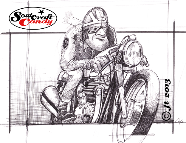
The three card designs in this first foray are from the Cafe Racer series of biro drawings completed last year and among my favourites. They have been digitally printed on heavy card stock with a matt finish to lend them some quality. They are A6 in size which works pretty well and helps me to offer them at a competitive price for a pack of three. Go take a look even if you’re not in the market, I’d welcome any feedback you’ve got.


The images on the cards are also offered as larger A3 and A2 fine art prints for those who feel like owning or giving something a bit more unique, and these are limited edition this time around, with a run of 250 prints in each size for each image. As I may have mentioned before these are Giclée prints of archival quality, fade resistant and on heavy stock acid free cotton paper.


That’s it for today, though I’ll leave you with a glimpse of something I’ve been fiddling with whilst I’ve been thinking about what I could put on a t-shirt. It’s just a sketch, but it could lead somewhere.

Soulcraftcandy sketch by Jon Tremlett


In between times.

Cafe Racer sketch ©Soulcraftcandy 2013

There always seems to be a kind of unintended lull between the end of one project and the commencement of the next. It’s a time of reflection yes, moments spent considering the quality of the recently finished work but, it’s also a period spent shuffling bits of paper around whilst ones butterfly mind flits from one thing to another in an attempt to decide on what to tackle next. I am coming to the end of one of these phases at present. Whilst every impression is given that this is somehow wasted time, much more has been happening in reality.


Previously I mentioned wanting to get the nine small colour Cafe Racer pictures made into cards. Well, I did and they turned out pretty well. Using an online printing service that did some business cards for me a while back, Moo.com, I elected to have a small batch printed. The advantage of services like this is that you can order very small print runs which keeps your financial exposure to a minimum as you test the water, as it were. I ordered twenty of each design, so twenty sets in total. I also ordered twenty five each of three greetings cards based on the black and white biro drawings done last year. The intention is to try and sell them via the Soulcraftcandy store on Big Cartel. Well, that was the intention, and it still stands, though a good friend who’s starting up a bike building workshop and store has just taken virtually all of my stock off my hands, leaving me with a few greetings cards. However these will hit the store soon.


Time has also been spent thinking a lot about making stuff, something I haven’t done for a while and need to do more of. There are some fresh t-shirts sitting here waiting for an introduction to some printed transfers of some of the drawings, just to see how they’ll come out and to spur me into developing some specific images for printing on shirts in the future. Two books from the library about working in precious metal clay sit on the shelf awaiting further investigation, though I have no idea if I possess any latent jewellery making ambitions, and I’ve been checking out the costs of various sheet metals because I’ve got some mad idea that it might be fun to try and draw on metal with a Dremel tool. So, not much whizzing round the grey matter!

Cafe Racer © Soulcraftcandy 2013

To keep the hand and eye in shape, a couple of new drawings are about to start too, the first of which you’ll see here in rough sketch and tuned up pencil versions. I’ll try an ink and wash version, perhaps a biro one and, having just found an old dip pen in the drawer, perhaps an old fashioned inky thing. Time to get cracking.


No.8 and a trip to the Tate.

Matchless cafe racer by Jon Tremlett

This is number eight, the penultimate picture in this series and for me one of the best ones. Finding that the limits of my embedded knowledge were being reached I had resorted to flicking through one of the many reference books here in an attempt to top it up a bit. I find with great books that each different viewing often reveals a new set of surprises. In this case a lovely picture of an old Matchless jumped off the page and at once demanded to serve as inspiration for this picture. As with all these drawings the final picture is never really a true rendition of the reference, they all get pushed and pulled about a fair bit to suit the original vision, but this one’s got a bit more truth behind it than some. One detail in particular stands out, and is one that reveals how an utterly simple approach can be just as effective as a far more complex solution to the same problem. The simple curving shadow line along the fuel tank, to delineate reflection, very clearly says “polished metal” without the need to apply any more shapes, shadows or colour areas. A triumph of less being more, and oh so simple.


Yesterday I was lucky enough to get a ticket to the Roy Lichtenstein retrospective currently running at the Tate Modern Gallery in London. Although a fan of various aspects of Pop Art, I’d never really considered any of his work other than the large comic format pictures repeatedly paraded in front of us like Whaam! So it was very interesting to see a much more varied collection of pictures across a number of periods which followed the development of his unique style and approach. From his early experiments with abstract expressionism, through flat graphic interpretations of objects and on to landscapes inspired by chinese scroll paintings, with a fair bit of work in between, it proved an enlightening journey through the canon of an artist many might dismiss as a one trick pony. The landscapes and seascapes in particular, were both surprising and stunning, his Benday dot screen technique combined with some fantastically bold colours producing images that were both strangely mechanical and oddly dreamy at the same time. If you are  anywhere near London and the show is still running I would recommend going to see it. Rumours of ticket non-availability proved wrong, we got some without any problems. It’s on until May 27th.