Double helping.

74_French_cafe

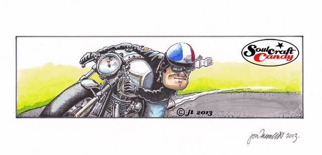
It is the weekend and what better way to celebrate a couple of days free from the grind of the working week than to post a double helping from the Soulcraftcandy studio. This first one is called “French Cafe”, for obvious reasons, though it was not my original intent to make a specific gallic reference when applying the colours, which I attempted to limit the number of. Perhaps it’s because I was thinking about our friends Veronique and Chris whom we are visiting in Bordeaux in April, who knows.


I don’t seem to be able to stop myself from drawing these old style rocker guys, I’m not sure exactly why. That said I’ve always admired the paired down nature of the bikes and the almost iconic look of the guys who ride them. As well as the structural and visual appeal there is also some emotional appeal too. Some might consider the whole scene a little hackneyed these days but this can not deny the fact that it has endured, and so remains a rich source of inspiration.

75_Burnout

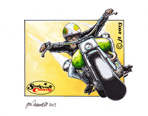
The second image is slightly different. During the idea churning sessions it became clear that certain groups and themes were emerging, large amounts of smoke was one of them. The dynamism of a smoking tyre is a unique thing but in my experience quite difficult to capture, I have pretty much failed on all previous occasions. Now seemed like a good time to try once again to get some proficiency in their rendering. The shading on this one was attempted with an airbrush and only partially succeeds, the rest I’m happy with and I like the idea that the front wheel is somehow prevented from moving by the line of the boundary box. It’s called simply “Burnout”.


Experiment and learn.

73_Big_Green

These small images are really coming along thick and fast, well, relative to the time it takes to do the larger ones anyway. The working title for this one is “Big Green” for obvious reasons and every time I look at it I’m gladdened by the brightness of the colours. Being a head on view there wasn’t the complexity of an engine to carry the detail so it needed to be found somewhere else. With such big tank bulges showing I thought it would be fun to see if detail could be included in the reflections shown. It’s only a small image so there’s not that much room but I managed to get some in.


These smaller pictures are a lovely canvas to experiment on, the technique is quick and you can try things out without worrying about wrecking a picture you’ve spent weeks working up. The process also teaches you what does and doesn’t work, and you can then apply that learning to bigger pictures when they come along. I’ve always found reflections tricky, so this is a really unthreatening way to get a bit more familiar with them.


Keeping it punchy.

72_Desert_repairs

Ok, so here’s the next one in the now growing collection of small pictures coming together here in the studio. This one is lifted from one of the worksheets done a couple of weeks ago. There were a couple of characters sat behind the bike in that version but I decided to take one of them out and slightly change the context of the picture.


These are proving really fun to do. It’s not just the drop in scale and the subsequent shortening of making time that provides the pleasure, as much as the change in approach to the punchiness of the colours and handling a different level of detail. It is logical to think that going smaller should also mean going simpler, and I would agree to some extent, though I would also argue that if you take too much away you risk losing something, be it the attention of the viewer or the impact of your picture. With less area of paper to accommodate the image one must work that little bit harder on maintaining a level of detail that still makes the image interesting to look at, hence all the little stickers and badges, and possessing an impact in some way, hence the use of bright colours. These are after all fun images of fun subjects, and so to me it pays to put the work in to help them jump off the page.