From blank sheet to finished picture – part 3.

Norton_wash3

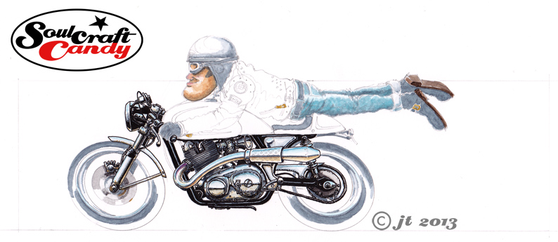
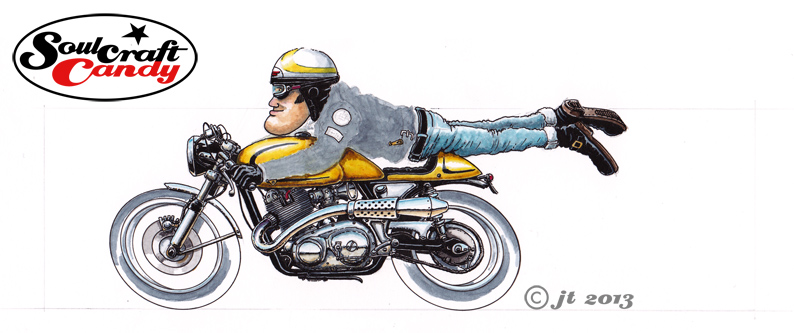
The next stage in the application of colours to the picture is probably the most nerve wracking and delicate, though it is hugely rewarding when completed to ones satisfaction. Although in your minds eye you feel you can “see” exactly how you want things to to turn out, the reality is that one is merely aiming at achieving that vision, as actually it’s not at all clear until you’ve put paint to paper, and sometimes by then it is too late to make a change. You have to kind of feel your way towards your goal. I’d decided the bike should be a golden yellow colour. The first stage is to put some shadow tones onto the areas that require them like lower edges and vertical faces. With these you have to think what colour the yellow would be in shadow as these things are invariably never a case of simply adding black or grey to your base colour. In this case doing that would make everything a dirty green colour, not good. So using small quantities of darker ochres and browns these areas are touched in and left to dry. Having decided on highlight size and position it’s time for the yellow, applied in a thinned wash to start with and then built with some less diluted colour as the from appears. Knowing when to stop is as much judgement as experience, so slowly, slowly, catchy monkey as they say. The yellow on the helmet follows and then finally the base layer for the leather jacket making sure I leave clear all the small details I want to stand out in the finished picture.

Norton_ink3

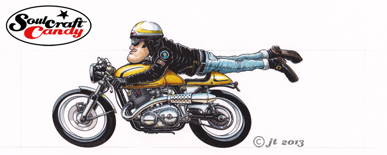
When all the above is fully dry it’s time for the last of the inking stages. Using a fatter pen than usual, a 0.5 point, the tyres are done first, leaving hard edged areas for the highlights rather than a more messy looking feathered edge. Back to a fine pen and the jacket comes next where it’s very much a case of working slowly down or across the shape, again leaving small slivers of grey to denote highlight areas where the leather wrinkles. You could argue that areas like the jacket should be more gradated and “realistic”, but if you do that then the rest of the picture doesn’t “fit” and you end up having to apply the same approach to everything. All that’s left to do now is add any small colour touches into any helmet and jacket badges, the spark plug cap and small reflections of the yellow that appear on metal parts facing the coloured area. A final tickling process takes some time, constantly scanning the image for little white gaps and spots where a bit more colour or black is needed, but it serves to lift small parts of the picture that you perhaps didn’t see before.


The picture is now nearly done, all that remains is to choose the right colour for the background block, one that gives enough contrast with the bike colour but doesn’t drown the image in the process. That’s all in the next post, see you then.


From blank sheet to finished picture – part 2.

Norton_wash1

In the last post I showed how I create the base drawing for one of the small colour images I’ve been making recently. Now it’s time to take a look at how the colour and ink go down onto the paper. There is no right or wrong way of doing this, we are all individuals after all and our working methods all differ accordingly, but this is how I do it. There are about seven steps involved, and they pretty much alternate between applying colour washes and inking in. I have a preference for building the image from the centre outward so this is where I start, engine, chassis and other cycle parts.


Greys go down first, in this case Payne’s Grey, slowly building up in layers to give shadow where I want it, form where I need it and a backing for black areas which may contain a high or low light. Using a very small brush with barely any paint on, things start to take shape. There is a strangely imprecise precision to the process. Next come the smaller areas of browns, ochres and blues which begin to define the ground and sky reflections on the various metal parts. I leave the exhaust for now as I find this easier to do later, working within the confines of the outline after it has been inked in.

Norton_ink1

With the core of the image coloured, it’s time for the first pass with the technical pen, and being an old fashioned kind of bloke I’m still very fond of a good Rotring pen, in this case a 0.25mm nib width. The tightening of the detail that this achieves also has the benefit of allowing you to see where you may need to apply a bit more colour, or even a different colour, to an area which needs a bit more punch. You’ll notice I’ve also applied wash to the front and rear brake areas in this step to put myself in the position where the core of the bike is very much done. The frame rails, which were washed all in grey are now mostly black apart from a highlight line and I’ve applied solid black in selected areas to bring other details to the fore and create some depth.

Norton_wash2

This second wash stage involves getting the rider figure underway and laying the base colour pieces to the wheels as well as getting that tricky curving exhaust sorted out. As with the frame I put grey on the wheels and tyres in the places where I know I’ll leave gaps in the black of the ink, and apply this same method to parts of the rider like boots, helmet parts and goggles. Now, a quick word about that exhaust. Back when all of us budding designers were drilled in the fine art of marker rendering, it was obvious after a while that the practice involved learning a few, what I would call, conventions. Little techniques for doing curved surfaces, metal parts, areas of high gloss, textures and chrome amongst others. Although I haven’t picked up a marker in years, some of them remain useful when dabbling in other media. Shiny exhaust pipes are a case in point. A grey line to denote a horizon below which a brown area denotes ground reflections, and finally a blue upper area to signify the sky. Simple and effective, with some extra colour tones around the cylinder head exit where the metal changes colour due to the heat.

Norton_ink2

Time for more ink using the same approach as before, tightening detail and bringing definition. The wheel outlines get some attention using an ellipse guide for neatness, to be honest my freehand ellipse drawing is not what it used to be, and picking out a couple of details on the jacket and such will remind me not to wash over these at the next stage. The bike’s going to be a golden yellow colour so that’s what is coming in the next installment.


From blank sheet to finished picture – part 1.

With five of the small Cafe Racer colour pictures done and posted there is one left to do which will complete this set. Rather than merely post up the final finished version of it I thought it might be interesting for people to see more of the process I go through when creating these images. So for this one I’ve scanned the various stages as I complete them.

Norton_biro_1

The first step, once the overall composition had been decided, happens on the newsprint pad where I rough out a couple of sketches to get a feel for what I’m after. Often this involves sketching it out a couple of times as in this case. The first sketch is really just  about working out the proportions, rider position and the general look of the bike in the image. Once you’ve got something then you’re in a position to make changes as you see fit.

Norton_biro_2

So with this done, I decided that I wanted a slightly different looking bike and to move the rider up the tank a bit, good reason to do another sketch. I wanted to base this drawing around a twin cylinder Norton and a quick search on the net yielded the right picture which could inform me about engine details and other bits and bobs. I can now start to work these into the drawing.

Norton_pencil

With these two sketches done there is enough information on the sheets to allow me to transfer the image onto the A4 Bristol Board for the final version. This is where my handy little light box comes into its own. If there is a need to blow up or reduce the sketch size for this stage then it is simply a matter of printing out a quick scan at the right size before hitting the light box. For the pencil stage I need a good point to the pencil so use a 2mm leaded technical push pencil, with an H grade lead, which keeps a point well and isn’t so hard as to leave big grooves in the paper when you erase it. Most of the drawing is done freehand though I resort to my ellipse guides to get the wheels nice and tight. At this stage I’m building in all of the details gleaned from reference pictures like the engine case shapes, cylinder head position and brake details. I love density in these drawings so put a lot of effort into distorting things slightly and filling in all of the big gaps that normally exist when looking “through” a motorcycle. It’s also a good time to get all those tiny details in. I don’t necessarily need accuracy here but I do like things to be reasonably believable, if that makes sense. With the bike and rider done, I loosely put a box around it which will approximate the background block. By the time this pencil layout is done, my mind has already started to think about what colour to paint the bike, the riders helmet design and the background colour. Time to get the brushes out and a look at the various painting and inking in the next post.