Fast and furious.

Dirt_rider_2

Welcome to the first post of 2013, a new year hopefully full of promise, creativity and unbounded potential for us all. Whilst trying my upmost to remain in a creative mindset over the holiday period, I have to confess I found it monumentally difficult to maintain any momentum. Still, there are some things to show today so the time wasn’t wasted completely.


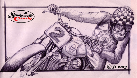
The small doodles from the previous post have received a goodly amount of attention in their transfer from the sketchbook into the A3 Newsprint pad. Taking them up in scale quickly helps greatly in the process of nailing the views one is after and is a great way of giving the old freehand skills a good work out. The newsprint paper is possessed of a beautiful kind of softness which takes Biro pen really well, and so drawing is both fast and furious, though it has a strange resistance to certain media like chalky pastels. That said, it can withstand a healthy level of abuse for such thin paper. This stage of the process also provides a great opportunity to throw some colour about, just to see how things might work if that’s the chosen way forward. For this I’ve used some very old Caran D’Ache Neocolor pastels that have been with me for years. They don’t crumble like normal oil pastels, so less mess, but they still maintain a fair degree of smudge-ability, so you can blend and overlay the colour. Sat here writing this I’m of a mind to perhaps try them out on a much larger format sometime, once I’ve visited the art shop to get a few more colours that is, currently the small tin holds the remnants of perhaps half a dozen or so. There are quite a few of these little sketches to work up, so more coming in the next post.

Caferacer_2


What next?

Cherry Red Bobber.

The most nerve racking moment when finishing one of these coloured pictures is not when applying the last little bits with the brush, or even putting in the last bits of the thickened outline, it’s actually the time when you’ve got to lay a ruler along the edge of the exposed paper and cut the image free from the stretching tape. I need to get myself a heavier weight straight edge, the thick plastic one I’m using feels like it will slip at any moment. I confess that I have accidentally sliced presentation drawings in half before, hastily patched up with spray mount and tape, but it’s not something I want to make a habit of.

Like many previous drawings my satisfaction in finishing it is tempered by an irritating feeling that there are little improvements that could be made. It’s right though to fight these for now as engaging in a final fiddling session is a sure fire way to make a mess of things. So I’ll leave it and divert my creative energy toward getting on with another image. Todays dilemma is which image to work up next? Having spent ages being reasonably well organised with my workflow, I find myself today with no idea what I’m going to work on now. Lots of sketchy things on the wall but none is screaming “Me me me”. Best go away and choose one. Actually having said that, there is the small matter of finishing the black and white version of this picture which was featured in a post a couple of weeks back. The man now has a plan.

Colourful fun.

Having decided to be a bit bolder with the colours on this one I’ve pushed the boat out a little. Normally I’m not normally regarded as the worlds most colourful person, my wardrobe is mainly centred around innumerable shades of blue, black, white and the occasional earthy tone. The interior of my house is painted mostly white. Not very flamboyant and there are certain colours I daren’t go near like yellow and green. When I worked as a designer I thought about colour a great deal, there were many lengthy deliberations involved in picking colours for products, details and graphic elements. Nowadays things are different, some years spent not being in control of this aspect of projects has rather reduced my colour confidence and so splashing it about again takes some nerve, but it’s good fun.

Though the drawing may look slightly washed out at this stage I’m hoping that the intensity will return once the black ink starts to go down and I have decided on a colour for the backdrop area behind the central image. This should help to give it some punch, lift it from the background. Current thinking is go fairly neutral in both colour and tone so’s not to clash too much with the bright red frame and the helmet colour. The next post should show how that’s starting to look.