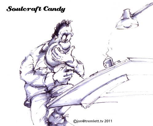
Comfort in the familiar.

With the lightbox constructed the speed and easiness with which I can transpose drawings onto fine quality paper is greatly improved. What I really like about it is the ability it gives you to not only see where you are with the drawing as you go but, also it’s become much easier to make those fine adjustments to the composition. I appreciate that this all sounds wonderfully old fashioned but there is a beauty in that.

Another problem I’ve been dealing with on a relatively regular basis is that of getting into the rhythm of drawing on days when it doesn’t come easily. I’m not an artist and as such I’m not in the habit of engaging with my work on a daily basis. There are often gaps and I find that my eye takes time to get back in when I return to the page and the pen. Normally I find a good scribble gets me into the swing but there are other times when nothing progresses beyond that. Angles, proportions and perspectives are all out of my creative reach.

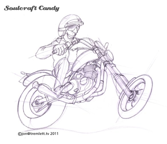
What I’ve found helps me get over this hurdle is to go back to something familiar and draw that. Something that I know intimately and when it comes to drawing bikes there’s nothing more familiar than your own machine. As I’ve mentioned before, I’m lucky enough to have two, but it’s the smaller one which always gets the job. Having spent a month modifying it a couple of years ago, and riding it a lot since then I know it inside out.

Above is a “getting into the rhythm” sketch of the little 250 that eventually went all the way to a finished drawing, below.

Like many of my other images I’m still fiddling about with what device to use to ground the picture and have so far only scratched something rough in using Photoshop. What I find happens when I follow this path to warming up is that the familiarity of the object in some way makes it easier to distort the view and the drawing. Sitting here writing this I’m actually struck by the fact that I haven’t needed to draw the 250 for a couple of weeks, so things in general must be getting better and easier to engage with.

Here’s pic of the bike. I mentioned ages ago in a very early post that I would tell some of the story behind this little special build. This is supposed to be a blog about drawing and making after all. So I shall sprinkle some of that into the mix over the next few posts.



Making a lightbox.

It’s a great truism of anything connected to a hobby, making anything, fixing anything as much as of life in general, that whatever it is you’re doing the one bit of kit you find you need is the one you don’t have. How many times have you taken a whole bunch of stuff and tools out front to fix the car only to find that the one spanner you need is the one you didn’t bring.

So it was with me realising I needed a lightbox if I was going to stand any chance of transferring sketches to better quality paper for final drawings. I had a couple of sheets of a varirty of good old fashioned carbon copy paper but it wasn’t what I wanted and you can’t see where you’ve been so easily with it. Jumping on-line I realised I’d be in to over £200 for an A3 size. And the boxes on offer were just like I’d used in the past; big, heavy things fabricated out of metal extrusions and packed with great big fluoro tubes that get hot.

I wanted something slim and low in profile, capable of taking an A3 sheet and certainly cheaper than £200 or so. After no more than two minutes thought I decided to make my own. One mad project I’d done a couple of years ago was converting a new office machine into a do-it-all device complete with coffee machine, DVD player, stereo sound, screen etc. It was made to “float” on a bed of light, and for this purpose I’d usesome brilliant low voltage cold cathode light tubes. Very compact, bright and they don’t get hot. I tracked down the company Luxx and ordered some tubes in white and the various bits of power supply and inverters.

Luxx offer a service whereby you can order over the phone and they were really prompt in their despatch of the parts to me, try them though I’m not sure they send stuff abroad.

So with four tubes in hand I worked out how big I wanted the box to be, essentially A3 plus a bit. Again using an old work supplier, and there are lots of people out there who can supply you should you need, I purchased two pieces of Acrylic sheet (Perspex) cut to my dimensions. One is white, for the base of the box so I didn’t have to paint the whole interior and the other opal for the top.

Then off to the local wood store for some strip wood in two widths for the frame. By laminating the strips together I could create frame sides with an integral rebate to take the acrylic sheets and leave me with a flush surface.

I made sure that this rebate was continuous around the top to fully support the top opal sheet. To fix the white base sheet I cut thin strips and four triangles to give me four corner fixing points and some support areas for the base. See pic on the right. I simply took my time, which means taking plenty of time to let glue dry and set, and simply glued the structure together. PVA wood glue is great stuff if you leave it alone to do its thing.

While the frame dried I got busy on the base sheet and lights. The tubes come in square section housings so you can rest them on whichever face you want for the best effect. Luxx usefully supply some very handy velcro tabs for fixing the lamps in position which makes life dead simple. I also measured the positions for some mounting holes for the inverters, the white boxes shown, drilled some holes and put them in place. two tubes can run off each one. Once I’d decided on the light spread I wanted it was merely a case of positioning the Velcro bits and fixing the lamps in place. Some white tape to manage the wiring and it was ready to go.

I’d used two layers of double sided tape to hold the front sheet in place and so everything mounted into the back of the frame using the foiur screw holes in the corner triangles I’d put in at the start. The base sheet slipped in without any fuss and once screwed together I had a great little light box.

And here it is in action. I know full well that the light spread is not continuous across the box, but that’s not an issue. What I have is plenty of light coming through allowing me to trace away to my hearts content. It works through some pretty thick papers so all is well. I use it as shown, propped up on a plastic laptop support from our good friends at IKEA which makes a very comfortable working angle. I’m very pleased with it.

What you can see lurking on it in the pic is a loose sketch for a chopper/bobber/ low riding composition I’m starting to work up. Watch this space for the final version.

Oh, and by the way, if you do fancy making a similar lightbox the lamps are Deluxx 5 and the code number is TE26290-65UV. They will happily give you advice about inverters and cables if you need it, but it’s all on the website.

A time for ink.

Armed with the blue pencil sketch from the previous post, I used it as an underlay to create the final version of this drawing. Having said before that layout paper provides a good opacity for tracing through it became obvious fairly early on that despite this it was often difficult to pick out the lines that I wanted to follow. As a result I found working slowly and with a medium hardness pencil the best way to go. Basically I could erase things if I didn’t like them, though there is always the danger that you’re going to wreck the paper just at a critical moment as you get a bit enthusiastic with the eraser. I always try to avoid this by stretching my hand across the sheet and working the eraser slowly between my thumb and forefinger. Still, the danger is always not too far away.

I seem to have acquired a two pronged attack to adding detail to the drawings. I insert a certain amount in the pencil stage and then include more as I proceed with the ink pen stage, and so the drawing looks kind of half done at this stage. I also have to say that when I’m unsure about something, like the rider’s expression for example, I’ll leave it half done and continue to work on it in pencil as the inking process moves forward. Something in the way the drawing takes shape seems to help me find the right look further down the line.

Inking on this drawing was straight on top of the pencil on the layout paper. I realised I didn’t have any kind of light box that would allow me to easily transpose the image onto my favoured Bristol Board. This was something I didn’t forsee but was able to solve relatively quickly soon after as I made my own. I’ll cover that in the next post.

As a consequence the process of laying down layers of biro ink onto quite thin paper lead to the paper doing what it always does in these instances and that is to wrinkle quite badly, particularly around the areas where you put in the most effort. I suppose it must be that the constant pressure and side to side action of the pen stretches the paper. I could see myself ironing it in a desperate effort to make it flat enough to stick to a backing board. I know ironing a drawing sounds a bit mad but it does work provided you place it face down before you start and work slowly from the centre outwards and keep the iron dry. Stay away from the steam button. The strange things that my brain is filled with eh? As an aside, I first learned about ironing paper from the father of an old friend who I was best man for at his wedding. He told me to iron all the cash I was due to hand over to the chauffeur and various other folk that day. The reason being that it would give a great impression and that a man in a top hat and tails should be armed with suitably smart money. Whatever.

Fortunately I didn’t need to flatten out the drawing in the end before getting it onto a backing sheet, to protect it as much as anything else. In its current state the paper drawing doesn’t have any ground line or background, I’ve added these in a very scribbly way in photoshop just to see what it looked like. I’ve been mucking about on a multitude of photocopies with all kinds of backgrounds and ground lines. I’ve not found what I’m after yet but will add to the final drawing when I do. Coming up with ideas which both convey speed, and sit naturally with the style of the drawing is proving a lot harder than I thought it would. Perseverance will win out in the end though. I for one will certainly be happier when it does. The last thing I want to do at this point is f**k up a decent drawing with a failed background experiment.

The inspiration for this image is definitely from my love of racing machines and a burgeoning liking for big twins and singles. There’s something about these engines that’s kind of pure and simple, though having said that many are certainly not so. I also have tried to convey in the rider the sense of barely controlled power and the kind of expression that I’m sure many of us make when we feel we’re really opening the taps. There’s still much more work to do and progress to be made but at this point I feel the drawings gaining a definite look of their own.