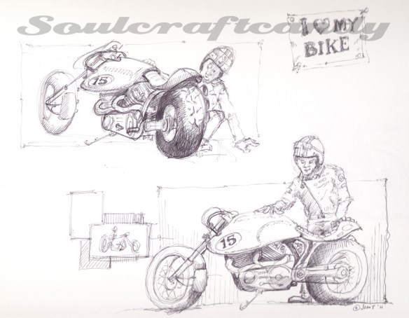
Despite much evidence to the contrary it is still a feature of the drawing activity (for me anyway) that one finds oneself staring blankly at a clean piece of paper without the slightest notion of what to put on it. You find yourself a bit stuck. Somewhere back in the annals of the blog this subject has probably already been mentioned, but the other day it happened again and a long forgotten way to get round it emerged from the deepest recesses of the ol’ grey matter.
As a child, art class at junior school was always something to look forward to with relish. as a consequence we needed absolutely no encouragement to throw ourselves head long into cramming the available paper sheet with images. It was as if our naivety gave us a courage to overcome any fears we may have harboured about subject matter, scale, detail and colour in our image making. The sheer joy of being creative for an hour or two gave us the energy to be unconstrained by any and all compositional constraints. What a lot of fun it was but, sadly it wasn’t the same for everyone and things don’t stay this way for ever. In fact I remember certain kids who suffered being utterly intimidated by a blank sheet of paper or a full palette of paints. Gregory King wasn’t one of them though, oh no, he knew exactly what he was going to paint or draw every time, a big red racing car. The bigger and redder the better. These remained a bedrock of Greg’s creative output for as long as I knew him. When charged with the task of rendering a nativity scene he would find a way to squeeze a big red racing car in there somewhere. We could analyse Greg’s fascination but I digress. The essence of this is that he had found a way to never be short of an idea.
As we learned more and knew more, our creativity changed too. The free flowing rampage across the paper of pencil, charcoal and paint fell victim to learned concerns about proportion, composition and fidelity of colour. It was as if a pendulum was swinging towards its other extreme and would culminate in either total mastery of ones medium or the frozen wastes of the blank sheet of paper. For any of us who’ve accessed our artistic creativity for most of our lives, learning to steer the pendulum towards the former outcome rather than the latter is a lifelong challenge which we confront relatively frequently. Moments of absolute flow are matched by others of a kind of creative block. Only we ourselves can solve the problem and navigate these moments. These strategies are not hard to learn, the challenge lies in finding those which work for you and remembering them when needed.
For some all it takes is simply making a mark on the paper, drawing a random line to get you going. For others it starts with an inky fingerprint or a splash of paint. Some people choose to merely copy something to get the process started. The sketch at the top of this post began with a personal favourite, hovering over the paper with a pen and gently touching the surface as the hand engages in a random series of movements. In a way it’s just like starting with a random line but feels very different and prescriptive. Anyway sooner or later something begins to appear. It doesn’t take much and off the imagination goes down some path. As the sketch emerges I maintain this hovering approach with the pen and move around the drawing adding bits here and there, slowly building elements and detail. Using a pen means not being able to erase anything, which has interesting side effects and introduces a gentle kind of discipline to the process. Though having said that, the slightly non-comital nature of line creation helps to keep the whole thing a bit more fluid. This more scribbly way of making an image is quite liberating and definitely helps to loosen up the mind as well as the hand.
In a way the drawings created are never really finished, you can stop whenever you choose to, and this lends them a liveliness often lacking from more formal sketches and drawings. Their quality might only be appreciated through the eyes of the beholder, but if they’ve unlocked the block then their purpose is complete. Here’s the next sketch that popped out straight after the one above.


