Alive and kicking.

Soulcraftcandy work in progress

It is probably very different for those who can maintain the discipline of posting to their blogs every day, but for the rest of us, who invariably post when we can, gaps appear in our flow and by the time we have seen them it is too late to close them up or fill them in. Such is the way of things. When posting relies quite heavily on making progress with a project or piece this is something you pretty much have to live with, cope with and try and overcome through trying just a bit harder. So, gaps are awkward but not the end of the world. My posting habits are erratic at times but this does not mean that nothing has been going on in the background.


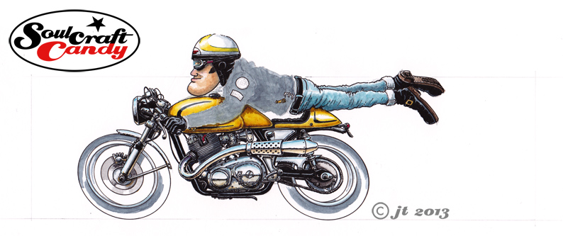
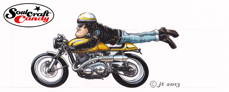
Following the last post, showing the journey from blank sheet to finished picture (see below), work has continued on that small series, sketching out, drawing up and starting colour work on the last three images that will take me to the complete set of nine that I want. In the photo above, taken today in the mini-studio, you can see two of these remaining pictures. In the foreground is number eight just over half way through with most of the inking in done and only bike colour and background to finalise. Number seven, in the top left, is all done and only awaits a background block and final fiddling. I will of course post them up as they get fully finished. I thought this shot would also be useful for the fact that you can clearly see my technical pens lying next to the picture, which gives you a clear sense of the scale I am working at with these. Small.

Soulcraftcandy ideas and sketch wall..

This second shot shows the current state of my ideas wall. I am trying to develop the habit of changing it’s contents a bit more regularly though doubtless some of what you can see will appear very familiar to those who have been following the blog for any time. On the right hand side though you can see evidence of what has been occupying my blog-time of late. I have been getting some of the drawings ready for printing as small cards with the intent of selling some through the Soulcraftcandy BigCartel store. The top row shows some run-offs of the first set from the original Cafe Racer series done last year and below them are some prints off the home printer looking at how best to size these newer images for their own card set. Getting all the files clean after scanning, colour balanced and nice and crisp takes a good deal of time but hopefully the results will be worth it. So there is lots happening and I will be reporting on progress as the journey to print continues.


If you spotted it and guessed correctly, yes that is a picture of one of the cats at the very bottom of the shot, but fear not, this blog is not about to be overtaken by feline inspired craziness.


From blank sheet to finished picture – part 3.

Norton_wash3

The next stage in the application of colours to the picture is probably the most nerve wracking and delicate, though it is hugely rewarding when completed to ones satisfaction. Although in your minds eye you feel you can “see” exactly how you want things to to turn out, the reality is that one is merely aiming at achieving that vision, as actually it’s not at all clear until you’ve put paint to paper, and sometimes by then it is too late to make a change. You have to kind of feel your way towards your goal. I’d decided the bike should be a golden yellow colour. The first stage is to put some shadow tones onto the areas that require them like lower edges and vertical faces. With these you have to think what colour the yellow would be in shadow as these things are invariably never a case of simply adding black or grey to your base colour. In this case doing that would make everything a dirty green colour, not good. So using small quantities of darker ochres and browns these areas are touched in and left to dry. Having decided on highlight size and position it’s time for the yellow, applied in a thinned wash to start with and then built with some less diluted colour as the from appears. Knowing when to stop is as much judgement as experience, so slowly, slowly, catchy monkey as they say. The yellow on the helmet follows and then finally the base layer for the leather jacket making sure I leave clear all the small details I want to stand out in the finished picture.

Norton_ink3

When all the above is fully dry it’s time for the last of the inking stages. Using a fatter pen than usual, a 0.5 point, the tyres are done first, leaving hard edged areas for the highlights rather than a more messy looking feathered edge. Back to a fine pen and the jacket comes next where it’s very much a case of working slowly down or across the shape, again leaving small slivers of grey to denote highlight areas where the leather wrinkles. You could argue that areas like the jacket should be more gradated and “realistic”, but if you do that then the rest of the picture doesn’t “fit” and you end up having to apply the same approach to everything. All that’s left to do now is add any small colour touches into any helmet and jacket badges, the spark plug cap and small reflections of the yellow that appear on metal parts facing the coloured area. A final tickling process takes some time, constantly scanning the image for little white gaps and spots where a bit more colour or black is needed, but it serves to lift small parts of the picture that you perhaps didn’t see before.


The picture is now nearly done, all that remains is to choose the right colour for the background block, one that gives enough contrast with the bike colour but doesn’t drown the image in the process. That’s all in the next post, see you then.


Take your imagination for a walk.

83_Wheelie_2

There aren’t many drawings here in my collection that are based fairly and squarely on actual, real machines. The bike in the picture today is probably as close as I’ve got in some time to depicting an actual bike. On the one hand this is down to the fact that I find “copying” from reference material a rather dull activity, and on the other it has a lot to do with keeping my imagination fed, watered and happy. Those of us who enjoy documenting the wonderful world around us through image making most likely occupy an area similar to that found between the two intersecting circles of a Venn diagram, where the real and imaginary overlap, and each image is a result of varying percentage combinations of the contents of those two circles. For me the ratio feels very much tipped in favour of imagination but, sometimes I wonder whether this is actually the case. What is my imagination up to during the process of making an image such as this one above? Is it actually creating anything or is it busy bending a set of reality based frameworks, and blending those with a healthy dose of embedded knowledge to create something which my  eye is happy with? I’m not sure, but it’s an interesting question all the same.


Generally speaking, an active imagination is a happy one, and though we all know that this isn’t always the case, learning to feed it with good stuff is an important life lesson. The pleasure though, in this activity, is that it seemingly has no problem propelling itself along at a fair old clip when it’s found something to get its teeth into, and for me this is where reality plays it’s biggest role, in influencing the choices my imagination makes and providing the fuel for the journey. This is one of the key reasons why these pictures come out the way they do. My imagination needs not only to bear creative fruit but also has to have something to distort, to have fun with in order to function properly. It’s a strong urge and one I’m almost powerless to resist, so most of the time I don’t try to. But there is some control involved somewhere as it doesn’t just run wild all the time. Perhaps it is like a kind of dog, look after it, feed it properly and give it regular exercise and it stays a loyal and rewarding companion.