Colourful fun.

Having decided to be a bit bolder with the colours on this one I’ve pushed the boat out a little. Normally I’m not normally regarded as the worlds most colourful person, my wardrobe is mainly centred around innumerable shades of blue, black, white and the occasional earthy tone. The interior of my house is painted mostly white. Not very flamboyant and there are certain colours I daren’t go near like yellow and green. When I worked as a designer I thought about colour a great deal, there were many lengthy deliberations involved in picking colours for products, details and graphic elements. Nowadays things are different, some years spent not being in control of this aspect of projects has rather reduced my colour confidence and so splashing it about again takes some nerve, but it’s good fun.

Though the drawing may look slightly washed out at this stage I’m hoping that the intensity will return once the black ink starts to go down and I have decided on a colour for the backdrop area behind the central image. This should help to give it some punch, lift it from the background. Current thinking is go fairly neutral in both colour and tone so’s not to clash too much with the bright red frame and the helmet colour. The next post should show how that’s starting to look.

Daring to be different.

TT Racer

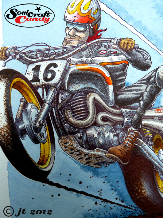
There were only a few lines to finish and a couple of pieces of text to finalise but getting them done took way too long. That said the TT Racer image is now complete and here it is. I’m pretty chuffed with how it turned out.

There are always an awkward few moments upon finishing an image when you have to push yourself to bring your critical eye to bear on it. The euphoria of finishing and regarding your completed work often promotes a kind of inner forgiveness where it’s comfortable to overlook things that perhaps you could have done better. So a good shove is required to jolt us into action. So here goes.

I would probably change the tank shape from the flared form shown to something more rounded to bring some extra lightness to the centre of the image. Tonally the bike and rider could be separated a bit more and while I was at it his face could do with a little less inking. It is a great relief to see the blue washed background giving the image a good degree of punchiness but, a bit more effort to make it less blotchy wouldn’t go amiss. I like text boxes but I’m not yet fully convinced. It will likely turn out that there are times to use them and times when it’s best to leave them out, it all depends. As a first stab at inking over water colour on rough paper I’d say this is something to keep working at for sure.

In that vein here’s a shot of the next one already started. You’ll notice that it is a slightly modified version of a previous drawing done in black and white a couple of weeks ago. I have changed some small details like the riders helmet and some bits on the engine to create some difference. For this one I thought I’d try and be a bit more bold with the colours, as you can see, to try and capture or express some of the more exuberant approaches that custom builders bring to their craft. No one ever said a frame had to be black after all. We’ll see how it goes, it should be fun, and I’ll be trying hard to benefit from all the little lessons learned from the previous drawing above.

Back to black.

On goes the ink.

A catchy title to todays post but, for all music fans out there I’m not going to be offering comment on the great studio album by the late, great Amy Winehouse, though I would say that Tears Dry On Their Own is my favourite track by far. Anyway I digress.


As you can see above The TT racer is nearing completion with a healthy dose of inking being done. As the title of the post implies this is very much an exercise in chasing all of the colour washed areas back towards black in the darkest shadows. This has proved quite tricky for a couple of reasons. Firstly it is incredibly easy to get a bit carried away and over do it, so teaching oneself when to stop is a constant challenge. The second reason is more techy in the sense that it’s about the touch of the pen on the drawing surface. Water colour paper is quite heavily textured relative to normal papers and so maintaining a delicate touch across areas is quite hard as you are not engaging with a smooth surface, so the line can be a bit inconsistent. It’s just something you have to get used to and work with. This also catches those little blobs of ink that gather on the pen tip every now and then so constantly cleaning the nib is a must do habit to get into.


It is coming together well though and should be finished soon. Then I’ll be able to release the paper from the back board, give it a proper scanning without there being a large bit of wood attached to it, and post it up here. Here’s a close up which reveals some of the dodgy line work.