Shotgun drag bike – slowly the bike emerges from the paper.

Shotgun_greys©JonTremlett2014

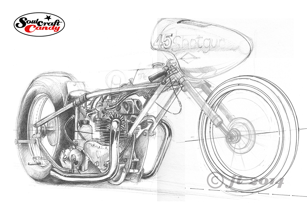
In a continuation from the previous post, here are some further images charting the progress of the Shotgun drag bike picture. In this first one I’m still very much in the process of laying down the grey tones, and as you can see this pretty much covers most of the parts of this bike, including the tyres, which are not painted red. As I mentioned previously this is very much a process of laying on tone and building up to the desired intensity in small steps. Most people who’ve ever rendered anything will tell you that true black doesn’t really exist, and they’d be right. But with this style of drawing or painting I like to create areas of absolute black as they help give the image punch and underline the more cartoonish nature of the final picture. So where possible it’s good to get those bits done at this stage too.

Shotgun_frame1©JonTremlett2014

In this second image you’ll see that I’ve completed the exhaust pipes having finished with the greys, before starting on the frame colour. Exhaust pipes, especially chromed ones are a lot of fun to do, but they do rely on you having some decent reference material to work from. In this case there was plenty going on in the photograph, so the reflections are quite colourful and intricate. The engine, and therefore the near vertical exhaust pipe too, provide a real central anchor point for the picture and the reflections really help to draw the eye to the focal point of the image.

Shotgun_frame2©JonTremlett2014

This final image shows the picture with the frame pretty much done. Again, this was a process of laying down slightly diluted tones of the red colour in steps, slowly building the colour up giving the frame tubes their form and highlight areas as you go. I took some time to get the base red right, mixing scarlet and orange inks to obtain something with the right amount of vibrancy. Diluted this gave a lovely pink for the lighter areas and with a bit of dark rich brown mixed in created a great tone for the shadows. It can be a bit nerve wracking when working with such strong colour as the last thing you need is to smear it across an area where it’s not wanted, or worse, get a small droplet landing on your pristine white surround. Once this stuff is down, there is no way to get rid of it or cover it up. But taking your time and working slowly and methodically pays dividends, and allowing things to dry every few minutes is a good habit to get into.

By this stage the picture is really starting to jump off the page, the red frame bringing a whole new three dimensional feeling to the piece. Nearly there.

Starting the Shotgun commission.

Shotgun_sk_1©JonTremlett2014

A couple of posts ago I put up some colour photographs of a lovely red vintage drag bike called Shotgun. I’ve been asked by its owner, Nik Fisk, to create a picture of the bike for him. It’s taken a couple of weeks to get going but here is the first layout sketch done in preparation for the final picture. It’s done in black biro on heavy weight lining paper. When I was taking the photographs we discussed in some detail the view we wanted to achieve in the finished piece, something that hinted at the length of the bike, but also showed off the overall shape well and the fantastic old Triumph engine that sits at the heart of the beast. Having the right hand exhaust pipe nearly vertical we reckoned this would allow the curvature of the left pipe to be a feature and would also create a strong central element to the picture.

It would be far simpler, and probably much easier, to sketch directly over a printed photograph, or do it digitally using something like Corel Painter, but that would defeat the object of this exercise. In asking me to create a picture for him, Nik is looking for something created in a particular style, which we reckoned would be called something like “factual caricature”. This is not about creating a facsimile image, more about giving the image a degree of character which a photograph just can’t do. So with a picture up on the screen as reference I like to work freehand directly onto the paper, working out the relative positions and proportions of things as I go. It’s a rather organic process, one which not only makes you look carefully at the subject, but also embeds knowledge about that subject into your minds eye as you go. I find this part of the process invaluable and it enables me to make the slight scale and proportional changes which bring the caricature into the image. It allows me to do things like make the engine slightly bigger and bulk up the exhaust pipes to increase the sense of power of the unit for example. I always like to increase the fatness of tyres on bike pictures, in makes them look more planted in my view, but at the same time I need to make sure that the ellipses that outline the wheels are as correct as possible. This sketch shows a revised front wheel from the original sketch, done with some ellipse guides at a smaller size (my templates only go so big), rescanned and photoshopped into place. So when I’m freehanding the outline drawing for the final picture I’ve got some decent guidelines to work to.

The drawing is about 380mm from the back of the rear wheel to the tip of the front and sits very nicely on an A2 sheet, so a really good size which will allow lots of details to be shown. The next step is to check over this one, make some notes for adjustments and then use the light box to start the process of getting it onto the Bristol Board I’ll use for the final painting. This is going to be a lot of fun and I’ll be posting progress reports as things take shape.

Submit your work to a local art show.

small water colour 19cm x 16.5cm for Soulcraftcandy.

Every couple of years here in Ealing, there is a local art show hosted in the Gallery of Pittshanger House, in the northern corner of Walpole Park. It’s called the Ealing Open and it serves as an opportunity for local artists, both amateur and professional, to exhibit an example of their work. You are allowed to enter one piece of work for the show and the great thing is that there are no barriers to entry other than the work must have been completed in the last twelve months by a person living within the borough. As a consequence there is a huge variety of different styles, abilities, media and images on show. It’s great and is a fantastic chance to see not just how creative people are but, how many creative people there are all around us. I submitted one of the Cafe Racer biro drawings last time, back in 2012.

This year I’m submitting again and the image above is the one being entered. It’s a small piece, done in water colour, ink and a touch of gouache. Two weeks ago I was reluctant to submit it, I’d fallen out of love with it completely and was finding it hugely difficult to summon the energy to finish it. I’m not exactly sure why but, I think it had something to do with the amount of colour in it. Every time I looked at it, it just looked far too dense, too much blue, too much green and lacking in a depth of field that I thought I’d worked hard to achieve. But things change, and sitting down last weekend having taken a break from it for some time, it jarred much less and finishing it off took surprisingly little time and brought much relief. I’ve called it “Tom, Dick and Harry”.

My partner is submitting some work too, though her style of painting is much more abstract than mine to say the least, a grasp of which is seemingly beyond my comfort zone. It will be fun to enter such different pieces and to see where in the vast collection of entered works our paintings are hung. I seem to remember that last time there were in excess of three hundred entrants, so plenty to entertain the crowds for the month the exhibition runs for.

The Ealing Open, PM Gallery, Pittshanger House, Ealing W5 5EQ, 24 May – 21 June.