From blank sheet to finished picture – part 2.

Norton_wash1

In the last post I showed how I create the base drawing for one of the small colour images I’ve been making recently. Now it’s time to take a look at how the colour and ink go down onto the paper. There is no right or wrong way of doing this, we are all individuals after all and our working methods all differ accordingly, but this is how I do it. There are about seven steps involved, and they pretty much alternate between applying colour washes and inking in. I have a preference for building the image from the centre outward so this is where I start, engine, chassis and other cycle parts.


Greys go down first, in this case Payne’s Grey, slowly building up in layers to give shadow where I want it, form where I need it and a backing for black areas which may contain a high or low light. Using a very small brush with barely any paint on, things start to take shape. There is a strangely imprecise precision to the process. Next come the smaller areas of browns, ochres and blues which begin to define the ground and sky reflections on the various metal parts. I leave the exhaust for now as I find this easier to do later, working within the confines of the outline after it has been inked in.

Norton_ink1

With the core of the image coloured, it’s time for the first pass with the technical pen, and being an old fashioned kind of bloke I’m still very fond of a good Rotring pen, in this case a 0.25mm nib width. The tightening of the detail that this achieves also has the benefit of allowing you to see where you may need to apply a bit more colour, or even a different colour, to an area which needs a bit more punch. You’ll notice I’ve also applied wash to the front and rear brake areas in this step to put myself in the position where the core of the bike is very much done. The frame rails, which were washed all in grey are now mostly black apart from a highlight line and I’ve applied solid black in selected areas to bring other details to the fore and create some depth.

Norton_wash2

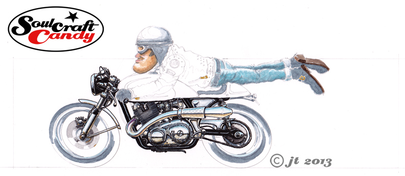
This second wash stage involves getting the rider figure underway and laying the base colour pieces to the wheels as well as getting that tricky curving exhaust sorted out. As with the frame I put grey on the wheels and tyres in the places where I know I’ll leave gaps in the black of the ink, and apply this same method to parts of the rider like boots, helmet parts and goggles. Now, a quick word about that exhaust. Back when all of us budding designers were drilled in the fine art of marker rendering, it was obvious after a while that the practice involved learning a few, what I would call, conventions. Little techniques for doing curved surfaces, metal parts, areas of high gloss, textures and chrome amongst others. Although I haven’t picked up a marker in years, some of them remain useful when dabbling in other media. Shiny exhaust pipes are a case in point. A grey line to denote a horizon below which a brown area denotes ground reflections, and finally a blue upper area to signify the sky. Simple and effective, with some extra colour tones around the cylinder head exit where the metal changes colour due to the heat.

Norton_ink2

Time for more ink using the same approach as before, tightening detail and bringing definition. The wheel outlines get some attention using an ellipse guide for neatness, to be honest my freehand ellipse drawing is not what it used to be, and picking out a couple of details on the jacket and such will remind me not to wash over these at the next stage. The bike’s going to be a golden yellow colour so that’s what is coming in the next installment.


Bending the rules, just a little.

82_Wheelie_1

Todays stunt, the Wheelie. As much as they are displays of machine control and skill, they are also a perfect expression of the utterly boyish exuberance and confidence that infects us when we’re out on our bikes. It’s a lot of fun to depict them in images, though capturing that moment, like a camera snapshot, presents its own challenges. If you drew up some kind of list of all the variables one could consider before putting pen to paper, you would probably never start. For me the essence lies in capturing that sense of fun and confidence such a display gives off. It is after all, nothing more than showing off to an audience, so trying to get that into the picture is important. It would be far simpler to draw the whole thing as a straight elevational view but that would be too easy. Like a camera lens your eye can be a pretty wide angle device, and so creating a sense of depth and perspective is the main challenge. Which part of the image is almost flat to the viewer, and at what angle does one see the rest of the subject are aspects that present an interesting challenge when drawing from imagination. Too little and things look rather flat, too much and you get a kind of fish eye effect that turns the subject into a kind of banana. In perspective terms these are not perfect depictions but I hope they do enough to convey the idea. Cartoons invariably bend the rules a bit, but I think you can get away with it when you admit that that is exactly what you’re creating.


This one is Wheelie 1, and yes, that means there is another one coming along shortly. I hope you enjoyed it.


A new picture and an inspiring book.

81_FlyBy_2

This is the second version of FlyBy. There wasn’t anything wrong with the first one, it just seemed like a good idea to do another one, and bring in some more of the classic cafe racer details like a black leather jacket with patches on and a big silver tank on the bike.


The background got really patchy on this one but once it had dried out fully it didn’t seem too bad after all. The colour works really well with the bike image and it would have been foolhardy to think that it could be rescued or changed in any way by adding more liquid. I’m really pleased with the reflections on the exhaust and the engine side cover, I confess I referred to some photographs to truly try and get a handle on these parts. There is certainly a “way” of doing these things, and it is reliant on being able to pick the information  you want from a photo as it is in being able to access ones embedded knowledge. The former certainly feeds the latter, the photos serving purely to inform what I’m doing rather than be representative of the only way things can be rendered. More of these to come.

This is a great book.

This is a great book.

On another note today, here’s a really great book to recommend. It’s called “An Illustrated Life” by a chap called Danny Gregory. Essentially it is a collection of features on various creative people and their sketchbooks, including he author, though the books are very much the heroes. It is a fascinating look into other worlds where the books are used as journals for recording everyday life, through to how various artists use them as repositories for ideas and laboratories for creative experimentation. To accompany all of this visual candy there is also plenty to read, each featured person is given plenty of column inches to explain what they use their books for, how they do it and, just as importantly, why they do what they do. It is all very enlightening and interesting stuff, I can’t recommend it enough as a source of energy, inspiration and delight. For any of us who spend any time slowly filling sketchbooks all this might at first seem a bit intimidating, but go with it and it soon becomes clear that we are all doing the same thing, just differently and individually. It’s readily available through all the usual channels. Here’s a link: To the book.

Illustrated_Life2 Illustrated_Life3 Illustrated_Life4