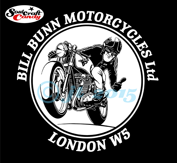
The finished workshop polo shirt.
So here is the shirt design for Bill Bunn Motorcycles, my local bike shop, in its finished form. The guys very kindly gave me a polo shirt in way of payment, which makes one feel very good about the idea of bartering. The quality of the screen printing is really good and the level of line and detail they have managed to keep is very high. A great result.
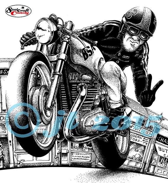
This black and white block reductive drawing is becoming strangely addictive. Partly I think it has to do with the process being quite quick, you see results quite fast but, it also has much to do with the simple pleasure of pen use and the decision making process. Areas of the drawing are either black or white and that’s it, this way or that, simple. As more drawings take shape it becomes easier to decide which way to go, ones ability to “see” what gets left out becomes clearer. It is amazing how the eye and brain are able to build a complete image from only a rather basic framework of information.

This activity is also helping me to complete some drawings which have been lying dormant in the drawing chest because I couldn’t decide on how to finish them. This indecision invariably comes from a lack of confidence and a worry about messing something up having invested a great deal of time and effort into it. For some reason this temerity seems to disappear once I start thinking of completing them in this style. One example is the drawing above. It must have sat in the drawer for about a year while I dithered over the final execution. However, armed with a couple of freshly filled Rotring pens it all came together rather quickly. there is still some background to complete to bring it on a bit further but essentially a neglected work has taken on new life.

One aspect of working in this way is that I’ve realised that I actually have a rather unhealthy pen fetish! I’m actually a bit of a technical pen nerd in reality. It is a necessary part of using these things that one has to be rather fastidious about their cleanliness in order to get the best out of them, and I find myself enjoying this often messy job. There’s something terribly satisfying about making the first lines after a thorough clean and refill of my most oft used pen. What strikes me as a bit excessive is why I have to have so many of the things? At least a dozen at the last count, though not all are in working order. Long neglected at the bottom of a drawer, one or two are utterly dried up and solid with ink residue, a rock hard shellac like substance that seems to be impervious to most solvents. Prolonged soaking in cleaning fluid, often weeks, helps to release things but often the smaller sized nibs are beyond help. I have no idea why I have so many, like many bits of drawing equipment we just seem to accumulate them unwittingly over time. I remember purchasing my original Rotring box set over 30 years ago, second hand from a market stall but where the others have come from is anyones guess. Likely bought because I’d forgotten I had that size already or they were so bunged up I just went and got a new one rather than bother cleaning them out. Profligate and lazy days to be sure. One thing being a freelancer teaches you though, is looking after your stuff so hopefully m nibs can look forward to a more pampered and productive life from here on.